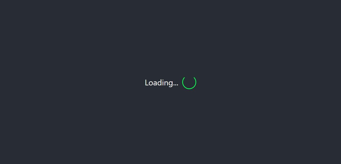
Hey People, I was finding a good way to make Loading screen/animation for my small React application, and I found 3 different ways to make good loading screens, : Using library. Type-1 react-loading : Using library. Type-2 react-lottie : Using simple . Type-3 CSS If you prefer to watch video tutorial then you can watch it here else just watch first 2 minutes to get an idea of what we're going to build here..and keep reading!😄 Let's Start Building... Create your react app with, npx create-react-app React-Loading-Screen Next, install two libraries that we're going to use. npm install react-loading react-lottie Here, I'm using to get data, to show how we can use pre-loader when using API. NOTE: jsonplaceholder API Type-1 Create separate file like PreLoader1.js. Create Functional Component and here, we're going to use two state, const [data, setData] = useState([]); const [done,setDone]=useState( undefined ); : To store data which comes from API call. data state : It is boolean to decide weather to show pre-loader or not. done state Now in the useEffect, setData(json); }); }, []); useEffect( () => { setTimeout ( () => { fetch( "https://jsonplaceholder.typicode.com/posts" ) .then( ( response ) => response.json()) .then( ( json ) => { console .log(json); setDone( true ); }, 2000 ); You can put your own logic in useEffect! Now in the above useEffect method, First we use fetch method to get data from api then we convert that data into json, then we will set data state with json data, and after that set done state to true. NOTE: Here I have used time out function for 2 seconds so that we can see loading screen for more time. Now let's render our component. we will check if state is false then we will render pre-loading component else we will render data we want to show. Line 22: done Here I have used react-loading library, where we only have to set type, color, height and width. you can find more functionalities on . Line 23: here From here I have mapped data state inside the ul tag which returns title of each post in li tag. Line 30: (use console.log() inside useEffect to see what kind of data we are getting) That's the end of Part-1 here. Type-2 Create new file and name it as PreLoader2.js Create functional component, and import react-Lottie library. import Lottie from "react-lottie" In this type of loading screen we have to download animation files from https://lottiefiles.com/ For this tutorial i'm using below two files, Earth animation : https://lottiefiles.com/1055-world-locations Success animation: https://lottiefiles.com/1127-success Download this file (Lottie JSON) and keep them in your project directory. Let's import this json files like below, import * as location from "../1055-world-locations.json" ; import * as success from "../1127-success.json" ; As mentioned in the react-Lottie library documentation, we need to set default options to use this animation files in our project so first declare this options as, here }, }; }, }; const defaultOptions1 = { loop : true , autoplay : true , animationData : location.default, rendererSettings : { preserveAspectRatio : "xMidYMid slice" , const defaultOptions2 = { loop : true , autoplay : true , animationData : success.default, rendererSettings : { preserveAspectRatio : "xMidYMid slice" , for first file while for second file. defaultOptions1 defaultOptions2 In this tutorial we're going to use 3 state: const [data, setData] = useState([]); const [loading, setloading] = useState( undefined ); const [completed, setcompleted] = useState( undefined ); : To store data which comes from API call. data state : Boolean state for first animation file. loading state : Boolean state for second animation file when API call is completed. completed state setData(json); }); }, []); useEffect( () => { setTimeout ( () => { fetch( "https://jsonplaceholder.typicode.com/posts" ) .then( ( response ) => response.json()) .then( ( json ) => { console .log(json); setloading( true ); setTimeout ( () => { setcompleted( true ); }, 1000 ); }, 2000 ); You can put your own logic in useEffect! UseEffect method is almost same as in part-1, only difference is that instead of done state we have to set completed and loading state to true, Also, I have used one more timeout function for 1 sec to see the 2nd animation. ) : ( )} </> ); } return ( <> {!completed ? ( <> {!loading ? ( < Lottie options = {defaultOptions1} height = {200} width = {200} /> ) : ( < Lottie options = {defaultOptions2} height = {100} width = {100} /> )} </> <> < h1 > Your Data </ h1 > </> As shown in the above code, in the return, if completed state is false then we will render loading screen else we will render our data. In the animation part we will do one more conditional rendering, when loading state is false then we will render the earth animation else we will render the success animation. Dont't forget to set for file 1 and for file 2. options={defaultOptions1} options={defaultOptions2} Full Code: Now as per the Creative Commons License of https://lottiefiles.com/page/license The creator(s) must be attributed in your application. You can attribute creator as shown in line no 60 to 71. That's the end of Part-2. Type-3 In this type we are not going to use any library instead we are only using simple css styling. Now the logic of displaying pre-loader is same as in the part-2 so here I'm not going to show you the whole process. Create new file PreLoader3.js Copy the whole code from PreLoader2.js file and remove all code related with react-Lottie library and keep everything as it is. only change return statement as shown below, ) : ( )} </> ); return ( <> {!completed ? ( <> {!loading ? ( < div className = "spinner" > < span > Loading... </ span > < div className = "half-spinner" > </ div > </ div > ) : ( < div className = "completed" > &#x2713; </ div > )} </> <> < h1 > Your Data </ h1 > </> In the above code, div with the class spinner contains Loading text and spinner. while div with the className completed contains success symbol.(✓). Now let's do some css styling. crate separate file preloader3.css for styling and import it in the preloader3.js file. Now, class is simply box for spinner. .spinner contains styling and animation for loading text. .spinner span contains styling for spinner. .half-spinner now to cut this whole spinner as in line no 20 you just have to set border top to transparent. contains styling and animation for success(✓) symbol. .completed This is the End of type 3. You can find Full-Code repository from . here 😄 Thanks for reading and supporting. Feel free to visit my youtube channel: @CodeBucks