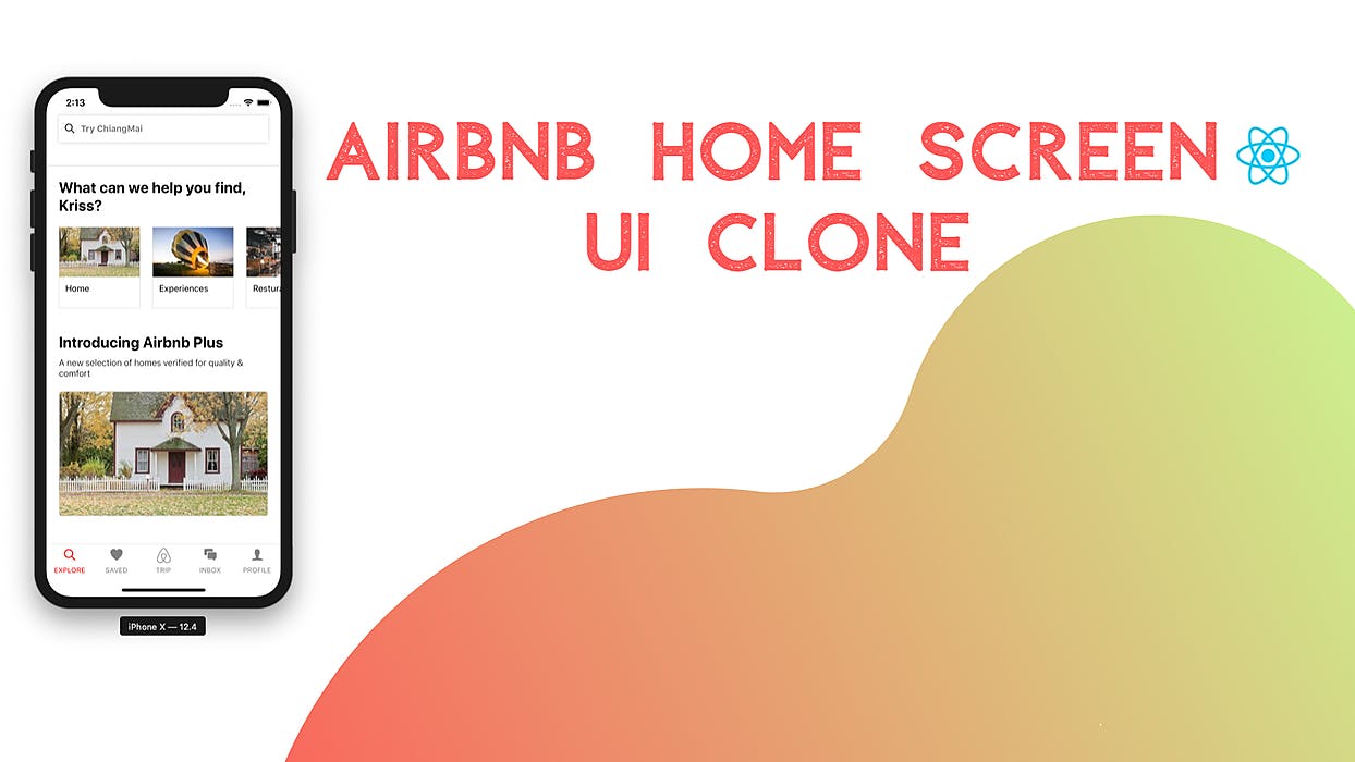
This tutorial is the second part of our Airbnb Home Screen UI clone using React Native. In the previous part, we successfully implemented the bottom tab bar and the search bar at the top. This tutorial is the continuation of the same tutorial from where we left off in the last part. So, it is recommended to go through the for better understanding and insight into the overall project. previous part As mentioned in the first part, the inspiration for the creation of this tutorial series came from React native template which helps us build some amazing ready to deploy applications that anyone can use to build startups or sell the application templates. And, this part is also the continuation of coding implementations and designs from the Youtube video tutorial by for the Airbnb clone. Unsure programmer In this part, we are going to implement two main sections to our Home Screen UI which will emphasize the recommended homes from the actual app. They are the Category section and Airbnb plus section on the Explore screen. The idea is to start by implementing the category section. Then, we will convert the category code implementation to a single component and make the component reusable. Then, we are going to move to the designing fo Airbnb section UI. So, let us begin!! Implementing Category Section Importing Required Component First, we are going to import the required components into the Explore.js file from the react-native package. The required components are , Image and Text component which we are going to use in the Explore.js file to implement the Category section. ScrollView All the imports are shown in the code snippet below: { View, TextInput, Text, Image, SafeAreaView, ScrollView } ; import from "react-native" Adding HeroText containing Description In this step, we are going to make use of and component that we imported before in the Explore.js file. The component enables us to implement a view which users can scroll. ScrollView Text ScrollView We are going to implement it with of value 16. scrollEventThrottle Then, the component wraps a View component with inline styles for proper view. Then, the View component wraps the component containing a description with some inline styles to make the description look as in the original app. ScrollView Text The code to implement all this is provided in the code snippet below: <ScrollView scrollEventThrottle={ }> <Text style={{ fontSize: 24, fontWeight: "700", paddingHorizontal: 20 }} > What can we help you find, Varun? </Text> < 16 < = , " ", }}> View style {{ flex: 1 backgroundColor: white paddingTop: 20 </ > View /ScrollView> Hence, we get the following result in our emulator screen: Adding Featured home UI in the Category section In this step, we are going to create a feature section in which we display the image of a home along with some text at the bottom. This section is to coded below the description section. For this, we need to add a new View Component that wraps another View component in the process. Both the View components will have inline styles for the correct view. The inner View component will wrap the Image component which has the source image acquired from directory. ‘./images’ We need to bind some styles to the Image component as well to make the image look proper and nice. Then just below the View component that wraps the Image component, we need to add another View component with some inline styles. Now, this View component will wrap the Text component which will contain some text describing the image. The code to implement all this is provided in the code snippet below: <View style={{ : , : , : , : , : }} > <Image source={require("../images/home.jpeg")} style={{ flex: 1, width: null, height: null, resizeMode: "cover" }} /> </View> <View style={{ flex: 1, paddingLeft: 10, paddingTop: 10 }}> <Text>My Home</Text> </View> height 130 width 130 marginLeft 20 borderWidth 0.5 borderColor "#dddddd" < = }}> View style {{ flex: 2 </ > View Therefore, we will get the following result in our emulator screen: As we can see, we have got the description as well as the image section for our category section. But, we need to add the same type of images section repeatedly to make it into the category section. How are we going to do that? The answer is to for the Category section. create a separate component Separate Component for Category section Here, we are going to create a separate component for our category section containing the image and text elements that we implemented in the earlier step. Separating the UI into different components is very essential in the case of React Native because it enables us to re-use the same code in the different sections as well as make the code appear clean. So, in order to create the component, first, we need to make a separate directory to keep the components file. So, we need to . create a directory called ‘./components’ into our main project directory After that, we need to into the components directory. create a file called Category.js Then, we need to import the necessary components from the react-native package as well as the react package. Then, just create a class called Category which extends to the Component module. After that, we just need to add the Image and text section wrapped by View components that we implemented earlier in the Explore.js file into the render() function of the Category.js component file. And then, replace the Image source by prop value containing the source and tex in the Text component with another prop that we will send from the parent component. The code to implement the overall Category component is provided in the code snippet below: React, { Component } ; { View, Text, StyleSheet, Image } ; { render() { ( <View style={{ flex: 2 }}> <Image source={this.props.imageUri} style={{ flex: 1, width: null, height: null, resizeMode: "cover" }} /> </View> <View style={{ flex: 1, paddingLeft: 10, paddingTop: 10 }}> <Text>{this.props.name}</Text> </View> </View> import from "react" import from "react-native" class Category extends Component return < = , , , , "# " }} > View style {{ height: 130 width: 130 marginLeft: 20 borderWidth: 0.5 borderColor: dddddd ); } } export default Category; Importing Category component to Explore screen Here, we are going to import the component that we implemented in the earlier step into the Explore.js file by using the code in the following code snippet: Category Category ; import from "../components/Category" Then, we are going to make use of that component into our Explore screen. We need to create the three blocks of component which will contain an image and text. We need to remember to pass the prop value named that will contain the source of image from the directory, as well as a prop called nameas shown in the code snippet below: Category imageUri ‘./image’ <ScrollView scrollEventThrottle={ }> <Text style={{ fontSize: 24, fontWeight: "700", paddingHorizontal: 20 }} > What can we help you find, Kriss? </Text> <Category imageUri={require("../images/home.jpeg")} name="Home" /> <Category imageUri={require("../images/experience.jpeg")} name="Experiences" /> <Category imageUri={require("../images/restuarunt.jpeg")} name="Resturant" /> </View> </ScrollView> 16 < = , " ", }}> View style {{ flex: 1 backgroundColor: white paddingTop: 20 Then, we will get the following result in our emulator screen: As we can see, we now have three blocks of images representing the Category section. Now, we need to show those image categories horizontally which will be scrollable as well. In order to do that, we need to add a component with two props and . ScrollView horizontal showHorizontalScrollIndicator The horizontal prop is set to true in order to show the categories horizontally and make it scrollable. And, the is set to false in order to hide the horizontal scroll bar as shown in the code snippet below: showHorizontalScrollIndicator <View style={{ : , : }}> <Category imageUri={require("../images/home.jpeg")} name="Home" /> <Category imageUri={require("../images/experience.jpeg")} name="Experiences" /> <Category imageUri={require("../images/restuarunt.jpeg")} name="Resturant" /> </ScrollView> </View> height 130 marginTop 20 < = = > ScrollView horizontal {true} showsHorizontalScrollIndicator {false} Therefore, we will get the following result in our emulator screen: As we can see, we have got the horizontal categories in the emulator screen which indicates that we have successfully completed the implementation of the Category section. Implementing Airbnb Plus Section In this step, we are going to implement the Airbnb plus section which will introduce users to Airbnb plus features as in the real app. This is a simple step in which we just need to include a title, subtitle and an image to feature. For that, we are going to make use of components like , and . Image Text View We need to add a View wrapper with some inline styles containing two Text components that will include a title and subtitle. The Text components have their own style bindings as shown in the code snippet below: <View style={{ : , : }}> <Text style={{ : , : }}> A selection homes verified quality & comfort < marginTop 40 paddingHorizontal 20 Introducing Airbnb Plus < = , " " }}> Text style {{ fontSize: 24 fontWeight: 700 </ > Text fontWeight "100" marginTop 10 new of for /Text> Hence, we get the following result in our emulator screen: Now, we are going to add a featured image just below the components. For that, we are going to use the Image component with inline styles and an image source acquired from directory. Text ‘./images’ The component is wrapped with View component bound to some inline styles to give image proper height and width as shown in the code snippet below: Image <View style={{ : , : }}> <Text style={{ : , : }}> A selection homes verified quality & comfort < ages/home.jpeg marginTop 40 paddingHorizontal 20 Introducing Airbnb Plus < = , " " }}> Text style {{ fontSize: 24 fontWeight: 700 </ > Text fontWeight "100" marginTop 10 new of for /Text> <View style={{ width: "100%", height: 200, marginTop: 20 }}> <Image style={{ flex: 1, height: null, width: null, resizeMode: "cover", borderRadius: 5, borderWidth: 1, borderColor: "#dddddd" }} source={require("../im ")} /> </View> </View> Therefore, we get the following result in our emulator screen: As we can see, the Airbnb plus section looks very appealing with the featured image. With this, we have successfully completed our second part of this tutorial series. We have successfully implemented the category section and Airbnb section into our Airbnb Home Screen UI clone. Conclusion This tutorial is the second part of the Airbnb Home Screen UI clone tutorial series. In this part, we continued from where we left off in the first part of this tutorial series. Here, we learned how to implement the re-usable component and use it in multiple places in the screen files. We also learned how to implement the horizontal category layout with a horizontal scroll element with a scroll bar. This portion of the tutorial was mainly about the component creation and styling of different elements. And then, we finally created the horizontal category section and an Airbnb plus section to our Home Screen UI clone using React Native.
