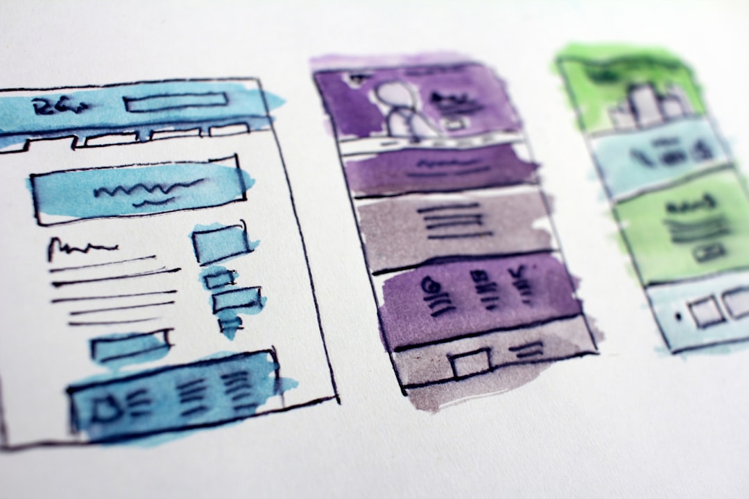
I'm a senior programmer, And when I say senior I mean it. I've started to make programs when Fox Base was the hit to rapid application development, and UI was just a matter of "user-friendly" stuff. Now the UI must not only be user-friendly but "attractive" and "Responsive" and has to be easy to maintain. Here it's where I had to look to HTML as a weapon of choice to have UI that can have all mentioned attributes and allow me to create fast interfaces for my applications. In the process to learn HTML I found the most difficult part was to position and align my interface elements (forms, graphics, controls) in the right place and to move them around as the device or at least the windows size change. NORMAL FLOW Originally I started positioning my elements with the normal flow. This it's just the way the browser pile up the elements accordingly with apparition order in the HTML file and if they are block or inline element. Then it comes the need to position some of these elements on the same row and others using the whole top row, in the case of navigation bars or menus. I achieved this using an attribute called float and playing a little with the width and margins of the section I wanted it to be the navbar. The margins and widths of an element can help you to align and element inside the container and in relation to it's surrounding items accordingly to the box model. This approach even when somehow better than let the elements just stay with the flow proven difficult and slow to create a good looking UI and especially it was really hard to create a responsive interface. Then the flexibility idea came to rescue me. What if there could be a flexible and adaptable container that could handle the alignment itself? wouldn't it be great?. And it was!. FLEXBOX The first "flex" container I used was the "flexbox", it was such a great advance (from my point of view at least) that now this container could help me to save a lot of time and focus more on how I wanted things to look and elements to be aligned than in how I would manage to make it. Flexbox can handle most of the weight lifting for me to align and position things around. But nothing in this life it's a perfect fit for everything, and Flexbox even when I felt strong for it, I couldn't avoid feeling that something was absent still to be able to be called a happy developer. This container could only handle one dimension with ease, you could align your element in a column or in a row, but I need to align my interface elements in both dimensions. Well, I thought, happiness can´t be that well rounded, or, can it be?. GRID Then came into the scene the most beautiful and perfect container of them all, !. It is as flexible as the flexbox but, it worked on both directions columns and rows at a time! it was so perfect!. I could even create areas to handle my full layout, an area for the Navbar, another for the main content, one more for the side section (or sections) and a footer!. the grid The grid also manages the wrapping and re-ordering of the elements accordingly to the media the layout is displaying on. And with some media query I can re-arrange the distribution of the layout very easily like this: This way you can create great-looking layouts that respond to the change of the media display the user it's utilizing to view your app. CONCLUSION The new paradigms of UI come with great and fast changes you must try to keep up to the new trends, but there are also new and powerful tools that can help you to get the task done. This article does not pretend to be a guide to css tools but a relation of my path to get the hang of it. Thanks for reading.
