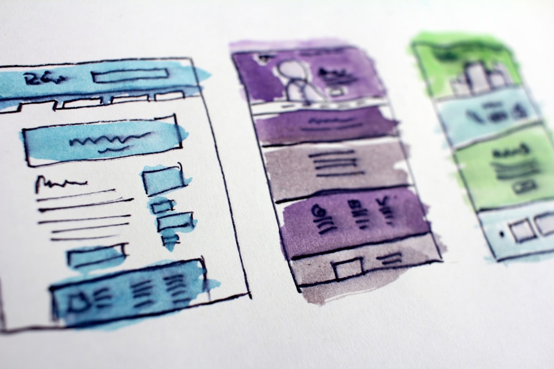
Coming from a design background, as I make my way into the tech world, I constantly hear friends, fellow students, and even successful web developers claim that they “just don’t have an eye for design”. Let’s try to do something about that. The purpose of this article is to give a helping hand to any web-dev that finds themselves having to both design and code a project. It is in no way an “All you need to know” kind of thing, and I really encourage everyone to read which is a great resource to learn more than just some basics. The Non-Designer’s Design Book by Robin Williams The way we’ll go through each principle is fairly simple, the topic will be explained, and example shown, and a nice snippet will be provided so it’s clear how to apply it. For the sake of simplicity, we’ll use vanilla CSS. Without further ado, let’s dive in. Spacing Just as organisms, elements in a webpage need space to exist, whatever box model you choose to use, you can use the margin property to make sure everything has enough room and is eye-pleasingly spaced. A good rule of thumb is to keep a clear relationship between vertical and horizontal spacing like 1 vertical unit will always be three horizontal ones. Though my go-to choice is more often than not just doubling one. In this first example we see nine blue squares randomly spaced, it looks out of order and out of place. This is the HTML that creates the first example: Example One Assigns spacing to each element individually. <!-- Example One --> < = > h2 class "title" </ > h2 < = > h3 class "subtitle" </ > h3 < = > div class "example-one" < = > div class "example-one-element element-1" </ > div < = > div class "example-one-element element-2" </ > div < = > div class "example-one-element element-3" </ > div < = > div class "example-one-element element-4" </ > div < = > div class "example-one-element element-5" </ > div < = > div class "example-one-element element-6" </ > div < = > div class "example-one-element element-7" </ > div < = > div class "example-one-element element-8" </ > div < = > div class "example-one-element element-9" </ > div </ > div This is the CSS that styles it: { : grid; : (3, 1fr); : ; } { : ; : ; : blue; } { : ; } { : ; } { : ; } { : ; } { : ; } { : ; } { : ; } { : ; } { : ; } /* Example One */ .example-one display grid-template-columns repeat margin-bottom 100px .example-one-element width 200px height 200px background-color .element-1 margin 10px 45px .element-2 margin 30px 5px .element-3 margin 5px 45px .element-4 margin 17px 10px .element-5 margin 15px 15px .element-6 margin 5px 5px .element-7 margin 35px 35px .element-8 margin 15px 45px .element-9 margin 15px 35px Not only is it repetitive and ugly code, it looks terrible. Let's see a few ways to fix this. The second example shows 12 red squares, spaced using the property. grid-gap This is the HTML that creates the second example: <! <h2 = >Example Two</h2> <h3 = >Assigns same vertical horizontal spacing.</h3> < = > < = ></ > < = ></ > < = ></ > < = ></ > < = ></ > < = ></ > < = ></ > < = ></ > < = ></ > < = ></ > < = ></ > < = ></ > </ > -- Example Two --> class "title" class "subtitle" the and div class "example-two" div class "example-two-element" div div class "example-two-element" div div class "example-two-element" div div class "example-two-element" div div class "example-two-element" div div class "example-two-element" div div class "example-two-element" div div class "example-two-element" div div class "example-two-element" div div class "example-two-element" div div class "example-two-element" div div class "example-two-element" div div This is the CSS that styles it: { : ; : grid; : (4, 1fr); : ; } { : ; : ; : red; } /* Example Two */ .example-two margin 0 50px display grid-template-columns repeat grid-gap 50px .example-two-element width 200px height 200px background-color As we can see, the CSS is a lot shorter. The third example shows ten green squares that have been spaced so that the vertical space is larger than the horizontal one, still, by keeping a clear and constant proportion, it looks nice. In this case, we're using for spacing. margin This is the HTML that creates the third example: Example Three Assigns more vertical than horizontal. <!-- Example Three --> < = > h2 class "title" </ > h2 < = > h3 class "subtitle" </ > h3 < = > div class "example-three" < = > div class "example-three-element" </ > div < = > div class "example-three-element" </ > div < = > div class "example-three-element" </ > div < = > div class "example-three-element" </ > div < = > div class "example-three-element" </ > div < = > div class "example-three-element" </ > div < = > div class "example-three-element" </ > div < = > div class "example-three-element" </ > div < = > div class "example-three-element" </ > div < = > div class "example-three-element" </ > div </ > div This is the CSS that styles it: { : ; : grid; : (5, 1fr); } { : ; : ; : green; : ; } /* Example Three */ .example-three margin 0 50px display grid-template-columns repeat .example-three-element width 200px height 200px background-color margin 0 40px 160px 0 The fourth example is similar to the third but we have more horizontal than vertical space. We used the and properties for spacing. grid-row-gap grid-column-gap This is the HTML that creates the fourth example: Example Four Assigns more horizontal than vertical space. <!-- Example Four --> < = > h2 class "title" </ > h2 < = > h3 class "subtitle" </ > h3 < = > div class "example-four" < = > div class "example-four-element" </ > div < = > div class "example-four-element" </ > div < = > div class "example-four-element" </ > div < = > div class "example-four-element" </ > div < = > div class "example-four-element" </ > div < = > div class "example-four-element" </ > div < = > div class "example-four-element" </ > div < = > div class "example-four-element" </ > div < = > div class "example-four-element" </ > div < = > div class "example-four-element" </ > div </ > div This is the CSS that styles it: { : ; : grid; : (5, 1fr); : ; : ; } { : ; : ; : purple; } /* Example Four */ .example-four margin 0 50px display grid-template-columns repeat grid-column-gap 60px grid-row-gap 30px .example-four-element width 200px height 200px background-color Contrast This is fairly simple, no dark elements on top of other dark elements, no light elements on top of light elements. Think of a zebra, a zebra has very nice contrast, and if it were a webpage it’d have nice visual accessibility. I understand this might be tricky, so when in doubt, increase the contrast. Remember that content should be easy to recognize. For the following examples, we're going to skip the HTML and CSS snippets since it's a rather simple concept. Example 5 Shows little contrast between a light element and a light background. Example 6 Shows little contrast between a dark element and a dark background. Example 7 Shows great contrast between a light element and a dark background. Example 8 Shows great contrast between a dark element and a dark background. Uniformity I cannot stress this enough, we must keep it regular, and, if possible, simple. The core concept here is that if we use a typeface for a piece of text, say a element, we use the same typeface for all, or at least most elements. On principle, we don’t use more than three different fonts unless we really have a great reason for it. <p> <p> Another great example of this is alignment, it likes commitment, so once we choose, we’re there for good. Same with colors, we should always resist the urge to have a thousand colors around, as fun as making great palettes is, simple is the word we need to remember, each color must serve a purpose. A color for text, a color for titles, a color for contrast and, yes, a color might serve more than one purpose. Lastly, the shape of elements is important, border-radius should be the same, or, as spacing, proportional. Same with shadows. Our ninth example shows how horrible things look when every element follows its own rules, and there is no uniformity. This is the HTML that creates the ninth example: Example Nine Shows how irregular elements look bad. This says something neutral This says something better This says something worse <!-- Example Nine --> < = > h2 class "title" </ > h2 < = > h3 class "subtitle" </ > h3 < = > div class "example-nine" < = > div class "example-nine-container-1" < = > p class "example-nine-container-1-text" </ > p </ > div < = > div class "example-nine-container-2" < = > p class "example-nine-container-2-text" </ > p </ > div < = > div class "example-nine-container-3" < = > p class "example-nine-container-3-text" </ > p </ > div </ > div This is the CSS that styles it: { : ; : ; : (205, 232, 248); : flex; : row; } { : lightblue; : ; : ; : right; : ; } { : lightgreen; : ; : ; : flex; : row; : center; : center; : center; : ; : ; : solid green; : (10, 107, 2, 0.3); } { : lightpink; : ; : ; : center; : ; : ; : ;; } { : Verdana, Geneva, Tahoma, sans-serif; : ; : blue } { : Arial, Helvetica, sans-serif; : ; : green; } { : , Times, serif; : ; : purple } /* Example Nine */ .example-nine width 100% height 300px background-color rgb display flex-direction .example-nine-container-1 background-color width 150px height 75px text-align padding 15px .example-nine-container-2 background-color width 200px height 200px display flex-direction align-items justify-content text-align margin 50px 0 20px 150px border-radius 10% border 3px box-shadow 0px 0px 7px 7px rgba .example-nine-container-3 background-color width 800px height 200px text-align border-radius 2px margin-top 50px margin-left 70px .example-nine-container-1-text font-family font-size 15px color .example-nine-container-2-text font-family font-size 30px color .example-nine-container-3-text font-family 'Times New Roman' font-size 60px color We know that it's an exaggerated example, but it does look bad, right? Our tenth and last example shows how we could correct the ninth example, making sure uniformity is achieved. This is the HTML that creates the tenth example: Example Ten Shows how much better the previous example looks when uniformity is applied. This says something amazing! This says something amazing! This says something amazing! This says something amazing! <!-- Example Ten --> < = > h2 class "title" </ > h2 < = > h3 class "subtitle" </ > h3 < = > div class "example-ten" < = > div class "example-ten-container" < = > p class "example-ten-container-text" </ > p </ > div < = > div class "example-ten-container" < = > p class "example-ten-container-text" </ > p </ > div < = > div class "example-ten-container" < = > p class "example-ten-container-text" </ > p </ > div < = > div class "example-ten-container" < = > p class "example-ten-container-text" </ > p </ > div </ > div This is the CSS that styles it: { : ; : ; : (169, 252, 206); : flex; : row; : space-around; : center; } { : lightgreen; : ; : ; : flex; : row; : center; : center; : center; : ; : solid green; : (10, 107, 2, 0.3); } { : Arial, Helvetica, sans-serif; : ; : green; } /* Example Ten */ .example-ten width 100% height 300px background-color rgb display flex-direction justify-content align-items .example-ten-container background-color width 200px height 200px display flex-direction align-items justify-content text-align border-radius 10% border 3px box-shadow 0px 0px 7px 7px rgba .example-ten-container-text font-family font-size 30px color The cheatsheet At this point, it’s worth mentioning that having a document with the exact colors, which typefaces to use (how, when and where) is always a great idea, many companies have them (shame if they don’t) and it’s commonly called a brand book. In my work, I combine brand books with Sass in order to use variables for colors, font-sizes, but that’s a topic for another day. I hope you find this article useful, and you can find all the code for all examples in this . Happy coding! Github repo