809 reads
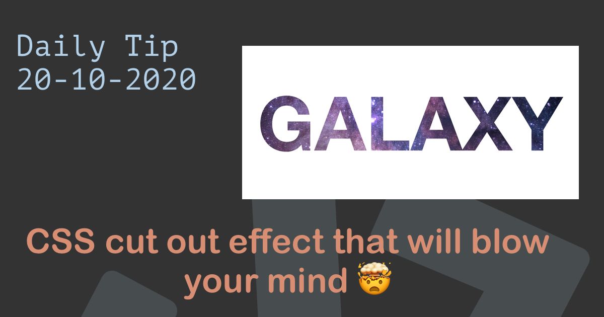
This CSS Cut Out Effect is Guaranteed to Blow Your Mind 🤯
by byDaily Dev Tips@daily-dev-tips
https://daily-dev-tips.com I write daily dev tips to contribute to the development community!
November 16th, 2020


https://daily-dev-tips.com I write daily dev tips to contribute to the development community!


https://daily-dev-tips.com I write daily dev tips to contribute to the development community!
About Author

https://daily-dev-tips.com I write daily dev tips to contribute to the development community!
Comments