paint-brush
How the Twitter Homepage has Changed in the Past 10 Yearsby@toptechcompanies
979 reads
979 reads

How the Twitter Homepage has Changed in the Past 10 Years

by Top Tech CompaniesNovember 14th, 2020
Read on Terminal Reader
Read this story w/o Javascript
tldt arrow

Too Long; Didn't Read

Twitter was created in March 2006 and launched later that year in July. Today we are going to review the changes and evolution of Twitter homepage design in the last ten years. Twitter Homepage Changes from 2011 - 2020 have evolved a lot. The homepage was an excellent interactive design, but the direct page sign-in option would have been nice. In 2018, Twitter introduced a clean, minimalistic look. It highlights the logo and the overall theme of the company beautifully. The company also kept the "Featured Tweets" on the homepage.

Companies Mentioned

Mention Thumbnail
Mention Thumbnail
featured image - How the Twitter Homepage has Changed in the Past 10 Years
Top Tech Companies HackerNoon profile picture

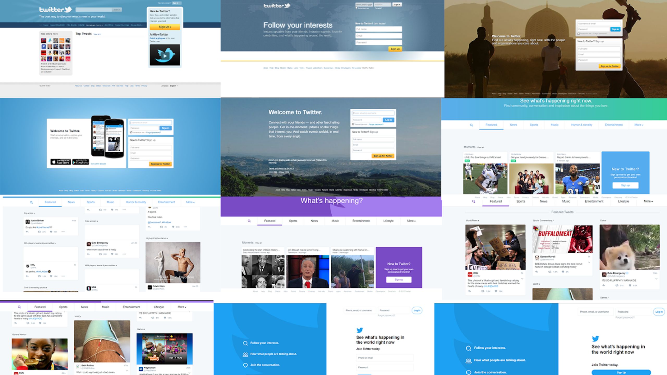
Twitter is the world’s most loved microblogging social network. Users interact and post messages known as Tweets. Twitter was created in March 2006 and launched later that year in July. Since then, it has evolved a lot. Today we are going to review the changes and evolution of Twitter homepage design in the last ten years.

Twitter Homepage Changes from 2011 - 2020

Without further adieu, let's get into it.

2011

The first look of the homepage is a bit cluttered. It is not very clean. However, a dedicated and highlighted section for new sign up is acceptable. The homepage also had an option to search trending topics and news. Overall, it was an excellent interactive design, but the direct page sign-in option would have been nice.

2012

In 2012, the homepage was more to the point. It had a direct sign-in option and featured a short sign-up section as well.

2013

Again in 2013, Twitter had a similar approach with sign-in and sign-up. However, the background featured a more human touch. Also, Twitter used words like "care" to encourage empathy.

2014

In 2014, as smartphone usage increased overall, Twitter started marketing platforms other than PCs. It also featured the famous blue color again; however, the sign-up and sign-in features were still straightforward.

2015

In 2015, Twitter focused more on branding itself as a social network, and it showed on the homepage as well. It also featured background images just like in 2013 to introduce the same human element.

2016

In 2016, Twitter introduced a whole new design; it offered a lot more on the home page.

A straightforward sign-up and sign-in were no longer on the page but much news and featured tweets became part of the homepage.

2017

2017 featured a similar design; however, it featured the famous logo in the background. Also, the logo was modified and had a clean vector look.

The company also kept the "Featured Tweets" on the homepage.

2018

2018 featured the best design yet. Twitter introduced a clean, minimalistic look. It highlights the logo and the overall theme of the company beautifully. Also, direct sign-up and sign-in were introduced again.

2019

2019 again featured the same look, only the sign-up and login buttons were introduced in the same theme.

2020

In 2020, Twitter is featuring the same design, and no changes were made.

We hope you enjoyed our quick feature on how Twitter has changed their homepage design in the last 10 years. If you liked this article, check out: