A/B testing is a double-edged sword using which you could test absolutely anything and everything. To be a good A/B tester, you need to have a discipline and a proper system to trim the fat and dig into the useful aspects of eCommerce conversion.
I would recommend developing a solid hypothesis. A lot of people use A/B testing to settle design debates.
You must have a solid hypothesis behind every experiment. The best way to do that is to use actual data, identify conversion, study underperforming areas of your site using heat maps, user testing, analytics, and your funnel reports, etc. and then develop a solid hypothesis.
Today we’ll be discussing the most common issues that people find while A/B testing their eCommerce sites. By learning about these common issues, you can clear them and conduct a better A/B testing for your website, which may find new issues to solve.
This way, you can conduct a more detailed A/B testing as you’ve already cleared level 1 from the tests done by others. Such an approach will reduce your eCommerce website and mobile app development timeline.
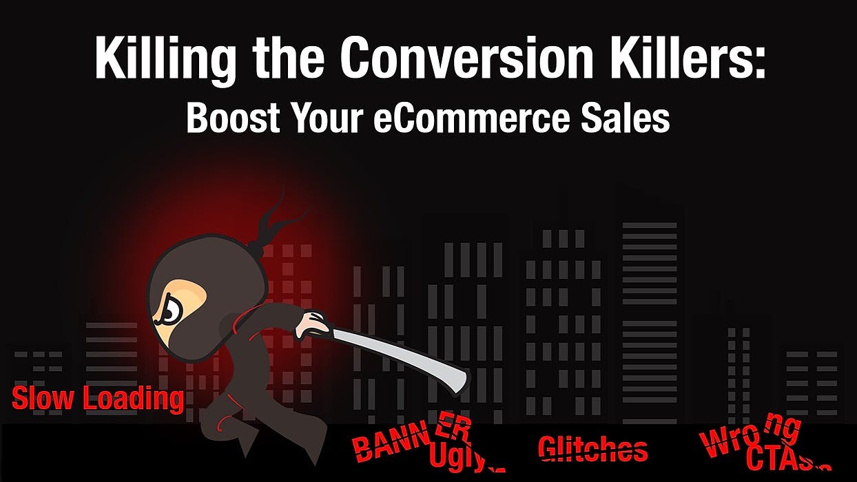
Here are a few of the most common errors that you can fix before conducting your site’s A/B testing.
The page loading speed is a critical factor because it doesn't just affect the way your site visitors perceive your site but also SEO as Google is using it as a ranking factor. So before you think of running A/B tests, make sure you've done everything to speed up your site because that would raise all of the testing points throughout the site.
Look out for glitches, especially in the responsive design. One of the most common mobile glitches that create issues is entry pop-ups. Entry pop-ups are an excellent way to collect user data, but you need to be sure that carry over to the mobile screens.
There have been cases where a site has had 75% of traffic coming from mobile devices, but 95% of that traffic was bouncing, the reason being responsive glitches on the mobile screen. But that issue was only found when they A/B tested the mobile version of the site. That’s when the site owners realized why their viewers didn’t stay.
If you are using a template that you got from theme forest or any similar site, a lot of these templates get you up and running quickly. Still, the coding and the behavior of these templates aren’t always optimal for the actual user and the mobile screen.
Just look for hidden things, test every page on your desktop first. Drag and pull the browser window into different sizes, and you’ll see the content re-flowing and adjusting in real-time. If the content re-adjusts according to the window size, then go for the A/B testing.
Here’s another glitchy approach concerned with CTA buttons. For example, you may have seen such sites where there are three or more buttons stacked in line with the same style, design, and color. This approach is fine till two buttons, but anything more than two is just a waste of space as the site visitors will simply ignore those CTA buttons.
Further, when such stacked CTA buttons are viewed in the mobile devices, the buttons span the entire width of the mobile screen that can easily be mistaken for a graphical element and ignored by the visitors.
Image Source: Wishpond
Another silly mistake that new sites do with the CTA button is to place the checkout button in new locations that the users are not used to. For instance, if the checkout button is at the top of the screen, then that would confuse the heck out of online shoppers.
Banner Blindness is a term that generated out of the old school publishing sites that used to be littered with banners everywhere, and this was a phenomenon where users just learned really quickly how to filter out the stuff that was just advertising.
The viewers subconsciously overlooked the superfluous stuff that screamed for their attention. As users, we get really good at ignoring that noise and looking for useful content that we came for on the web page.
Now the issue here is that if some crucial graphical elements in a website look like those advertising banners, they end up having the same impact on your users. Your intentions may be good with these graphical elements, such as offering a discount on products or services, but the user will not even look at the banner.
There are several ways that you can bifurcate your eCommerce site’s products, but the one we would like to talk right now is whether it is an aesthetics driven product or specs driven product.
For instance, if you are buying a shirt, then what matters is the look of the shirt, the only spec important is the size and cloth material. On the other hand, if you are looking for an expanded hard disk, you’ll be concerned by the specs first and then the looks.
So, you need to understand which product categories need to showcase more images, and which one more spec. Accordingly, design and showcase products to get a higher conversion rate compared to your competitors.
Some vendors or multi-vendor sites show their product images with a white or grey background. This approach may give a visually clear idea of the product, but there is a better approach to product photography.
If you showcase the product in its natural surroundings, it provides higher conversion rates. For instance, when people see a juicer on the kitchen table, they get a better idea about the dimensions and aesthetics of the product.
The psychology behind this approach is that when users a seeing plain background images of the product on other sites, the images on your website will help them imagine how the product will look in their home or office.
This simple change will give the slight push needed for converting the site visitor to buy from you.
There are talks about hyper-personalized and hyper-targeted commerce and AI-driven commerce; Instead of talking about such highly technical approaches that may not come to fruition, I’d like to talk about Geo-targeting.
If you are in retail and you're working for or manage a chain that has stores across the country, you might notice that sales trends and product usage may vary very differently in one place than in another. For example, the same women's dress may be worn one way in New York and differently in Miami or Los Angeles.
So, you need to market the products differently for different locations. Whether you do it with billboards, online banners, email marketing, or Insta stories, you have to hit the right context for each location.
A/B testing is a very beneficial approach for startups that are entering the digital space for the first time. All the silly, simple mistakes that can cause huge losses to your eCommerce site will be eliminated through these tests.
Make sure to thoroughly check every screen and element of your eCommerce site and app, especially from the user's perspective.