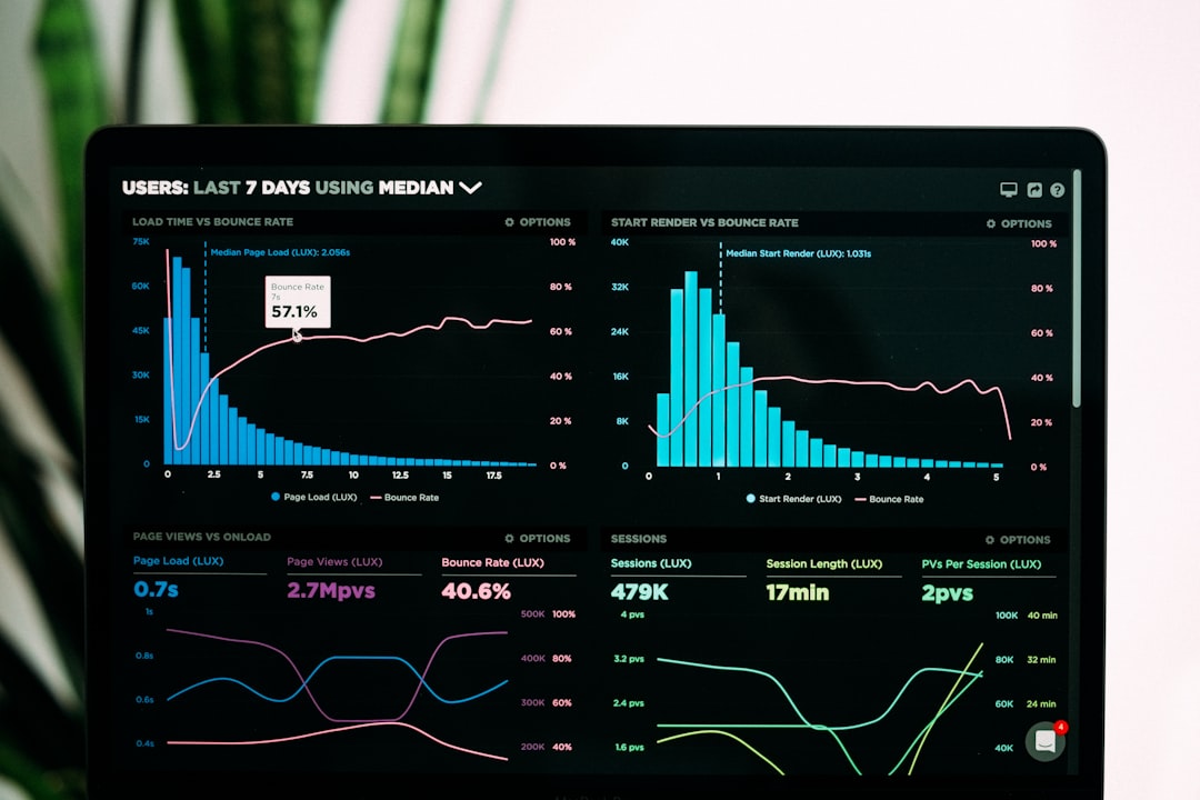
Did you know that approximately are visual learners? Hence, for most of us, pictures are easier to understand than text. For instance, the incumbent U.S. President prefers the information accompanied by visual aids like maps, charts, graphs, and photos, . 65% of people according to Reuters Finding effective ways of cleaning and making data graphical is increasingly on-demand. Business and UI dashboards, as well as basic charts, are great data visualization examples. UI Dashboard built with DHTMLX JavaScript Charts It’s important to choose the right type of chart for the right purposes. This might sound simple, but it’s not always the case. This article will explain what pie and bar charts are and when to use them most effectively. I’ll get started with pie charts. As a general rule, they are used to compare parts of a whole. By cutting a pie into slices, you can define the size of each data point and allow the viewer to understand quantity relationships between categories. However, you have to follow some common rules to get them right. Pie charts are most effective when there is an adequate number of categories (from 6 to 8 slices maximum). The data values have to differ from each other and be greater than zero. For example, the above donut chart shows the percentage of respondents choosing their favorite Bond actor. I can tell pretty quickly that Sean Connery and Daniel Craig are beloved 007 actors. Moreover, the author added text labels with percentages to describe the content and give us a better understanding. Donut chart example from Statista However, there is much controversy over the JavaScript pie and donut charts. The most often-heard criticism against circle graphs is that they can be difficult to interpret. That’s because the human brain has a hard time processing the slice size, so we need extra hints to see the differences in an optimal way. For instance, when the proportions are close to each other, readers face the challenge of determining if a specific slice is bigger than another. To offset, pie charts require a clear legend and text labels for each of the slices. Besides, when categories become too small, graphs have to rely on colors or arrows. This makes pie charts unsuitable for use with a larger amount of data. Let’s compare the same data set, but presented in a horizontal bar chart. As for me, this chart type provides a more convenient and at-a-glance way to know who won in the survey. Survey results from YouGov JavaScript bar charts are typically the top choice when comparing the values of different categories or groups. The quantity of each category is represented by a bar. More importantly, the number of bars can be almost infinite enabling you to depict and analyze large data sets. Look at the three charts below. Each of them contains 25 categories, however, the results are pretty obvious. From the StackOverflow 2019 Developer Survey Firstly, Rust is the most loved programming language among the respondents, followed close behind by Python. Secondly, VBA and Objective-C are rated as the most dreaded languages. And finally, Python and JavaScript are the most wanted languages, meaning that developers who do not use them say they want to learn them. Some bar charts are composed of several columns sorted in groups, displaying the values of more than one measured variable. These are clustered bar charts that allow comparing multiple series inside the same category. Below you can see a clustered chart with two colored bars (red and blue) that represent the quantity of micro and macro plastics, respectively. The x-axis shows the periods of garbage accumulation in the World Ocean. From Our World in Data The chart with grouped bars enables tracking big changes in data over time (from the 1950s to 2015, by decades). Summing up, much of the macroplastics in our shorelines is from the past 15 years. In coastal waters, most macroplastics are recent - less than 5 years old. In offshore areas, macroplastics are accumulated over the past decades implying the amount can grow over the coming years. However, a clustered bar chart makes it difficult to show the differences between the totals. In this case, you can add a pie graph to fix it. Let’s review the last example. As the following infographic shows, only 18 percent of U.S. students surveyed own (or have owned) some amount of cryptocurrency. The conclusion is obvious thanks to the simple and intuitive pie chart. If you want to go deeper and know about the numbers by each specialty, a bar chart is the choice. Combination of bar and donut charts from Statista Final thoughts Pie and bar graphs are very popular and widely-used data visualization tools, but it’s important to apply them correctly. You have to ensure you convey information clearly and concisely. Create a JavaScript pie chart when you have to do a part-to-whole data analysis. You can add a clear legend and labels to help your users translate and retain the information in a correct manner. But if you aim to reveal the amount of each category or compare multiple series inside the same category, the bar chart is more effective.