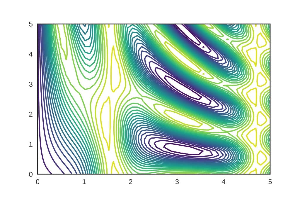
Contour Plot Drawing in three dimensions is inconvenient, a contour map is a useful alternative for representing plots in 2D space. Contour map uses contours or color-coded regions helps us to visualize 3D data in two dimensions. Contour maps are also used to visualize the error surfaces in deep learning/machine learning optimization techniques like Gradient descent, Momentum gradient descent, Adam, etc… In this article, we will see how to interpret the contour maps and visualize the 3D Gradient descent error surface using a contour map. Citation Note: The content and the structure of this article is based on the deep learning lectures from One-Fourth Labs — . Padhai Let’s assume that my 3D Error surface looks like this from the front view, Front View of 3D Error Surface The x-axis in the graph represents the combination of two parameters , represented as one parameter theta and the y-axis represents error value. Suppose if I take horizontal slices of this error surface along the vertical axis. How would the error surface look like from the top? w b Top View of Horizontal Slices The inner ellipse corresponds to the first slice and outer ellipse corresponds to the second slice on the error surface from the top. Each horizontal slice is like a plane that is cutting this hat like error surface and the loss function value around the entire perimeter of the sliced hat will be the same. It means that the loss function value around the entire perimeter of the inner ellipse will be the same. Similarly, the loss function value around the entire perimeter of the outer ellipse will be the same. Remember that whenever you see a boundary in the contour map blindly follow that the loss value around the entire boundary is same. If you notice the error surface from the top the distance between two ellipses is not equal. At the left side, the distance is more and at the right, the distance is less. The reason for this is that the shortest distance between two ellipses marked in red corresponds to the area where the slope is very steep in the error surface. Similarly, the longest distance between two ellipses marked in yellow corresponds to the area where the slope is a bit gentle in the error surface. The key takeaway from this analysis is, A small distance between the contours indicates a steep slope along that direction. A large distance between the contours indicates a gentle slope along that direction. Using this intuition now we will see some 2D contour plots and understand how to interpret them. Let’s assume that we have a 2D contour plot of a 3D surface error surface as shown below, now can you imagine what the 3D surface would look like? Guess the 3D Surface The darker the shade of red indicates higher the loss value and darker the shade of blue indicates lower the loss value. For all the contour plots shown in this article, I will be following the same color schema. Every angled line you see in the contour plot represents one cut along the vertical axis that means the error (loss value) is the same along the line. If you look at the contour present at the extreme left side of the plot (marked with yellow in the below figure) there are no other boundaries or contour surfaces towards the left side in contrast to the right side where you can see a cluster of contour surfaces very close to each other. Contour Extremes As there are no contours present on the left side I can say that the distance between the two contours (contour marked with yellow and some other contour located far away towards the left, if present) is very large because I can’t see any contour in the vicinity. If the distance between the contours is large that means the slope in this area is very gentle so this area in the 3D plot will be a flat region. Is it a low flat region or high flat region? It is going to be a high flat region because the color is red that indicates the error value in this area will be high. Similarly, if we look at the contour present at the right extreme of the plot (marked with black in the below figure) there are no boundaries towards the right side that means the slope in this area is also very gentle and it will be a flat region, it will be a low flat region because the color in this region is blue that indicates the error value in this area will be low Look at the Middle Region Now we look at the region between the two extremes (marked with purple in the above figure) it indicates that we are transitioning from high flat region to low flat region and the transition is very rapid. If you look at the contours present in this middle region they are very close to each other, we know that if the distance between the contours is very less that means there is a very steep slope between the contours. Now let’s see how the 3D surface looks like, We started from the high flat surface (dark red) and the loss value was constant for a long time because the surface is flat. We are transitioning very rapidly from the dark red region to the dark blue region because the slopes were very steep in this region. This is how we interpret the contour maps and imagine how the 3D surface would look like from the corresponding 2D surface. We will see one more contour map for practice and then we will move onto visualize gradient descent error surface. Guess the 3D Surface We will start with the corners of the plot and figure out where are the flat surfaces or plateaus located and then we will figure out where the valleys are located. First, by looking at the regions marked(with black) in the below plot we can see that the distance between the contours is large that means the slope in these regions will be gentle and these are flat surfaces. Also, the shade difference between the corresponding contours is not large it means that they are close to each other and the loss value is not decreasing that much decreasing between the contours. These flat regions will be high regions because their color is coded in red that indicates the error value will be high in these regions. Now coming to the blue regions of the plot marked with yellow lines, the distance between the contours is large that means the slope in these regions will be gentle and these will be flat surfaces. The error value in these regions will be on the lower side because these are color-coded in light blue. The white region in the plot indicates that when we are transitioning from red to blue somewhere we hit the white color. The error value in the white region will be medium it’s not high and not low. The topology of this white region also is a flat plateau because the distance between the two consecutive orange contours is large. Let’s see how the 3D surface would look like, 3D Surface As we interpreted, we have the four plateaus at different heights based on the error value and all of these four plateaus are rapidly converging into the valley (dark blue region) where the error is minimum. Visualize Gradient Descent on 2D contour Map To generate the 3D gradient descent loss surface, I have taken some toy data and iterated over all the data points for 1000 epochs and computed loss for different values of and Once I got the loss values for all possible combinations of and , I was able to generate an animation that shows the gradient descent rule in action. w b. w b Gradient Descent Rule in Action (Animation) The points at the bottom indicate the different combinations of & (parameters) and the points on the contour indicate the loss value for the corresponding parameter values. By looking at the 3D plot try to visualize how the 2D contour plot would look like, from the gradient descent loss animation, you would have observed for the first few iterations while the curve is still on the flat light red surface the updates are moving very slowly that means we would expect the distance between the contours is large. w b Once the curve reaches the edge of the plateau it rapidly converges into the dark blue valley that means we would expect consecutive contours to be very close to each other. Now let’s see how the 2D contour look like, As expected in the region where the gradient descent curve starts, the distance between the consecutive contours is large. Once the curve starts to move towards the dark blue region we can see that the distance between consecutive contours is very small that indicates there is a steep slope along that direction. Now we will see an animation which shows how the gradient descent update moves on the 2D contour plot. The animation is a bit slow That’s about it, this how we interpret contour plots. Conclusion In this post, we have seen that using the distance between the contours we can tell how the gradient is moving along that direction and then we went on to interpret a couple of contour plots. We then visualized 3D gradient descent error surface using a contour plot and interpreted it as well. Continue Learning As a data scientist, one of the important skill is to create visualizations for presenting your results to the clients. Microsoft Excel is one of the most widely used tools across the industry for data analysis and visualizations. Check out the by Abhishek and Pukhraj from . Microsoft Excel Masterclass: From Zero to Hero course Starttechacademy In my next post, we will discuss the different variants of gradient descent optimization algorithm like Momentum, Adagrad, Nesterov Accelerated, etc.. and we will also use contour maps to visualize the error surfaces in each of these optimization techniques. So make sure you follow me on medium to get notified as soon as it drops. Until then Peace :) NK. is an intern at HSBC Analytics division. He is passionate about deep learning and AI. Currently, he is one of the top writers at in . Connect with me on or follow me on for updates about upcoming articles on deep learning and Artificial Intelligence. Niranjan Kumar Medium Artificial Intelligence LinkedIn twitter Photo by on Rashtravardhan Kataria Unsplash


![What Are Convolution Neural Networks? [ELI5]](https://hackernoon.imgix.net/images/69s32rn.jpg?auto=format&fit=max&w=3840)