paint-brush
How Instagram's Homepage has Changed Over the Past 10 Yearsby@toptechcompanies
1,090 reads
1,090 reads

How Instagram's Homepage has Changed Over the Past 10 Years

by Top Tech CompaniesDecember 5th, 2020
Read on Terminal Reader
Read this story w/o Javascript
tldt arrow

Too Long; Didn't Read

Instagram is one of the world’s most used photo and video sharing social networks. It is owned by Facebook and was launched in 2010 on iOS and the Android version was launched two years later along with a trimmed down desktop version. Today, let us see how the homepage of Instagram has evolved over the years. The homepage has no sign-up or sign-in option but only redirected to App Store as the application was only available for iOS. In 2020, Instagram is featuring the same design, and no changes were made, except for the inclusion of a CTA to download the mobile app.

Companies Mentioned

Mention Thumbnail
Mention Thumbnail
featured image - How Instagram's Homepage has Changed Over the Past 10 Years
Top Tech Companies HackerNoon profile picture

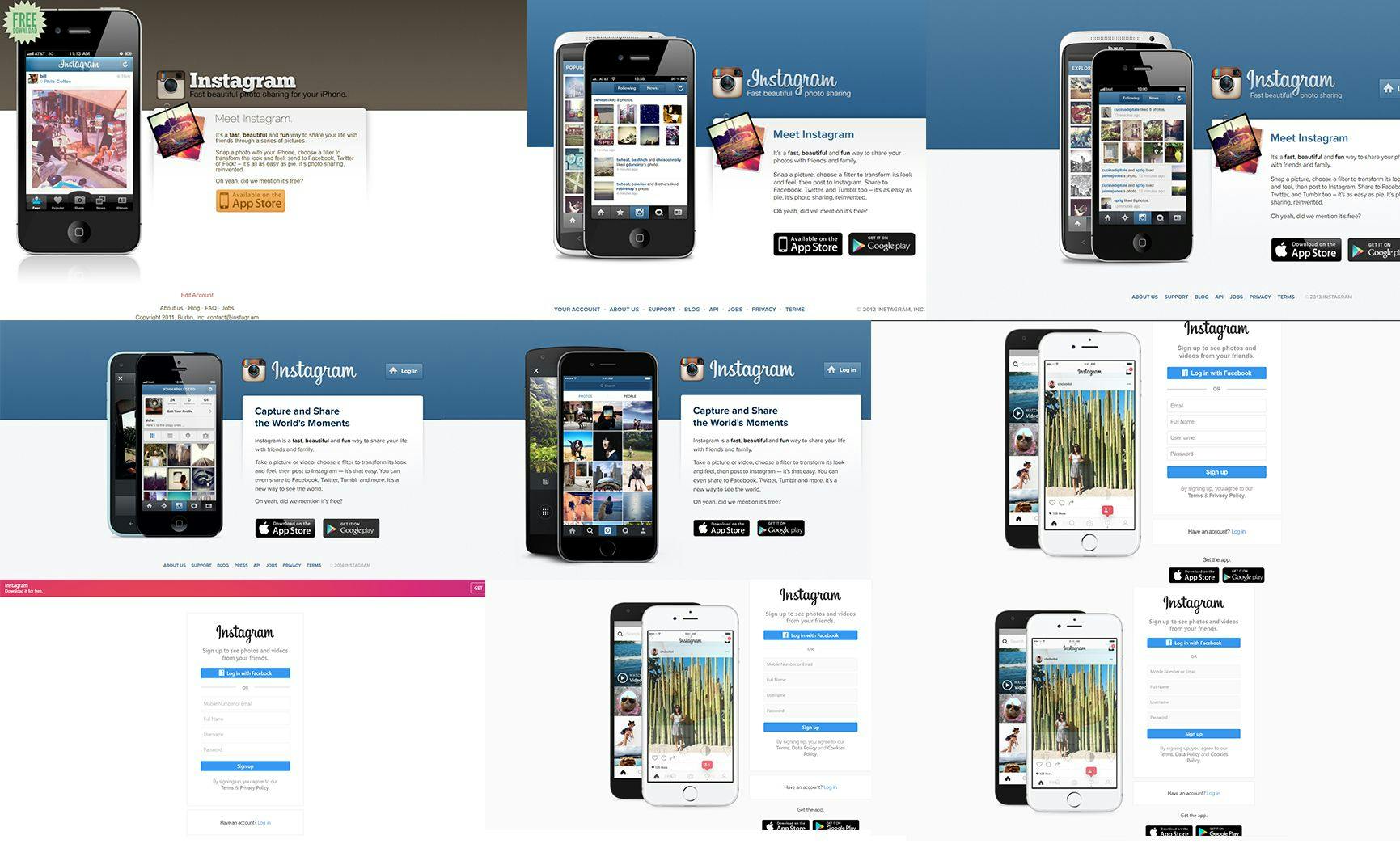
Instagram or Insta is one of the world’s most used photo and video sharing social networks. It is owned by Facebook and was launched in 2010 on iOS and the Android version was launched two years later along with a trimmed down desktop version. Today, let us see how the homepage of Instagram has evolved over the years.


2011

The 2011 version of the homepage shows the initial theme of the logo. Also, the page has no sign-up or sign-in option but only redirected to App Store as the application was only available for iOS.

2012

In 2012, the color scheme was changed to blue and the page had an option for the PlayStore as well which shows that the android version was launched as well. Again, no sign-up or sign-in option was available. Also, an android phone can also be seen on the screen.


2013

In 2013, Instagram did not change much on the experience but you can clearly see a log in button which shows the introduction of a desktop
version as well.


2014

Initially, Instagram was focused on marketing the application itself however the bold heading “Capture and Share the World’s Moments” shows Instagram started focusing more on marketing the experience. Also, the updated version of phones can be seen.

2015

In 2015, the look remained the same, but it only featured new
mobile versions.


2016

In 2016, Instagram improved a lot on the overall experience. The white theme looked way more pleasant and clean. Also, buttons for direct
Facebook login, direct sign-up and updated versions of phones can be seen. Also, it was the first time when Instagram did not feature the Logo.


2017

2017 was the most minimalistic homepage ever. Although it had less content but looked amazing. It also featured the new color of the logo
in the top banner. Also, it was the first time when mobile phones were not a part of the homepage.


2018

2018 featured a design similar to 2016 or you can say it was practically the same again.


2019

2019 again featured the same look, and only the pictures featured on the phone changed.

2020

In 2020, Instagram is featuring the same design, and no changes were made, except for the inclusion of a CTA to download the mobile app, similar to the 2018 design.