paint-brush
How I Approached My Organization's Rebranding As a Software Engineerby@keenanzucker
527 reads
527 reads

How I Approached My Organization's Rebranding As a Software Engineer

by Keenan ZuckerMarch 15th, 2023
Read on Terminal Reader
Read this story w/o Javascript
tldt arrow

Too Long; Didn't Read

The Agora app is being rebranded as Kojo. The rebranding took 6 weeks to complete. The team had to create a new color palette, typography, logos, and more.
featured image - How I Approached My Organization's Rebranding As a Software Engineer
Keenan Zucker HackerNoon profile picture

Background

Last year, Agora — who I work for— announced an exciting rebrand. Our new name is Kojo, and we have a shiny new color palette, crisp typography, spiffy logos, and more. It’s time to say goodbye to our beloved purple and caret logo and say hello to a more modern, yellow and blue future!


Our old Agora login page vs the new Kojo screen


We had about 6 weeks to complete this rebrand while still working on other product features and deadlines — after all, we were (and still are) a fast growing startup with a lot to accomplish.


My team at the time was the Field team, so we were in charge of rebranding the mobile application, which is written in React Native.


This was our first (and hopefully last) time rebranding, so we didn’t totally know what we were getting into. We thought the rebrand would be simple; we’d search the codebase for the word “Agora” and replace all matches with “Kojo.” Similarly, for our colors: search for purple, replace with blue — how hard could it be?


Kojo Logo guide

Our Existing System

Once we started digging in, it quickly became clear this required a bigger overhaul than we originally intended. Huge amounts of tech debt had surreptitiously piled up around the definition and usage of our colors. We defined colors in many different ways, had far too many grays, had inconsistent naming, and more. A simple find and replace was not going to cut it.


Eww! 😱


For example, while searching the codebase, we found:

  • ❌ Hard coding hex values: <Button backgroundColor="#3C3C43">

  • ❌ Hard coding RGB values: color: rgba(255,255,255,0.5)

  • ❌ Importing a Color constant to 'darken' or 'lighten' other color values: color: Color(Colors.callout.background).darken(0.35).toString()

  • ❌ Using CSS default colors: borderColor: "red"

  • ❌ Using the Colors constant: textColor={Colors.tint.primary}

  • ✅ Using the theme file: <Button backgroundColor={theme.colors.primary}>


How did this happen? As any software engineer knows, tech debt accumulates when clear standards aren’t set, even for simple tasks like defining colors. When engineers add new code, they simply use what is already in the file. Or copy & paste from another file. And the problem grows and grows. This trap is especially easy to fall into as a fast-growing startup — people often feel pressure to move quickly instead of taking time on maintenance tasks that don’t affect the bottom line.


When we took on the rebrand, I knew we couldn’t allow this problem to continue to fester and grow. So we decided to roll up our sleeves and work towards a better system rather than contribute to the problem.

The Process:

Step 1: Get our new colors in order 🎨

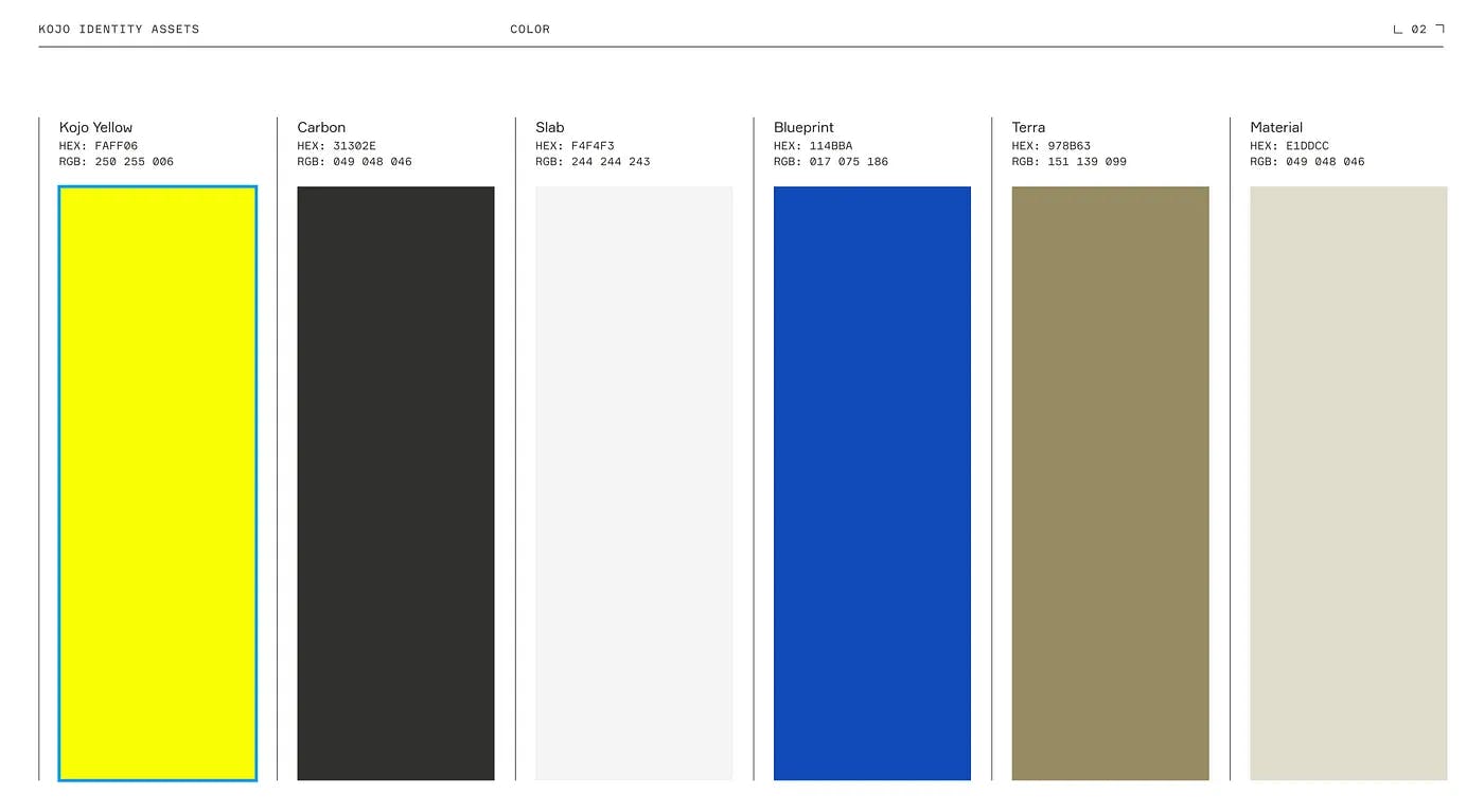
We first created a new color palette with our brand new colors from the rebrand design agency. We needed to be consistent and clear.


The color palette given to us by the design agency


Sidebar: How many grays do we even need?


We assumed we would need maybe 3 or 4 grays to use across our app. When working through all of the layers, we realized we needed more. It ended up being NINE different grays across all screens.

Seven different grays on the same screen


How to define colors?

Should we define colors by the color itself, like “blue” or “gray100”? Or should we define the color by the application, such as “mainBackground” and “accent”?


We decided on creating a new palette constant with all of our new color definitions. Only in this constant could hex codes live. No more RBG, no more custom definitions. This made the code easier to search.


Our palette looks like this:

const palette = {
  black: 'black',
  bluePrimary: '#114BBA', // 'Blueprint'
  blueSecondary: '#5482DB',
  gray1: '#F4F4F3', // 'Slab'
  gray2: '#EDEDED',
  gray3: '#E7E6E3',
  gray4: '#DFDFD8',
  gray5: '#ACACA5',
  gray6: '#979797',
  gray7: '#6C6C6C',
  gray8: '#525252',
  grayCarbon: '#31302E', // 'Carbon'
  green: '#59D06C',
  greenMint: '#54DFA5',
  notesBackground: '#FFFEE5',
  olive: '#797400',
  orange: '#FEA000',
  pink: '#F44670',
  pinkNeon: '#BD3F7C',
  red: '#F74541',
  tan1: '#E1DDCC', // 'Material'
  tan2: '#978B63', // 'Terra'
  teal: '#2EC2CC',
  white: 'white',
  yellowNeon: '#FAFF06', // 'Kojo Yellow'
};


Notice, this palette is not exported. Then, we updated our theme file, which contains definitions such as standard text sizes, border widths, etc. This file gets imported into React files. The colors section of the theme file looks like:


colors: {
    // colors
    primary: palette.bluePrimary,
    secondary: palette.blueSecondary,
    accent: palette.yellowNeon,    // grays
    contentBackground: palette.white,
    appBackground: palette.gray1,
    primarySectionBackground: palette.gray2,
    primarySectionBackgroundDark: palette.grayCarbon,
    headerTop: palette.grayCarbon,    stripeBackground: palette.gray2,
    divider: palette.gray5,
    disabled: palette.gray4,    // text
    text: palette.black,
    textGray: palette.gray7,
    textLight: palette.gray6,
    textInverted: palette.white,    // uniqueColors
    preferred: palette.greenMint,
    error: palette.red,
    success: palette.green,    // status colors
    pill: palette.gray6,
    noIssues: palette.green,
    backordered: palette.pinkNeon,
    damaged: palette.orange,
    missing: palette.red,
    wrongItem: palette.teal,
    partial: palette.gray6,		...
  },


The goal of the theme file is to be more prescriptive of how to use colors. An engineer doesn’t need to know when to use a gray3 vs a gray4 . But the engineer should know from looking at their mockup from the designer that the text should be gray. So they simply use textGray.

Step 2: Feature Flag ⛳

We added a feature flag for kojoRebrand that would flip between two palette variables, the other being named paletteLegacy for clarity. This change also included changing all of the words AgoraKojo as well as some emails or links to the updated places.

Step 3: Replace, replace, replace 🔁

This step was tedious. There were several large “find all and replace” moments, but also included:


  • searching for all "# values, to see where we were defining custom hex values

  • searching for all Color( values, to see where we were darkening or lightening colors

  • searching for all rgb( and rgba( values, to find custom color definitions


The feature branch for the rebrand ended up changing 1,403 lines! 👀


You can also see there are more lines removed than added, meaning we cleaned up code along the way.

Step 4: Test 🧪

We went through every flow of the mobile application with a thorough QA document to make sure the colors and contrast looked good. This can also be tedious, but we found several places with poor contrast or where colors weren’t quite right. We partnered closely with our design team for quick spot checks and advice.

Step 5: Deploy and Documentation 🚀

By utilizing a feature flag for our rebrand, we were able to deploy our design changes seamlessly without any negative customer impact. Once this was live, we first enabled it for internal Kojo accounts, then a small subset of customers, then all customers.


We also added to our Style Guide document for our mobile repository. It contained some best practices for how to define colors, as well as what not to do. Here’s an example:


A portion of the Kojo styleguide


What we learned 🤓

Defining standards is important! The earlier your company can define what ‘best practice’ code is and document it, the better. Tech debt is inevitable, but having examples and best practices early in the codebase will only help the team going forward.


Engineers will almost always take the easiest path when writing new code — make the easiest path the correct one. In our case, it’s a lot easier to just add color="primary" than trying to find the hex code of our new primary blue, #114BBA.

Next Steps 📈

While this project was a vast improvement, software development is an iterative process. Here are ways we plan to improve our color system into the future:


  • Define a linter rule to surface warnings if colors are defined not using the theme constant.
  • Reduce the number of colors. We currently have 9 grays, which we could simplify in a design audit process.
  • Now that our palette is the only place colors are defined, we could add a paletteDarkMode that could switch the app to dark mode. 🌚 / 🌞


A version of this article appears here.