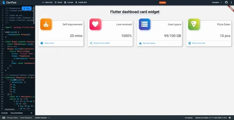
The easiest way to make your app responsive for all screen sizes (Mobile, Tablet, and Desktop) My introduction to the "Flutter" framework came while developing a mobile version of an IoT web app, which allowed me to focus solely on creating a responsive screen for mobile devices. However, my perspective changed during my third project when my boss tasked me with streamlining the process of goods entering and leaving the warehouse, making it paperless. Until then, workers had to print documents before receiving or picking up goods. To achieve this, we decided to develop a Warehouse App to be used on Tablet devices, which required me to learn how to create widgets that could cater to larger screens within the app. Flutter After learning from several sources, I decided to make the app responsive for all devices. As well as using Tablets, Workers could also install apps on their phones and also open apps from desktops in the warehouse. Here are 3 methods, I picked along the way, that you can employ when making responsive layouts in apps. Flutter Table of Contents Dynamic Padding | ⭐️ Layout Builder | ⭐️⭐️⭐️ extension BuildContext | ⭐️⭐️⭐️⭐️⭐️ Live demo on Dartpat ( in case you want to try it first) Responsive Padding Layout Builder Extension Builcontext Responsive GridView Dynamic Padding | ⭐️ You might think it's unresponsive, but it's one solution for dealing with wide screens. It works by adding horizontal padding as the parent widget. The padding value will be set dynamically based on screen width. Let's have a look at the code below: import 'package:flutter/material.dart'; class ResponsivePadding extends StatelessWidget { final Widget child; const ResponsivePadding({ Key? key, required this.child, }) : super(key: key); @override Widget build(BuildContext context) { return Padding( padding: MediaQuery.of(context).size.width > 650 ? EdgeInsets.symmetric( horizontal: MediaQuery.of(context).size.width / 3.8) : const EdgeInsets.all(0), child: child, ); } } You can create a separate file for the above code. Then, use it whenever you need to limit the screen width. All you need to do is wrap your screen with the ResponsivePadding : widget @override Widget build(BuildContext context) { return ResponsivePadding( child: Scaffold() .... Here’s the result: Layout Builder | ⭐️⭐️⭐️ This Builds a widget tree that can depend on the parent widget’s size. Unlike , this approach captures all screen sizes and sets their layout accordingly. We have three layouts: Mobile, Tablet, and Desktop, and use a distinct widget for each one. I learned this technique from TheFlutter Way on YouTube - you can access the video through the reference link. Dynamic Padding See the responsive code below: import 'package:flutter/material.dart'; class Responsive extends StatelessWidget { final Widget mobile; final Widget tablet; final Widget desktop; const Responsive({ Key? key, required this.desktop, required this.mobile, required this.tablet, }) : super(key: key); /// mobile < 650 static bool isMobile(BuildContext context) => MediaQuery.of(context).size.width < 650; /// tablet >= 650 static bool isTablet(BuildContext context) => MediaQuery.of(context).size.width >= 650; ///desktop >= 1100 static bool isDesktop(BuildContext context) => MediaQuery.of(context).size.width >= 1100; @override Widget build(BuildContext context) { return LayoutBuilder(builder: (context, constraints) { if (constraints.maxWidth >= 1100) { return desktop; } else if (constraints.maxWidth >= 650) { return tablet; } else { return mobile; } }); } } From the code above, we have a and return a . As you can see, we have 3 constraints width. You can modify the value as you need. StatelessWidget LayoutBuilder : Example implementation : Generally, this is the smallest width, I want to display content vertically, so I need to scroll down to see all content, Mobile layout : it has a wider screen than that of a mobile device, and I want to combine vertical and horizontal views. Tablet : for a desktop size I think it's enough to display all content horizontally. Desktop I also varied the width of each child to see the difference. We can use it like the code below: @override Widget build(BuildContext context) { return Responsive( mobile: mobileWidget, tablet: tabletWidget, desktop: desktopWidget, ); } Now we have 3 different layouts depending on screen size. You can create custom widgets for each layout. when the app is opened on different devices, they all have a corresponding look. Extension BuildContext | ⭐️⭐️⭐️⭐️⭐️ Okay, this is a fairly intermediate level but very decent and easy to use. We will use an extension method from Flutter and also a generic function. Let's start with the definition. A generic function is a function that is declared with type parameters. When called, actual types are used instead of the type parameters.[ ] ref With generic functions, we can use functions based on the type we declare. So it will be more dynamic. In Dartlang, we usually encounter this when a class or function is declared with type <T>. , introduced in Dart 2.7, are a way to add functionality to existing libraries.[ ] Extension Methods ref Btw, I found this very interesting idea on Twitter. https://twitter.com/millergodev/status/1573545322457927680?s=20&t=a_eEgIMPf1uyTwoRHiUb5w&embedable=true In Flutter we often use context. takes care of widget location in the widget tree. So…. we will have context in all widget trees. Without context, the widget will not render. BuildContext We will create an extension method for BuildContext to handle the Responsive layout. Look at the code below: extension Responsive on BuildContext { T responsive<T>( T defaultVal, { T? sm, T? md, T? lg, T? xl, }) { final wd = MediaQuery.of(this).size.width; return wd >= 1280 ? (xl ?? lg ?? md ?? sm ?? defaultVal) : wd >= 1024 ? (lg ?? md ?? sm ?? defaultVal) : wd >= 768 ? (md ?? sm ?? defaultVal) : wd >= 640 ? (sm ?? defaultVal) : defaultVal; } } With this method, we can achieve the same result as LayoutBuilder but with simpler code. @override Widget build(BuildContext context) { return Container( child: context.responsive<Widget>( mobileWidget, // default md: tabletWidget, // medium lg: desktopWidget, // large ), ); } As I said earlier, this method uses a generic function. We can define functions to return any type of value. Let's try the example below. @override Widget build(BuildContext context) { return GridView.count( crossAxisCount: context.responsive<int>( 2, // default sm: 2, // small md: 3, // medium lg: 4, // large xl: 5, // extra large screen ), ....... This is another example with grid view in "Flutter". Result: Ok, that's 3 ways to give your Flutter app a responsive layout. You can change the breakpoint value as needed. Thanks for reading, please share if this article helped you Original story published on Easyread Reference: Flutter Fully Responsive Design for Web, Tab, and Mobile — YouTube LayoutBuilder class — widgets library — Dart API (flutter.dev) Extension methods | Dart
