paint-brush
10 UI Elements Web Developers Should Know Aboutby@michielmulders
986 reads
986 reads

10 UI Elements Web Developers Should Know About

by Michiel MuldersSeptember 15th, 2020
Read on Terminal Reader
Read this story w/o Javascript
tldt arrow

Too Long; Didn't Read

UI elements lay at the heart of web development and act as a common design language between web developers. Just being able to identify common UI elements won’t cut it. Web developers should have a deeper understanding of the UX value of these elements. Let’s explore the UX values of ten common elements. Checkboxes, toggles, radio buttons and dropdown menus are examples of the most important UI elements to be considered in this guide. The next section explains the use of a dropdown menu and how they can replace lists.

Companies Mentioned

Mention Thumbnail
Mention Thumbnail

Coin Mentioned

Mention Thumbnail
featured image - 10 UI Elements Web Developers Should Know About
Michiel Mulders HackerNoon profile picture

For web developers, it’s crucial to have a deep understanding of UI elements and how users interact with them. UI elements lay at the heart of web development and act as a common design language between web developers.

However, just being able to identify common UI elements won’t cut it. Web developers should have a deeper understanding of the UX value of common UI elements.

Imagine a situation where a web developer has to present the user with five different options to choose from. For the web developer, many UI elements that would serve the purpose:

  • List: Allows for the selection of multiple elements.
  • Dropdown: This usually allows for the selection of a single element.
  • Checkboxes: Alternative way for selecting none, one, or multiple elements.

So, tell me, which UI element would you pick? Let’s explore the UX value of ten common UI elements. Make sure to read until the end as I've included a bonus section on choosing a button design. If you are unsure about the difference between UI and UX design, definitely check out this guide.

#1. Checkboxes vs #2. Toggles vs #3. Radio Buttons

Firstly, let’s make a clear distinction between checkboxes, toggles, and radio buttons.

Checkboxes provide users with the following options:

  1. Do not select any option
  2. Select one option
  3. Select multiple options

In other words, all listed options are independent of each other. Why is this important? When you select a particular option, it doesn’t affect the state of another option.

This is exactly the key difference with toggles. Toggles represent a state that always applies. Whether you change or don’t change the value of a toggle, there’s always a connection with an underlying state. 

For example, a toggle can represent whether you want to receive notifications or not. When the toggle is turned on, you’ll receive notifications. When you turn it off, you won’t receive notifications. As you can see, each position of the toggle is connected to a state.

(Image by Rebecca Norén via Dribbble.com)

Lastly, radio buttons allow the user to choose a single option. In other words, there’s always one selected option. When the user selects another option, the previous option will deselect. This means that all options are mutually exclusive.

When you deal with opposing states such as turning notifications on or off, use a toggle switch.

However, when you deal with options that provide different alternatives, opt for radio buttons. For example, you want the user to choose between “landscape” mode or “portrait” mode as the default mode for a camera application. This isn’t an opposing state, and therefore, use radio buttons to present the choice to the user.

(Image by Vitaly Silkin via Dribbble.com)

#4 Dropdown - Use Dropdown Menus for Option-rich Selections

(Source: Semantic UI screenshot of a dropdown component)

Another tool that can be found in the toolbox of every good web developer is the dropdown menu. Dropdown menus can be very effective when the user is presented with a rich selection of options to choose from. When there are only a few options other components can be preferable, such as the above-mentioned slider for example.

There are many advantages to using dropdown menus. First of all, they conserve a lot of space when you are dealing with a lot of options. Another advantage is that you know exactly which input to expect from a dropdown menu since it is you who can decide which options the user can choose from.

However, a dropdown menu is not always the best component when you have a lot of options the user can choose from. One of the most important web design principles for user experience is that you always choose the component that allows for the fastest input. 

Pick a component that allows for the fastest input.

When you have too many options to choose from and the user has to scroll down the list of options, the user experience will suffer. If there is no possibility to use a smart default based on analytics or overall usage patterns, it may be useful in these cases to add a search function to increase the usability of your dropdown menu. 

The next section explains the use of selection lists and how they can replace a dropdown menu. A good rule of thumb is to use a dropdown menu when you want to display less than ten options. When you want to display more than ten options, use a searchable selection. Let’s learn why in the next section!

Recommended read: 23 Best React UI Component Libraries and Frameworks.

#5. Selection List or Pills

It’s often not an easy task to design a selection list. For example, an app that allows you to select your preferences for receiving news updates. The app offers more than 300 categories to choose from...

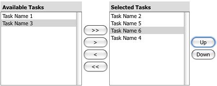
In the old days, we liked to use those left-to-right selection lists. However, those left-to-right selection lists won’t work for mobile devices and just don’t look nice.

Nowadays, pills (also referred to as chips) have become very popular. They make a list of options searchable in an efficient way by showing only the options that match your search query. Once you select an option, the option is saved as a “pill” or “chip” in the search bar. It’s a great alternative for searching among a large number of options for mobile devices.

#6. Sliders - Use Sliders Solely for Qualitative Values

The opinions about using sliders are very divided. Can sliders improve user experience or do they distract from your user’s goal? The answer probably lies somewhere in the middle. 

Sliders can be a great tool for users to quickly browse through the content that is new for them and it allows for company branding to be integrated into a smooth UX. That last bit is really important: the slider has to work smoothly in order for it to add to the user experience. That’s why it’s important to make sure your slider has smooth transitions. Sliders can be great for color pickers and any other gradient values. You can also use a slider to slide through items such as a photo gallery.

One of the most important web design principles to keep in mind when using sliders is that they should be avoided when the user has to select specific numeric values such as a person’s age or other quantifiable values. The nuisance of picking the exact right number takes away greatly from a smooth user experience.

(Source: screenshot of Airbnb.com price slider)

To sum up, sliders can be a useful tool to quickly present the user with new information or when the user needs to choose qualitative values. However, sliders should definitely be used in moderation to not distract the user from their goal and not to slow down your website. They should be avoided at all costs when the user has to pick specific numeric values.

#7. Tooltip - User-triggered Contextual Information

It’s important to understand that a tooltip is a user-triggered snippet of contextual information. Usually, a tooltip is triggered by a user mouse movement that hovers over a particular UI element. Only then, a small contextual information tooltip appears. The tooltip is only intended to provide additional information about the activated UI element and does not provide additional information about the entire flow or the bigger picture.

From a UX perspective, a tooltip is a great UI element that doesn’t consume any space on the interface and can be accessed by the user whenever they need it. 

However, tooltips are commonly abused by developers. For example, don’t use a tooltip to hide critical information about an input element. Imagine a situation where a user wants to create a new account. The user has to submit a password for their new account. The password should meet a couple of requirements such as a predefined minimum length.

Never use a tooltip for hiding critical information.

These requirements are vital information for the user to successfully complete the account creation process. Often, developers abuse tooltips to hide this type of vital information which is necessary for a successful form submission. Avoid using tooltips for this purpose!

(Source: screenshot of facebook.com)

#8. Accordion

An accordion is an old skool UI element. However, they are still relevant in today’s world. Applications primarily use an accordion for keeping a design-focused. An accordion allows you to display the most critical information and focus on this tab while hiding other details in further tabs. 

Nowadays, you’ll often find accordions in booking apps for transportation. They are ideal to hide specific types of information such as boarding information or a detailed route with all stops for a train journey. A user will likely check this type of information only once, and therefore, doesn’t require to see this information every time they open the app.

(Source: DB navigator app screenshot) 

#9. Input Stepper - Handling Large Input Forms

Input steppers are of great use for reducing the interaction cost for users when they have to complete a form or provide data input. 

Commonly, an input stepper is used for numeric values. The goal of an input stepper is to reduce the interaction cost. But what does this mean? Imagine a form that requires you to fill out with how many people you are traveling. Traditionally, you could use a regular text input field where the user can change the value.

However, the problem with this approach is the high interaction cost. The user has to perform the following actions to reach the goal of changing the number of travelers:

  1. Click the text field.
  2. (Optionally) Select the current numeric value if this doesn’t happen automatically.
  3. For mobile devices, a keyboard opens up which allows the user to type a new numeric value.

As you can see, those are three expensive interactions that slow down the user. An input stepper helps the user by limiting the number of actions to change the number.

Input steppers should reduce the number of actions for users.

Often, you’ll find a ‘plus’ and a ‘minus’ button next to a numeric input field. When you hit the ‘plus’ button, the count will increase by one. Therefore, you reduce the interaction cost drastically by using an input stepper.

However, input steppers are not only used for numeric values. You can also use them for reducing the interaction cost for a list of options. Besides, they are great for displaying default values. The below example shows an input stepper for choosing the cabin type. As most people fly in economy class, this is an ideal default value to further reduce the interaction cost to zero.

(Source: Easyjet app screenshot)

#10. Progress Indicator - Understanding the Tremendous UX Value

(source: free-to-use image by gifimage.net)

A final web design principle is to interact with the user and keep him informed that something is happening. A progress indicator such as a loading spinner is an ideal way to achieve this. It lets the user know that the application received the request and is actively processing it. Informing the user that something is ongoing is also crucial to prevent him from refreshing the page and resetting all progress.

A page refresh during form submission is one of the most frustrating edge cases web developers have to face. On the other hand, it can also be a very frustrating experience for users to have to complete the form for a second time in the hopes the page will respond this time.

Displaying a progress indicator provides an effective method to both give feedback to the user and it eases the user who has to wait because he knows something is happening. 

The perception of the user may even be that the wait isn’t as long because he devotes some cognitive resources to the feedback itself, which in turn provides for a smoother user experience altogether.

Bonus: Buttons - they are everywhere!

You’ll find buttons in all shapes and colors. But is there any strategy behind the design choices for buttons? Well, the answer is yes!

Let’s discuss the size, shape, color, and placement of buttons.

First of all, design your buttons to a minimum size of 10mm by 10mm. A button often represents a call to action or helps users complete important actions such as a form submission. Therefore, designing buttons too small will make it harder for users to notice them.

Next, as said before, a button needs to stand out. Therefore, pick a color that has a distinct contrast from its surroundings. For example, Gmail’s “send” email button nicely stands out from its grayscale UI.

(Source: Screenshot of gmail.com email submission interface)

When it comes to the shape of buttons, there’s no such thing as a rule of thumb. You are free to choose between square or rounded buttons. What matters most is consistency. Keep your button design consistent across your application.

What about the placement of buttons? Give buttons plenty of whitespace to help users to quickly discover them. In the end, a button represents an important action for your application or serves as a CTA. Therefore, you want your buttons to be seen! 

In short, stick to traditional button designs with a visual clue to make them stand out. This will help users to easily understand your layout and the purpose of the button.

Conclusion

What did we learn? Many UI elements exist that serve the same purpose. Having a deep understanding of the UX value of each UI element allows you to make better development decisions. 

For example, you’ll be able as a developer to choose between a radio button, checkbox, or toggle for presenting options to a user. Having a good understanding of the UX value of each element gives you an edge over other web developers. Nonetheless, a web developer should be capable of making the right UI decisions based on the UX value of elements.

Want to learn more about UX Design? This Hackernoon guide gives you actionalbe tips to start learning UI/UX design.