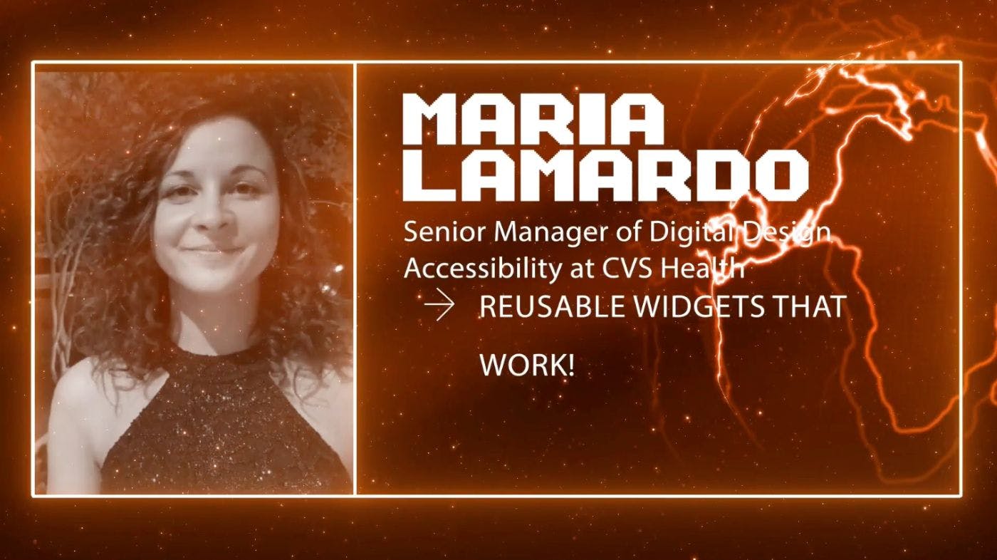
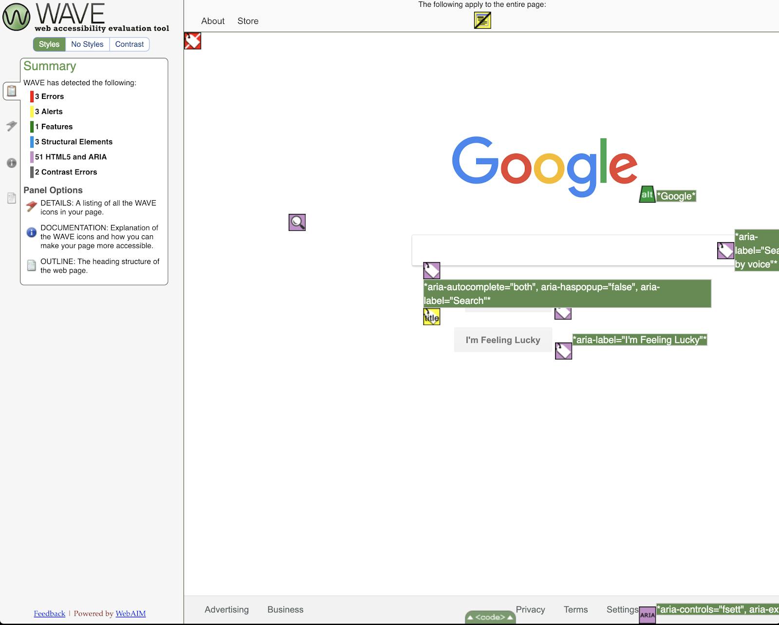
Welcome! Happy to see you in the fifth part of my Vuejs Amsterdam Conference 2022 summary series, in which I share a summary of all the talks with you. You can read my JSWorld Conference 2022 Summary series (in four parts) , where I summarized all the first day's talks. You can also find the previous Talks of the Vue Amsterdam conference 2022 in my blog. here (Recurring) Introduction After two and a half years, JSWorld and Vue Amsterdam Conference were back in Theater Amsterdam between 1 and 3 June, and I had the chance to attend this conference for the first time. I learned many things, met many wonderful people, spoke with great developers, and had a great time. On the first day the JSWorld Conference was held, and on the second and third days, the Vue Amsterdam. The conference was full of information with great speakers, each of whom taught me something valuable. They all wanted to share their knowledge and information with other developers. So I thought it would be great if I could continue to share it and help others use it. At first, I tried to share a few notes or slides, but I felt it was not good enough, at least not as good as what the speaker shared with me. So I decided to re-watch each speech, dive deeper into them, search, take notes and combine them with their slides and even their exact words in their speech and then share it with you so that what I share with you is at least at the same level as what I learned from them. A Very Important Point and I have only tried to learn them so that I can turn them into these articles. Even This means if you learn something new, it is because of their efforts. (So if you see some misinformation blame them, not me, right? xD) Everything you read during these few articles is the result of the effort and time of the speaker itself, many of the sentences written in these articles are exactly what they said or what they wrote in Slides. Last but not least, I may not dig into every technical detail or live codings in some of the speeches. But if you are interested and need more information, let me know and I’ll try to write a more detailed article separately. Also, don’t forget to check out their Twitter/Linkedin. you can find the program of the conference. Here Reusable Widgets That Work! - Head of Accessibility Training and Sr Manager of Accessibility Engineering at CVS Health Maria Lamardo Vue.js is an amazing framework that allows you to quickly build reusable components. We can leverage this to build accessible reusable widgets with the help of ARIA (Accessible Rich Internet Application). Using ARIA roles and attributes, we can improve the accessibility of certain elements by providing additional semantics. In this talk, we will go over how to follow the specifications and build accessible and reusable tabs, accordions, toggle buttons, and modal dialogs that work for everyone! Modal All the things that you need to know about ARIA are well documented in and it is recommended to read, but here is an abstracted version of it. W3C Modals Design Considerations It must have a button that closes the dialog. The content outside of the dialog should be obscured with visual styling like a grey background. Make sure you prevent users from interacting with content outside of the dialog. Modals Opening Focus Interaction When a dialog opens, focus can be set on either the first focusable element, or a static element at the top of the dialog to make content easier to read and ensure that all the content remains in view, or the most frequently used element if interactions are limited to providing information or continue processing. You don’t wanna set focus to something that is going to be destructive for the user, for example, let’s imagine you have an interaction where you open a modal to delete your account. You don’t want to set the first focus on “Yes, delete my account”. Modals Closing Focus Interaction When a dialog closes, the focus is set on the element that invoked the dialog, or when it doesn’t make sense you can set the focus on a different element, like an element that provides logical workflow if invoking element no longer exists, or on the next element if there is a subsequent step in the workflow following dialog task completion, especially if immediately reopening dialog is very unlikely. Modals Keyboard Interaction Tab Moves focus to next tabbable element in modalLooping around to first element Shift + Tab Moves focus to previous tabbable element in modalLooping around to last element Escape Closes the dialog Modals Technical Considerations Dialog container should have: Role of dialog set to true. aria-modal or referring to dialog title, this is going to help assistive technologies figure out what the naming of this element will be. aria-label aria-labelledby Optionally you can set to any description. aria-describedby All elements required to operate the dialog should be descendants of the element that has a dialog role. <div role="dialog" aria-modal="true" aria-labelledby="title" aria-describedby="description" > <h2 id="title">Title of the dialog</h2> <p id="description">Information provided by the dialog.</p> <button aria-label="close">×</button> </div> On the mac, you can Activate Voice Over which is the default mac screen reader by clicking Command + F5, and then you can go through your page and test it. Also in chrome Dev-Tools, there is an accessibility tab that has some cool accessibility information. With that, you can open and check it out, and is the code. this example here Toggle Buttons If you want the full information you can find it on the website. W3C Buttons A is a widget that enables users to trigger an action or event, such as submitting a form, opening a dialog, canceling an action, or performing a delete operation. button In addition to the ordinary button widget, WAI-ARIA supports 2 other types of buttons: Toggle buttons Menu buttons Toggle Buttons Design Considerations A two-state button that can be either off (not pressed) or on (pressed). To tell assistive technologies that a button is a toggle button, specify a value for the attribute . aria-pressed The label on a toggle mustn't change when its state changes; if the label changes in the design, there is no need for the aria-pressed attribute. Toggle Buttons Focus Handling If activating the button does not dismiss the current context, then focus remains on the button after activation. If activating the button opens or closes a dialog, then follow the dialog pattern. If the button action indicates a context change, you can move focus to the starting point for that action If the button is activated with a shortcut key, then focus usually remains in the context from which the shortcut key was activated Toggle Buttons Keyboard Interaction Enter Activates the button Space Activates the button Toggle Buttons Technical Considerations The Toggle button must have the role of . button Make sure that the button has an accessible name. You can set to any description. aria-describedby You can add set to true if action is unavailable. aria-disabled The toggle button has an state. aria-pressed <button aria-pressed="false"> Mute </button> Here is a good that you can check out and is the code. example here Accordions is the complete documentation. Let’s take a look at its main points. Here Accordions Design Considerations Vertically stacked set of interactive headings that each contain a title, content snippet, or thumbnail representing a section of content Accordion Header: Label for or thumbnail representing a section of content that also serves as a control for showing, and in some implementations, hiding the section of content. Accordion Panel: Section of content associated with an accordion header. Accordions Keyboard Interaction Enter or Space Expands associated collapsed panel, optionally collapses other opened panelCollapses associated expanded panel; if the implementation allows. Tab Moves focus to the next focusable element Shift + Tab Moves focus to the previous focusable element Down Arrow (Optional) Moves focus from the accordion header to the next accordion header Optionally loops back to the first accordion header. Up Arrow (Optional) Moves focus from accordion header to the previous accordion header Optionally loops back to last accordion header Home (Optional) Moves focus from an accordion header to the first accordion header End (Optional) Moves focus from an accordion header to the last accordion header Accordions Technical Considerations Make sure that Each accordion header button has: wrapped in a heading set to the ID of the corresponding accordion panel content aria-controls set to true if corresponding panel content is visible aria-expanded set to true if the collapsing accordion is not permitted aria-disabled Each panel content has and to the corresponding header button (Optional) role region aria-labelledby Avoid using the region role in circumstances that create too many landmark region Accordions Code Example <h3> <button aria-expanded="true" class="Accordion-trigger" aria-controls="sect1" id="accordion1id" > Accordion 1 </button> </h3> <div id="sect1" role="region" aria-labelledby="accordion1id" class="Accordion-panel" > Content Placeholder </div> Here is a good and its . example code Tabs You can see Tabs’ full documentation on . W3C Tabs Design Considerations Tabs are a set of layered sections of content, known as tab panels, that display one panel of content at a time. A set of tab elements contained in a element Tab List: tablist An element in the tab list that serves as a label for one of the tab panels and can be activated to display that panel Tab: The element that contains the content associated with a tab Tab panel: It is recommended that tabs activate automatically when they receive focus as long as their associated tab panels are displayed without noticeable latency. Tabs Keyboard Interaction Tab Places focus on the active tab element when user moves into the tab list Left Arrow (Horizontal tabs) Up Arrow (Vertical tabs) Moves focus to the previous tab; looping to the last tabOptionally, activates the newly focused tab Right Arrow (Horizontal tabs) Down Arrow (Vertical tabs) Moves focus to the next tab; looping to the first tabOptionally, activates the newly focused tab Space or Enter Activates the tab if it was not activated automatically on focus Shift + F10 When focus is on a tab that has an associated popup menu, opens the menu Tabs Optional Keyboard Interaction Home (optional) Moves focus to the first tabOptionally, activates the newly focused tab End(optional) Moves focus to the last tabOptionally, activates the newly focused tab Delete(optional) If deletion is allowed, deletes (closes) the current tab element and its associated tab panel, sets focus on the tab following the tab that was closed, and optionally activates the newly focused tab Tabs Technical Considerations Element containing a set of tabs must have or . Role of Tablist: aria-labelledby aria-label The element that serves as a tab must have paired to the associated tabpanel, the active tab should have the state aria-selected set to true; all other tabs are set to false. Role of Tab: aria-controls And it should have the property aria-haspopup set to either menu or true if a tab element has a pop-up menu. Element containing content panel for a tab should have aria-labelledby paired to associated tab, and set aria-orientation to vertical or horizontal (default). Role of Tabpanel: Tabs Code Example <div role="tablist" aria-label="Tabs Example"> <button role="tab" aria-selected="true" aria-controls="tab1-content" id="tab1" >Tab 1 </button> <button role="tab" aria-selected="false" aria-controls="tab2-content" id="tab2" tabindex="-1" >Tab 2</button> </div> <div tabindex="0" role="tabpanel" aria-labelledby="tab1" id="tab1-content"> <p>Content 1</p> </div> <div tabindex="0" role="tabpanel" aria-labelledby="tab2" id="tab2-content"> <p>Content 2</p> </div> Here is a good and its . example code Resources ARIA Authoring Practices Guide Web Content Accessibility Guidelines (WCAG) 2.1 You can find a complete Vue code example with different components here: https://github.com/mlama007/Widgets End of the Talk fifth I hope you enjoyed this part and it can be as valuable to you as it was to me. Over the next few days, I’ll share the rest of the talks with you. Stay tuned… Also published . here
