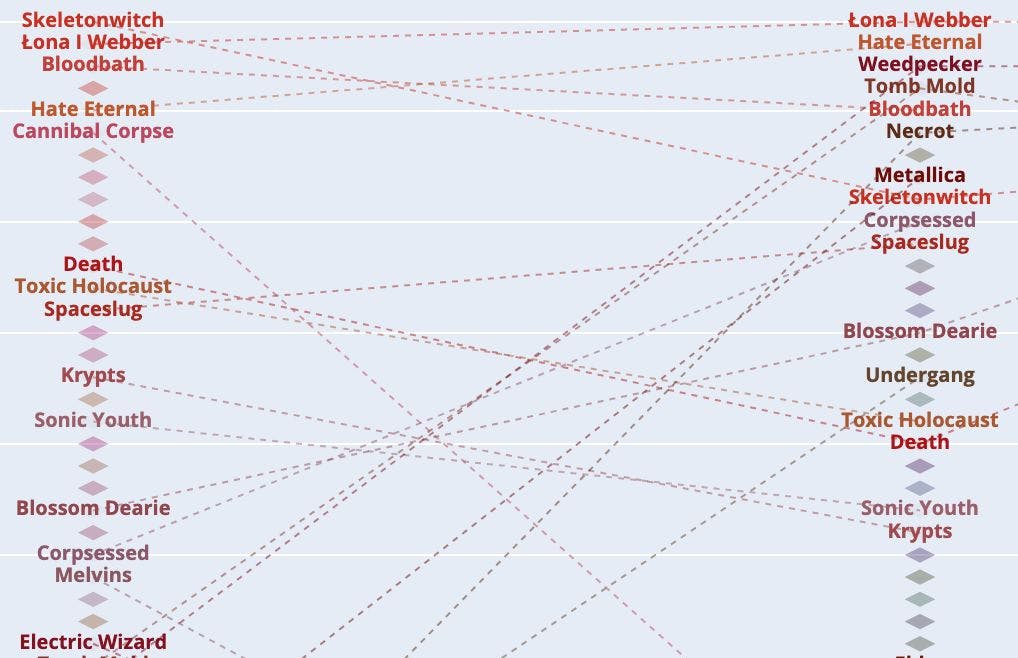
In my previous story, I described the app that I . One of its features is to show a gallery of your favorite artists. Spotify compiles this from your library and listening habits. This is a nice visual representation but recently I went back to check something on the Spotify API and noticed that the retrieval of your takes an additional argument: time range. This gave me an idea for a new feature to add to the app. How do your favorite artists change over time? This is the story of how I visualized my favorite artists from Spotify in a Plotly chart using Python. Additive Spotify Analyzer wrote favorite artists As in the previous article about working with audio features, we will also start with JSON files. In order to retrieve the favorite artists, we have to make three requests (long_term, medium_term and short_term time ranges) and we end up with three JSON files with the data. The files are already ordered by popularity. The hardest part is to visualize the data. How should it be represented? I took the data into a spreadsheet to play around and see what it looks like. In this spreadsheet, the left column is the long-term data, the middle column is medium-term and the right is the short-termed data. From this, we can see that there are very few artists that exist in all three-time frames. We have some that exist in two -ime frames but most exist in just one. (Katy Perry and Alicia Keys entries are from my SO when we were sharing my account... she now has her own... ;). First, I roughly decided to keep this format for a chart with three columns with the oldest data on the left and newest on the right but how do we go from a list of artist names to connecting the same artists across the three different time frames? In terms of charting, we have to think about a line in a 2D plane. We need one line per artist. Each line will have a maximum of 3 'x' values and a minimum of 1 (yes it will be a point then). An artist with 1 value exists only in one timeframe (we'll represent it as a diamond). An artist with 2 or 3 'x' values will form a line. For example 'At The Drive In' exists only in the long term time frame at position 16 so it can be represented by array [16, None, None] and 'Kaliber 44' only exists in a medium-term list so it will be represented by array [None, 7, None]. This transformation can be done in a quick loop. First, we initialize the None array to allow for each artist to appear only once. We create as many of these arrays as there are different artists. i, artistlist enumerate(topartists): topartistsranking.append([]) j, artist enumerate(artistlist): topartistsrankingM.setdefault(artist, [ , , ]) for in for in None None None Next, we need to attach the ranking for each artist in each time frame. (We also shift by one the ranking to avoid having the most popular artist at 0 positions instead of a more human-natural position 1 :) i range( ): j range( ): artist = topartists[j][i:i+ ] len(artist) > : a = topartistsrankingM.get(artist[ ]) a[j] = i+ for in 50 for in 3 1 if 0 0 1 After this, we have one array per artist and we're ready to plot them. Having data that can be plotted is good but actually plotting it and visualizing is a different story. I started with a scatter plot but it was unreadable. Color is definitely useful in connecting the artists that have moved in popularity but with 96 artists it becomes too difficult to distinguish them. The color is also not enough to show the movement. I wanted a line linking the artists in different time frames. I went through many iterations of the chart. You can see some tests above on visualizing the data. Even though it looked cool to have all artists listed, it was a bit too busy so in the end, I decided to represent the artists which appear only in one timeframe with a marker and the artist which exists in more than one timeframe to have a name shown. The marker and lines most clearly conveyed the changing places of the artists and a hover-over effect easily shows what artist it is and what its fortunes were over time. To aid in identifying the fortunes of the artists I added the hover box that displays it. Here we can see a fall in popularity of 'Krypts' from 17th all-time position to 24. So if you're looking to find out your favorite artists over time, check out all of the code is available on . GitHub