paint-brush
Visualization of Hypothesis on Meteorological databy@kavish
202 reads

Visualization of Hypothesis on Meteorological data

by KAVISH GOYALOctober 16th, 2020
Read on Terminal Reader
Read this story w/o Javascript
tldt arrow

Too Long; Didn't Read

The Null Hypothesis H0 is "Has the Apparent temperature and humidity compared monthly across 10 years of the data indicate an increase due to Global warming". The H0 means we need to find whether the average temperature for the month of a month says April starting from 2006 to 2016 and the average humidity for the same period has increased or not. This monthly analysis has to be done for all 12 months over the 10 year period. We are gonna perform the analysis on the Meteorological data and prove the hypothesis based on visualization.

Company Mentioned

Mention Thumbnail
featured image - Visualization of Hypothesis on Meteorological data
KAVISH GOYAL HackerNoon profile picture

In this blog, we are gonna perform the analysis on the Meteorological data, and prove the hypothesis based on visualization.

The Null Hypothesis H0 is "Has the Apparent temperature and humidity compared monthly across 10 years of the data indicate an increase due to Global warming".


The H0 means we need to find whether the average Apparent temperature for the month of a month says April starting from 2006 to 2016 and the average humidity for the same period has increased or not. This monthly analysis has to be done for all 12 months over the 10 year period.

So let's start:

## Importing libraries 
import numpy as np   ## for linear algebra
import pandas as pd   ## for data manipulation and visualization
import matplotlib.pyplot as plt
%matplotlib inline
import seaborn as sns

weather_df = pd.read_csv('weatherHistory.csv')

Formatted Date	Summary	Precip Type	Temperature (C)	Apparent Temperature (C)	Humidity	Wind Speed (km/h)	Wind Bearing (degrees)	Visibility (km)	Pressure (millibars)	Daily Summary
0	2006-04-01 00:00:00.000 +0200	Partly Cloudy	rain	9.472222	7.388889	0.89	14.1197	251	15.8263	1015.13	Partly cloudy throughout the day.
1	2006-04-01 01:00:00.000 +0200	Partly Cloudy	rain	9.355556	7.227778	0.86	14.2646	259	15.8263	1015.63	Partly cloudy throughout the day.
2	2006-04-01 02:00:00.000 +0200	Mostly Cloudy	rain	9.377778	9.377778	0.89	3.9284	204	14.9569	1015.94	Partly cloudy throughout the day.
3	2006-04-01 03:00:00.000 +0200	Partly Cloudy	rain	8.288889	5.944444	0.83	14.1036	269	15.8263	1016.41	Partly cloudy throughout the day.
4	2006-04-01 04:00:00.000 +0200	Mostly Cloudy	rain	8.755556	6.977778	0.83	11.0446	259	15.8263	1016.51	Partly cloudy throughout the day.
weather_df.info()

<class 'pandas.core.frame.DataFrame'>
RangeIndex: 96453 entries, 0 to 96452
Data columns (total 11 columns):
 #   Column                    Non-Null Count  Dtype  
---  ------                    --------------  -----  
 0   Formatted Date            96453 non-null  object 
 1   Summary                   96453 non-null  object 
 2   Precip Type               95936 non-null  object 
 3   Temperature (C)           96453 non-null  float64
 4   Apparent Temperature (C)  96453 non-null  float64
 5   Humidity                  96453 non-null  float64
 6   Wind Speed (km/h)         96453 non-null  float64
 7   Wind Bearing (degrees)    96453 non-null  int64  
 8   Visibility (km)           96453 non-null  float64
 9   Pressure (millibars)      96453 non-null  float64
 10  Daily Summary             96453 non-null  object 
dtypes: float64(6), int64(1), object(4)
memory usage: 8.1+ MB

weather_df.isnull().sum()

Formatted Date                0
Summary                       0
Precip Type                 517
Temperature (C)               0
Apparent Temperature (C)      0
Humidity                      0
Wind Speed (km/h)             0
Wind Bearing (degrees)        0
Visibility (km)               0
Pressure (millibars)          0
Daily Summary                 0
dtype: int64

As it is clear from above that our desired features, Apparent Temperature, Humidity and Formatted Date has no null values. So no need to perform interpolation here.

Here our Formmated Date column is of an object type, hence first we will convert it into DateTime format.

We can do that as follows:

from datetime import datetime
weather_df['Formatted Date'] = pd.to_datetime(weather_df['Formatted Date'], utc=True)

weather_df['Year'] = weather_df['Formatted Date'].dt.year

weather_df['Month'] = weather_df['Formatted Date'].dt.month

weather_df['Day'] = weather_df['Formatted Date'].dt.day

weather_df.head()

	Formatted Date	Summary	Precip Type	Temperature (C)	Apparent Temperature (C)	Humidity	Wind Speed (km/h)	Wind Bearing (degrees)	Visibility (km)	Pressure (millibars)	Daily Summary	Year	Month	Day
0	2006-03-31 22:00:00+00:00	Partly Cloudy	rain	9.472222	7.388889	0.89	14.1197	251	15.8263	1015.13	Partly cloudy throughout the day.	2006	3	31
1	2006-03-31 23:00:00+00:00	Partly Cloudy	rain	9.355556	7.227778	0.86	14.2646	259	15.8263	1015.63	Partly cloudy throughout the day.	2006	3	31
2	2006-04-01 00:00:00+00:00	Mostly Cloudy	rain	9.377778	9.377778	0.89	3.9284	204	14.9569	1015.94	Partly cloudy throughout the day.	2006	4	1
3	2006-04-01 01:00:00+00:00	Partly Cloudy	rain	8.288889	5.944444	0.83	14.1036	269	15.8263	1016.41	Partly cloudy throughout the day.	2006	4	1
4	2006-04-01 02:00:00+00:00	Mostly Cloudy	rain	8.755556	6.977778	0.83	11.0446	259	15.8263	1016.51	Partly cloudy throughout the day.	2006	4	1

We have extracted year, month, and days from the Date attribute.

Now we have cleaned our data, it is time to move on to prove the null Hypothesis. That is to check if Apparent Temperature and Humidity has increased during the last 10 years due to Global Warming.

To prove the check the hypothesis, we will visualize variation the attributes yearly for each month. I am gonna use plotly and cufflinks libraries first to plot bar graphs.

from plotly.offline import iplot
import plotly as py
import plotly.tools as tls
import cufflinks as cf

py.offline.init_notebook_mode(connected=True)
cf.go_offline()

Now we have imported and connected our notebook with Plotly, so let's visualize the attributes to get some insights.

jan = weather_df.loc[weather_df['Month']==1]

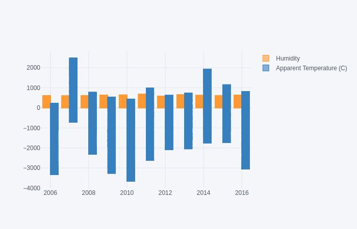
jan.iplot(x="Year", y=["Humidity", "Apparent Temperature (C)"], kind="bar")

We can analyze from this plot that Humidity for January month for each year is constant, does not vary with the year. But Apparent Temperature shows variations year by year.

But this plot does not give us an exact idea about the variation measure in the Apparent Temperature.

So now we will first resample the desired attributes by its mean(average) and then will visualize our hypothesis.

weather_df.set_index('Formatted Date', inplace = True)

weather_df = weather_df[["Humidity", "Apparent Temperature (C)"]].resample('MS').mean()

weather_df.head()

Formatted Date		
2005-12-01 00:00:00+00:00	0.890000	-4.050000
2006-01-01 00:00:00+00:00	0.834610	-4.173708
2006-02-01 00:00:00+00:00	0.843467	-2.990716
2006-03-01 00:00:00+00:00	0.778737	1.969780
2006-04-01 00:00:00+00:00	0.728625	12.098827
plt.figure(figsize= (15,3))
plt.plot(weather_df['Humidity'],label = 'HUmidity', color = 'orange', linestyle = 'dashed')
plt.plot(weather_df['Apparent Temperature (C)'], label = 'Apparent temoerature', color= 'green')
plt.title('Appenrent Temp and Humidity variation yearly')
plt.legend(loc= 0, fontsize = 8)
#plt.xticks(fontsize = 8)
#plt.yticks(fontsize = 8)
january =weather_df[weather_df.index.month ==1]
plt.figure(figsize= (15,3))
plt.plot(january['Humidity'],label = 'HUmidity', color = 'orange', linestyle = 'dashed')
plt.plot(january['Apparent Temperature (C)'], label = 'Apparent temoerature', color= 'green')
plt.title('Appenrent Temp and Humidity variation yearly')
plt.legend(loc= 0, fontsize = 8)
#plt.xticks(fontsize = 8)
#plt.yticks(fontsize = 8)

As we can analyze there is not any change in humidity in the past 10 years(2006–2016) for the month of January. whereas Apparent temperature increases sharply in 2006 and drops in 2007 and again increases in 2010 but drops in 2014 for the rest of the years there isn’t any sharp change in the temperature.

This plot has given us a clear idea about the variations. So let's do the same plotting for each month as well.

february =weather_df[weather_df.index.month ==2]
plt.figure(figsize= (15,3))
plt.plot(february['Humidity'],label = 'HUmidity', color = 'orange', linestyle = 'dashed')
plt.plot(february['Apparent Temperature (C)'], label = 'Apparent temoerature', color= 'green')
plt.title('Appenrent Temp and Humidity variation yearly')
plt.legend(loc= 0, fontsize = 8)
#plt.xticks(fontsize = 8)
#plt.yticks(fontsize = 8)
march =weather_df[weather_df.index.month ==3]
plt.figure(figsize= (15,3))
plt.plot(march['Humidity'],label = 'HUmidity', color = 'orange', linestyle = 'dashed')
plt.plot(march['Apparent Temperature (C)'], label = 'Apparent temoerature', color= 'green')
plt.title('Appenrent Temp and Humidity variation yearly')
plt.legend(loc= 0, fontsize = 8)
#plt.xticks(fontsize = 8)
#plt.yticks(fontsize = 8)
april =weather_df[weather_df.index.month ==4]
plt.figure(figsize= (15,3))
plt.plot(april['Humidity'],label = 'HUmidity', color = 'orange', linestyle = 'dashed')
plt.plot(april['Apparent Temperature (C)'], label = 'Apparent temoerature', color= 'green')
plt.title('Appenrent Temp and Humidity variation yearly')
plt.legend(loc= 0, fontsize = 8)
#plt.xticks(fontsize = 8)
#plt.yticks(fontsize = 8)
may =weather_df[weather_df.index.month ==5]
plt.figure(figsize= (15,3))
plt.plot(may['Humidity'],label = 'HUmidity', color = 'orange', linestyle = 'dashed')
plt.plot(may['Apparent Temperature (C)'], label = 'Apparent temoerature', color= 'green')
plt.title('Appenrent Temp and Humidity variation yearly')
plt.legend(loc= 0, fontsize = 8)
#plt.xticks(fontsize = 8)
#plt.yticks(fontsize = 8)
june =weather_df[weather_df.index.month ==6]
plt.figure(figsize= (15,3))
plt.plot(june['Humidity'],label = 'HUmidity', color = 'orange', linestyle = 'dashed')
plt.plot(june['Apparent Temperature (C)'], label = 'Apparent temoerature', color= 'green')
plt.title('Appenrent Temp and Humidity variation yearly')
plt.legend(loc= 0, fontsize = 8)
#plt.xticks(fontsize = 8)
#plt.yticks(fontsize = 8)
july =weather_df[weather_df.index.month ==7]
plt.figure(figsize= (15,3))
plt.plot(july['Humidity'],label = 'HUmidity', color = 'orange', linestyle = 'dashed')
plt.plot(july['Apparent Temperature (C)'], label = 'Apparent temoerature', color= 'green')
plt.title('Appenrent Temp and Humidity variation yearly')
plt.legend(loc= 0, fontsize = 8)
#plt.xticks(fontsize = 8)
#plt.yticks(fontsize = 8)
august =weather_df[weather_df.index.month ==8]
plt.figure(figsize= (15,3))
plt.plot(august['Humidity'],label = 'HUmidity', color = 'orange', linestyle = 'dashed')
plt.plot(august['Apparent Temperature (C)'], label = 'Apparent temoerature', color= 'green')
plt.title('Appenrent Temp and Humidity variation yearly')
plt.legend(loc= 0, fontsize = 8)
#plt.xticks(fontsize = 8)
#plt.yticks(fontsize = 8)
september =weather_df[weather_df.index.month ==9]
plt.figure(figsize= (15,3))
plt.plot(september['Humidity'],label = 'HUmidity', color = 'orange', linestyle = 'dashed')
plt.plot(september['Apparent Temperature (C)'], label = 'Apparent temoerature', color= 'green')
plt.title('Appenrent Temp and Humidity variation yearly')
plt.legend(loc= 0, fontsize = 8)
#plt.xticks(fontsize = 8)
#plt.yticks(fontsize = 8)
october =weather_df[weather_df.index.month ==10]
plt.figure(figsize= (15,3))
plt.plot(october['Humidity'],label = 'HUmidity', color = 'orange', linestyle = 'dashed')
plt.plot(october['Apparent Temperature (C)'], label = 'Apparent temoerature', color= 'green')
plt.title('Appenrent Temp and Humidity variation yearly')
plt.legend(loc= 0, fontsize = 8)
#plt.xticks(fontsize = 8)
#plt.yticks(fontsize = 8)

November

november =weather_df[weather_df.index.month ==11]
plt.figure(figsize= (15,3))
plt.plot(november['Humidity'],label = 'HUmidity', color = 'orange', linestyle = 'dashed')
plt.plot(november['Apparent Temperature (C)'], label = 'Apparent temoerature', color= 'green')
plt.title('Appenrent Temp and Humidity variation yearly')
plt.legend(loc= 0, fontsize = 8)
#plt.xticks(fontsize = 8)
#plt.yticks(fontsize = 8)
december =weather_df[weather_df.index.month ==12]
plt.figure(figsize= (15,3))
plt.plot(december['Humidity'],label = 'HUmidity', color = 'orange', linestyle = 'dashed')
plt.plot(december['Apparent Temperature (C)'], label = 'Apparent temoerature', color= 'green')
plt.title('Appenrent Temp and Humidity variation yearly')
plt.legend(loc= 0, fontsize = 8)
#plt.xticks(fontsize = 8)
#plt.yticks(fontsize = 8)

Now we have plotted the variation plots for each month with respect to 10 years period of time.

Anlaysis: From the month of april to the month of august there is slightly change in Apparent Temperature but nearly no change in humidity for the 10 years(2006-2016). Whereas, for the month from september to march there is a vast variation in the temperature but again humidity remains unchanged.So our null hypothesis is not so true.

We have visualized the variation, now we will check this by performing T-test.

import scipy.stats as stats

_,p_value=stats.ttest_rel(a=weather_df['Humidity'],b=weather_df['Apparent Temperature (C)'])

print(p_value)

6.686806829267691e-24

if p_value < 0.05:    # alpha value is 0.05 or 5%
    print(" we are rejecting null hypothesis")
else:
    print("we are accepting null hypothesis")

we are rejecting null hypothesis

NIce! We have verified our analysis by T-test as well.

So the conclusion here is that we are rejecting Null Hypothesis i.e. Apparent Temperature and Humidity have not been increasing since the last 10 years(2006-2016) due to the Global Warming.

That is it for this blog, if you find anything incorrect or have any suggestions/feedback, feel free to reach me.

I am thankful to mentors at https://internship.suvenconsultants.com  for providing awesome problem statements and giving many of us a Coding Internship Experience. Thank you www.suvenconsultants.com".