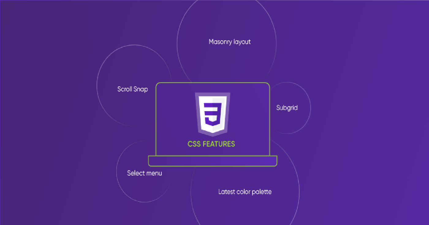
After a few weeks at Microverse, I was given a project to work on. I hoped on it expecting that it would be as simple as the first projects I had worked on as I learned. It was about responsive web design, a new topic I had never done before since I am a beginner in software development. This was the beginning of look good in any given screen size. So my journey in Responsive web design began: making the page What is a responsive web design? This is the first question that would come to anyone’s mind when they encounter a new thing. Responsive web design is the use of HTML/CSS to have a good design or layout in any screen size either by shrinking, enlarging, shrinking, hiding or moving its contents. Do you ever realize that when you open most sites the design outlay looks good despite the screen size you are using? Try it with your Twitter or Instagram accounts and check it out. And just like that, that is what responsiveness is. But how do we make a page responsive? How to achieve web page responsiveness There are several ways to make the web page responsive, these include: 1. Use of Media queries A media query is a CSS feature used to create new rules or overwrite existing rules for the web page contents styling in various screen sizes. The rules can be written in a different file and a link attached to the head tag to link the HTML file to the file with media queries. This can be done this link: < =” ” =” / ” =” ( : 480 )” =” ” /> link rel stylesheet type text CSS media screen and max-device-width px href style .css Media queries can as well be written in the main CSS file. Since CSS follows the order made in styling, it is always wise to write the media queries below the main styling you have. So how are they written? Here are a few examples of ways to write media queries: @ only screen and (min-width: ) and (max-width: ) { { : ; : ; : ; } { : ; : smaller; :auto auto; } } media 768px 1200px .home-page padding 2.5em font-size 1em width 100% .featured-speakers width 100% font-size grid-template-columns The styling above will be applied when the screen has a width of 768px and 1200px, but on the other screen sizes, it applies the style given. @ screen and print (max-width: ) { { : flex; : column; } { : red; : } } media 576px .main-page display flex-direction footer background-color color #fff With the above media query, the style in it is applied to a maximum width of 576px both on-screen and print @ only screen and (orientation: landscape;){ .home-page { : ; : ; } } media font-size 2em color #fff With the orientation, the style in the media query is applied in the given orientation, either portrait or landscape. 2. Using CSS grids and flexboxes CSS grid and flexbox are used in CSS to determine how elements are positioned on a webpage screen. Using either of the two enables content to be spread across the width of a screen. An example of flexbox is: { : flex; : space- between; } .home-page display justify-content With this, despite the screen size, the content will fill the page with some space between each of them. An example of a grid would be: { : grid; : auto auto;} .home-page dispay grid-template-column This gives chance to the content to fill the page with two columns in each screen size. 3. Using responsive units of measurement After spending a few months learning web development, I came across several CSS units and my curiosity drove to me to make research on the right CSS unit to use for a responsive design. A list of responsive units to use include: ( ): Relative to font-size of the root element. It is roughly 16px but can change depending on the device screen size. rem root ephemeral measurement ( ): Relative to the font-size of the element (2em means 2 times the size of the current font. ). em can be calculated as follows: 1em = 16px = 1 * 16px; 1.5em = 24px = 1.5 * 16px em ephemeral measurement ( ): viewport width is simply the size of the browser window width. If you set the width to 20vw, then the contents will take 20% of the browser window’s width. VW viewport width ( ): viewport height is simply the browser window’s height. If you set the height to 100vh, it simply means that the content will cover the whole height of the browser. Vh viewport height : Another idea is using percentages for any sizes instead of fixed sizes. This will take the percentage of the screen width or height. percentages is another method. Instead of giving is specific sizes auto enables the contents to cover the width the contents can fill. Using auto-properties We can use the measurements to set the sizes of everything responsively including font-size. *You can read more of this at . W3Schools 4. Using frameworks: Frameworks such as the bootstrap make responsiveness effective. Bootstrap uses the grid system in that it can tell how many columns should be applied in various screen sizes from the extra-large to the extra small screens. This styling is applied in HTML through classes. bootstrap Congratulations! You too can make your website beautiful in any screen size by trying any of the tips above! All the best!


![featured image - Make Any Webpage Responsive [A How-To Guide]](https://hackernoon.imgix.net/drafts/jd14n3yjl.png?auto=format&fit=max&w=3840)