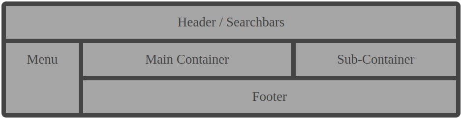
Cascading Style Sheet (CSS) Grid Layouts is the most important and powerful layout system available in CSS. It’s built inside a two-dimensional system, meaning it can handle both columns and rows. You can build a true grid layout by applying CSS rules both to the grid element and the parent element. CSS Grid Layout ( ), is a two dimensional grid-based layout system that aims to change the way we format a grid-based User Interface (UI). CSS helps Web Developers create a uniform look across several pages of a Web Site. Instead of defining the style of each table and each block of text within a HTML file. But most Web Developers will agree that it was not done very well. First, developers tried using tables, then floats, positioning and inline-block, but all of these methods were essentially hacks and left out a lot of important functionality. <grid> Grid is the very first CSS module created specifically to solve the layout problem we’ve all been hacking our way around for as long as we’ve been making websites. To understand more about its capabilities check out the image above (Basic Grid System) As you can see, Grid is a simple block of elements that allow you to position any element it contains inside a specific area with a specific dimension thanks to its two-dimension properties To get started we will need to understand some basic terminology to get a better understanding of what a grid is. Grid Container The Grid Container is the direct parent of all the grid items. And we will be calling it in our code with the Display Style Elements which will then add the Grid Property. Grid Layout This grid layout contains four grid items <!DOCTYPE html> < > html < > head < > style { : grid; } .container display </ > style </ > head < > body < > h1 </ > h1 < > p </ > p < = > div class ".container" < = > div class "item1" </ > div < = > div class "item2" </ > div < = > div class "item3" </ > div < = > div class "item4" </ > div </ > div </ > body </ > html Grid Item The Grid Item is the direct descendant of the Grid Container. The elements that are inside the Grid Items are not. To demonstrate, the elements of the items in the picture below are grid items, but the sub-item are not. Grid Layout This grid layout contains two grid items <!DOCTYPE html> < > html < > head < > style { : grid; } .container display </ > style </ > head < > body < > h1 </ > h1 < > p </ > p < = > div class ".container" < = > div class "item1" < = > h2 class "sub-item" </ > h2 < = > p class "sub-item" </ > p </ > div < = > div class "item2" < = > img class "sub-item" </ > img < = > div class "sub-item" </ > div </ > div </ > div </ > body </ > html Grid Lines A grid line is the one in charge of drawing the 2D grid. They can be either be vertical or horizontal. The vertical ones do make a line that gives us the proportion of each column, and the horizontal ones make a line that displays for us the rows lines. Here in this example below you will be able to get a better understanding of what is a grid line, which will be colored in yellow color. This line represents one of 5 lines that draw for us the grid that contain four columns. Grid Track The best way to think about them, in my opinion, is like a row or column that compose the grid. Basically they're the space between two adjacent grid-lines. Here below you’ll able to see the grid-track between the first and second column grid-line. Grid Cell As its name refers, it's a single piece of the grid and, it’s the space where a row and a column overlap. In this example you’ll be able to visualize it in the conjunction between the 1st column and the 3rd row. a grid-cell could be also refers as a grid-area. but it's not the best practice. and in the next section you'll understand why. Grid Area A grid-area is the space where two adjacent horizontal lines and two adjacent vertical lines overlap, a grid-area could be comprised of any number of gird cell. In this example below you'll be able to see that the grid-area is compose by the intersection on the grid-row-line 2 and 4 with the grid-column-line 3 and 5. I hope you enjoy this article, and that is suits your needs and answers some questions. Join me in the next article: Best practices of a Grid element By: Daniel Laloush
