If you are running or going to launch an eCommerce business, you need to understand the behavior and preferences of your target audiences.
Selling products is an increasingly challenging endeavour, given the
competition online.
To begin with, don’t just try to sell your products right away. First, you
need to build trust and create good relationship with your customers.
The idea is to gain a better understanding of your prospects and put
your best foot forward.
Here’s what else you should prioritize for your eCommerce website:
Today, 70% people are using mobile devices for online shopping, which is why mobile responsive websites are extremely critical. Mobile visits are
outranking desktop use. Your eCommerce site needs to be designed and
built for all devices, not just a personal computer or laptop.
So, what you are offering to them? Do you have a website that is mobile
friendly? Are you planning to launch a mobile app that reaches your
users more effectively?
Designing a mobile responsive website and improving the conversion rate is not an easy task. You have to make sure all functions of your eCommerce website must be easy to navigate through mobile devices.
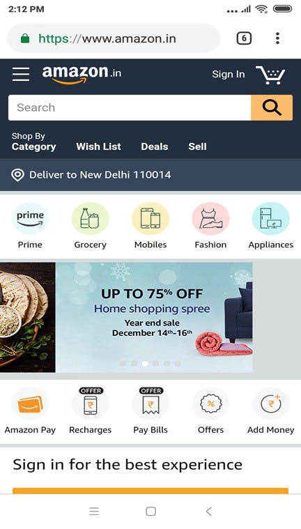
For example — Amazon is an online shopping website that runs well on all
smartphones. You will find the entire site is relatively easy to
navigate and offers a rewarding user experience. There are different
labels for different promotions pertaining to products on the site. You
will witness links to product categories in a prominent place, while
each category is properly named. You can easily check the products that
you need using their mobile app as well.
Checkout how the website looks on smartphone:
Not only Amazon, there are lots of other eCommerce brands that are giving high priority to mobile users. In addition to being a mobile-friendly
website, you need to make sure it has fast loading time and high speed.
For that, you need dependable hosting services like HostPresto that can
make your site safe, secure, and easily manageable, before finalizing,
you must understand the different between hosting so that you can select
best one. Furthermore, you need to make your website’s checkout process
easy and simple for your mobile users.
You can check the website performance on mobile with the help of Google mobile friendly testing tool. It is easy to check every issues given by this tool and have your development team to fix them. Even you can take help of best SEO company to make suggestions to improve the performance of your website.
Online shopping is where customers make purchase only by seeing the images of the products. Since customers can’t touch and feel the products, it’s one of the main challenges for online businesses to sell them. So how
are you going to change the mind of your website visitors?
This is where understanding the behavior of your customers and their
requirements comes into the picture. This knowledge will help you nudge
the customers towards making the decision to buy your products. So using
high quality images with strong zooming function can be the game
changer. Let your customers see the actual images of your products and
eventually figure out their quality.
Especially, if you are selling cloths online then you must use high quality
photographs on your website. Before buying, shoppers like to check out
product images to get a visual sense of the product. So clearly, it can
make or break your sale. Furthermore, whenever possible, make sure your
product images should also be lean and fast loading.
For example, BIBA added high quality images with the zoom function so that users can check product easily. You see it’s also easy to observe the
quality, color, and design of its products.
eCommerce conversions depend on multiple factors. From functionality to visual appeal to product information, everything matters. Even after designing a mobile-friendly website and adding high quality images, you aren’t getting the proper ROI. The other possible reasons behind shopping cart abandonment could be unclear shipping information, unambiguous return policy, and no payment options at all.
It’s not easy to burn hole in your customers’ pockets as no one wants to
spend unnecessary amount. According to Baymard Institute, nearly 70% of all online shopping carts are abandoned.
Research shows that high shipping costs and unclear shipping policy are
among the topmost reasons for that. Remember that customers don’t want to charge additional amount, especially for products that have issues.
So you need to spell out your shipping and return policy clearly. May be
you are not able to offer free shipping service for every product on
every location. Sometimes shipping costs are only displayed during the
checkout process, it is when customers feel duped by added costs. Thus,
if you want to optimize shipping process and set flexible costs, you can
use shipping suite extension on your website. Transparency is valued highly by digital shoppers, which is crucial for your store’s success.
For an example, Myntra mentioned shipping price in their website very well so that people know why and how much they have to charge.
Even if customers are landing on your site, it’s just not good enough. They
are yet to be convinced as to whatever products you are offering hold a
great value. This is where product descriptions can play a vital role.
Customers are eager to know the functions and features of your products
and compare them with competitor sites. So you need to make sure your
descriptions are enticing, informative, and optimized.
Adding detailed descriptions helps users understand the specifications, how products works, and how much better they are from others.
For example, Flipkart has added a function to check the specifications of the products on their website.
Checkout is the final journey of the customer. Since this is the stage when
customer parts ways with his hard-earned money, so it should be smooth
and seamless. If the customer finds the process too complicated, he will
leave without making any purchase. As per multiple surveys, 40% of
customers abandon the checkout page just because of the complexity of
the process. So a perfect checkout process requires a lot of tweaking
and getting rid of distractions.
Here are some steps to ease out the checkout process:
· You must add a function to login as a guest, and don’t demand for user registration. Let them decide for themselves.
· Ask only required information like address, name, phone number, email ID.
· Allow Customers to store their card details.
· Multiple payment options with COD facility.
· Your checkout process must be mobile friendly.
· Provide a clear summary of the cart items.
· Social sign-in option should be there so that they can also login through social media profiles.
A shorter and smarter checkout process can significantly improve the conversion rate of an eCommerce website.