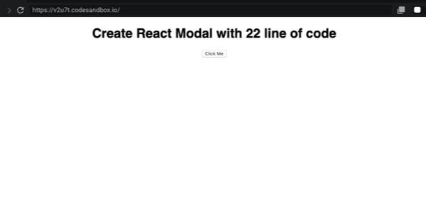
Nowadays, Modals are one of the most used components in React Application, having an easy way to create React Modals will help you sheep Modals related features fast in your upcoming React Applications. In this tutorial, we will build A simple React Modal using only 22 lines of code. The gif below will help you understand what we are trying to build Let's started Create React Project First, create a simple react project using create-react-app CLI. $ npx Create-react-app SimpleModal React ; ReactDOM ; ; { ( <h1>Create React Modal in X line of code </h1> <button>Click Me</button> ); } rootElement = .getElementById( ); ReactDOM.render( import from "react" import from "react-dom" import "./styles.css" ( ) function App return < = > div className "App" </ > div const document "root" , rootElement); < /> App In this tutorial, we will use the package which is a simple and Powerful react component with a lot of benefits : react-popup Modal, Tooltip, Menu: All in one 🏋️ Full style customization 👌 Function as children pattern to take control over your popup anywhere in your code. 💪 IE Support. 🚀 TypeScript Support 👌 All these clocks in at around 3 kB zipped. ⚡️ This package is available in npm repository as reactjs-popup. It will work correctly with all popular bundlers. $ yarn add reactjs-popup Create React Modal Import Component from reactjs-popup and start using it like the following. Popup Add property as a simple React Button element and set property to true. trigger modal React ; ReactDOM ; Popup ; ; { ( <h1>Create React Modal with 22 line of code </h1> <Popup modal trigger={<button>Click Me</button>}> Modal Content </Popup> ); } rootElement = .getElementById( ); ReactDOM.render( import from "react" import from "react-dom" import from "reactjs-popup" import "./styles.css" ( ) function App return < = > div className "App" </ > div const document "root" , rootElement); < /> App Customizing and Styling React Modal we need to create a file for Modal Content component and add some style Content.js React ; ({ close }) => ( <a className="close" onClick={close}> &times; </a> <div className="header"> Modal Title </div> <div className="content"> {" "} Lorem ipsum dolor sit amet consectetur adipisicing elit. Atque, a nostrum. Dolorem, repellat quidem ut, minima sint vel eveniet quibusdam voluptates delectus doloremque, explicabo tempore dicta adipisci fugit amet dignissimos? <br /> Lorem ipsum dolor sit amet, consectetur adipisicing elit. Consequatur sit commodi beatae optio voluptatum sed eius cumque, delectus saepe repudiandae explicabo nemo nam libero ad, doloribus, voluptas rem alias. Vitae? </div> ); //content.js import from "react" export default < = > div className "modal" </ > div { : ; } > { : ; : solid gray; : ; : center; : ; } > { : ; : ; } > { : auto; } > { : ; : ; : center; } > { : pointer; : absolute; : block; : ; : ; : - ; : - ; : ; : ; : ; : solid ; } /* index.css */ .modal font-size 12px .modal .header width 100% border-bottom 1px font-size 18px text-align padding 5px .modal .content width 100% padding 10px 5px .modal .actions margin .modal .actions width 100% padding 10px 5px text-align .modal .close cursor position display padding 2px 5px line-height 20px right 10px top 10px font-size 24px background #ffffff border-radius 18px border 1px #cfcece Now it's time for some magic Because provides a child as function pattern, you have full control on Popup state reactjs-popup we will update our example to use a function as a child instead of a react element to implement `close` button. React ; ReactDOM ; Popup ; Content ; ; { ( <h1>Create React Modal with 22 line of code </h1> <Popup modal trigger={<button>Click Me</button>}> {close => <Content close={close} />} </Popup> </div> <App /> //index.js import from "react" import from "react-dom" import from "reactjs-popup" import from "./Content.js" import "./styles.css" ( ) function App return < = > div className "App" ); } const rootElement = document.getElementById("root"); ReactDOM.render( , rootElement); Final Result reactjs-popup : https://react-popup.elazizi.com/ Repo : https://github.com/yjose/create-react-modal-with-22-line-of-code Codesandbox : https://codesandbox.io/s/create-react-modal-with-22-lines-of-code-v2u7t Make sure to visit react-popup home page Thanks for reading! If you think other people should read this post and use this project, tweet, and share the post. Remember to follow me, so you can get notified about my future posts.
