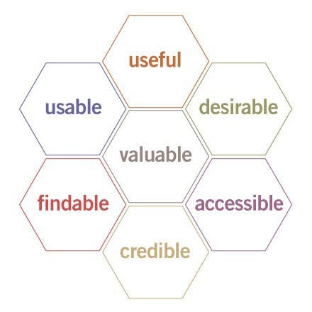
Canada has welcomed over 1.2 Million immigrants in the Imagine how many lost documents, missed deadlines, and rework has been required due to the inevitable misunderstandings that occur as people from abroad attempt to relocate their lives? last five years alone. Immigration processes can take years and cause an immense amount of anxiety for all those involved. Ensuring that the UX of this process is streamlined will help both the government agencies and the people they’re serving. While UX can be applied to every level of the immigration process, I’m going to address those accessing immigration information on the internet. How might we simplify the online immigration experience for newcomers wanting to live in Canada? UX Factors According to the United States Department of Health & Human Service’s , they describe the core of UX as: usability hub “…ensuring that users find value in what you are providing to them.” Longtime UX expert represents the factors that influence UX with the help of his . Peter Morville User Experience Honeycomb Value can only be achieved if all six factors of user experience surrounding it are realized. The six factors of UX: Usefulness Desirability Usability Accessibility Findability Credibility Whether it’s a physical or digital encounter, the experience of your end user must be observed from their perspective. I’m going to discuss a few ways that the Candian Immigration and Citizenship homepage can increase the usability of their services following the previously mentioned. six UX Factors The Case Study When I googled “Canada immigration”, the first non-ad link presented to me brought me to the webpage within the Government of Canada’s website (as seen below). Immigration and citizenship captured on Jan 3, 2019 https://www.canada.ca/en/services/immigration-citizenship.html What is the user experience of this web page based on the 6 Factors of UX? 1. Usefulness Your content should be original and fulfill a need First Impressions: The usefulness will depend on who’s accessing the site because there are a lot of reasons people would be arriving. The first thing that stands out is the image on the right and the link below discussing the My eyes then take me to the section on the right. Before scrolling, I also notice the they list, before seeing that they list the , followed by after two mouse scrolls. Atlantic Immigration Pilot. Most Requested Social Medias Services and Information Features Working Well: The most requested section will be useful for most users, as long as the links lead to the section the user is expecting. The language used is fairly simple and descriptive. Needs Work: Why is the button the largest? That’s not likely useful to most people and yet was where my eyes spent the most time. Atlantic Immigration The title is unclear. Would the use of a more descriptive word make this section more useful to users? Features 2. Desirability Image, identity, brand, and other design elements are used to evoke emotion and appreciation First Impressions: The page has a lot of white space. The main image looks like a typical stock image. The look is clean, but not in a modern way. It feels sterile and government-y. The homepage of Canada.ca Working Well: The branding is consistent with the rest of the Government of Canadas website. The design is clean and doesn’t include distracting features. Needs Work: Not very inspiring as the first impression of Canada. Images aren’t consistent with the others used at the bottom of the page. 3. Usability Site must be easy to use First Impressions: The large buttons on the top indicating that I am on the section of the Government of Canada’s website are easy to read and selection is indicated by the darker section. The titles of each is underlined to indicate that it is clickable. All the links work. The social media accounts at the top are all active. Immigration Service and Information Working Well: A clear indication of where within the federal government’s website we are. allows for the most common answers to be answered right away. Most requested Able to translate the page to French (the second official language of Canada). Needs Work: Took me some time to read right to the bottom before I was able to understand where I needed to click. Weak indications of where I’m able to click and where it’s going to take me. No ability to translate the page if I don’t speak English or French. 4. Accessibility Content needs to be accessible to people with disabilities First Impressions: Applying a colour-blind simulator to the homepage reveals that the colour choices make it accessible to those with difficulty seeing colours. Screenshot with Deuteranopia colour-blindness simulation Working Well: Buttons have enough of a texture and colour difference to indicate they are clickable to those with vision impairment. There are no overwhelming graphics to distract. The Government of Canada’s is fairly rigorous and applies to all government-run websites. Standards of Web Accessibility A button at the bottom of the page if something is not working or incomplete. Report Problem Needs Work: There is a lot of writing which can be overwhelming for some users. They might consider icons to signify certain topics, or give more space between content. 5. Findability Content needs to be navigable and locatable onsite and offsite First Impressions: The navigation bar makes it clear that we’re on the section of the website. Hovering over the navigation shows you the sub-levels of that topic. Immigration and Citizenship Working Well: Once you select a link and move off the front page, a navigation appears showing how you got to where you are. breadcrumb Able to navigate back to where you were before easily. Breadcrumb navigation showing how you went from “home” to “My Immigration or citizenship application” Needs Work: There isn’t any motion or indicators of progression. Unless I’ve seen a breadcrumb navigation, I may not know where I am. 6. Credibility Users must trust and believe what you tell them First Impressions: Accessed from the secure domain Government’s logo appears at both the top and bottom of the page. canada.ca. Working Well: Information is complete and links to web pages that are consistent with the home page. Terms and conditions are present at the bottom menu. Needs Work: Very little to prove that this is the website other than the logos. official Government of Canada No phone number to be able to call to confirm the information is true. Summary Overall, the UX of Canada’s main website is fairly well thought through. They stay consistent throughout, following their mandate very strictly. The colour pallet makes it colour blind friendly, and the navigation is easy to understand. Immigration and Citizenship accessibility All the content on the page is topical and action-oriented. The page is trustworthy and works well with all other federal web pages. That being said, . I understand that the Government isn’t meant to be sexy, but there needs to be a certain amount of inspiration given to people who access government services. This will be the first impression of communicating with the Canadian government. it isn’t an inspiring or fun page to be on There is also no ability to translate the page to languages other than English and French. This could be an issue for a newcomer without the language proficiency to navigate their immigration process. The government has a unique opportunity to really get their user experiences right. In the business world, customer service is a huge differentiating factor between businesses. The same can be said for governments. Well designed citizen-facing services are definitely in the best interest of governments. Thanks for reading! I’m the co-founder of GoDo , a data design firm working to create data-driven experiences that amaze. Feel free to reach out here, on Twitter , or LinkedIn.