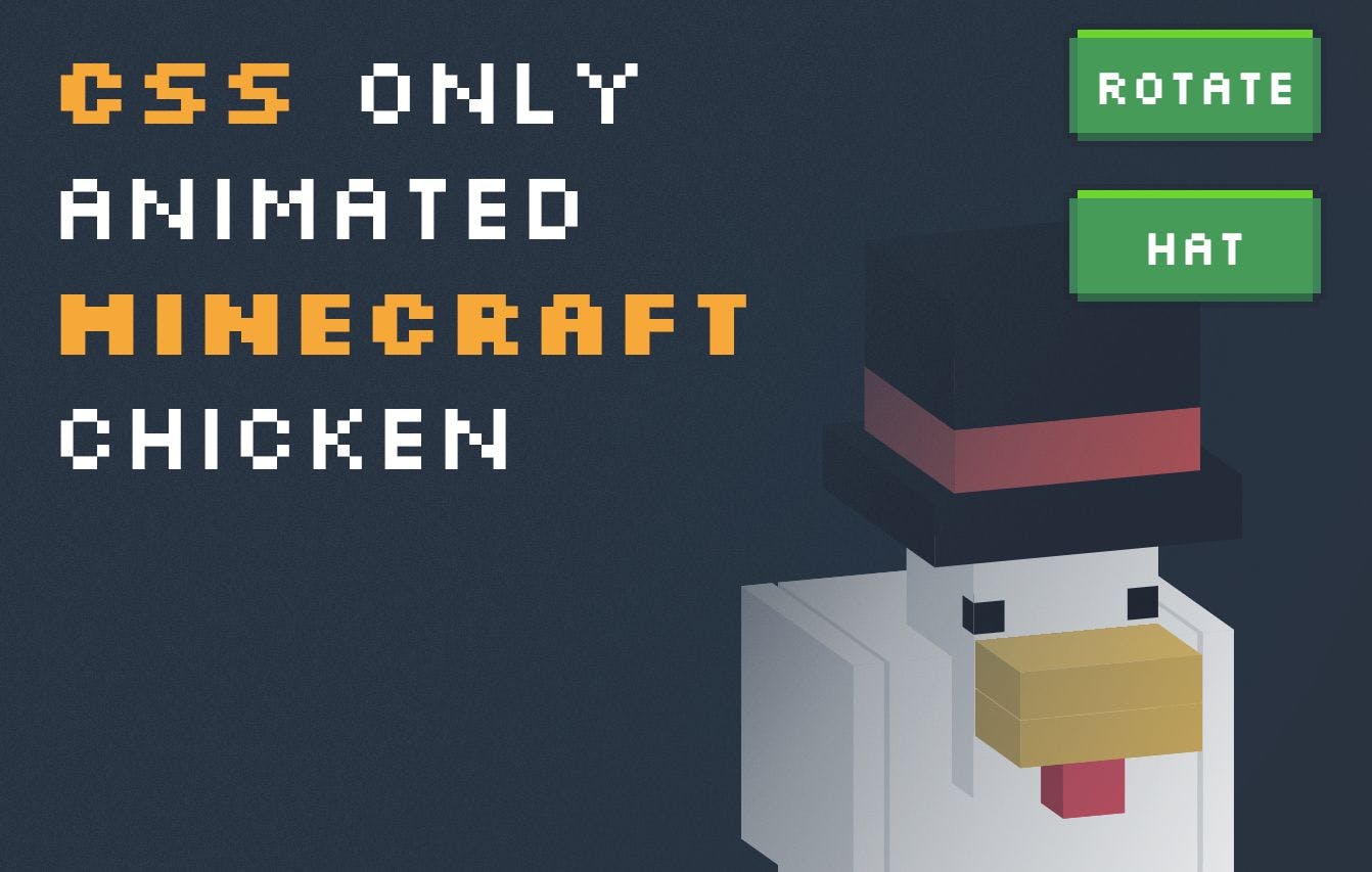
There are a bunch of articles floating about how to make cubes in CSS. There is a surprising of articles on how to make Minecraft chickens in CSS though. As such, I thought I'd spend a couple of hours making a CSS-only Minecraft chicken, and this guide will walk you through how I did that. lack , along with the full code via CodePen: Here is the demo https://codepen.io/smpnjn/pen/mdxzLWo The cool thing about the chicken is that you can give him a top hat, and he can spin. Also, if you click him, he may cluck. Making a CSS-Only Minecraft Chicken When I write articles, sometimes someone will message me to say it's , not Javascript - which makes me wonder if it's actually supposed to be Minecraft. In any case, every Minecraft chicken starts with a CSS cube. Making a CSS cube is relatively straightforward. First, we start with this HTML: JavaScript <div id="chicken"> <div class="c2"> <div class="cube head"> <div class="front"></div> <div class="bottom"></div> <div class="left"></div> <div class="right"></div> </div> </div> </div> ... which is essentially just a cube with four side div's inside. The reason it's only got sides rather than sides here is that I like to use CSS elements for the other two. It's also got a parent called here, because CSS starts doing some wacky things if you don't do this (like stacking the blocks in weird ways). four six pseudo .c2 After we've done this, we can start making our cube CSS. All the sides are relatively similar in CSS styling, with the only difference being how we transform them: #chicken { transform: rotateX(-15deg) rotateY(20deg); transform-style: preserve-3d; position: relative; left: 16rem; top: 16rem; transform-origin: 6rem 6rem; transform-style: preserve-3d; transition: all 0.1s ease-out; cursor: pointer; } #chicken .c2 { position: absolute; top: 6rem; } .cube.head { width: 6rem; height: 8rem; } .cube > div, .cube:after, .cube:before { content: ''; position: absolute; height: 100%; width: 100%; transform-style: preserve-3d; background: white; } .cube:before { transform: rotateX(-90deg); transform-origin: 0 0; } .cube:after { transform: translateZ(-6rem); transform-origin: 0 50%; } .cube .left { transform: rotateY(90deg); transform-origin: 0 0; background: #eee; } .cube .right { transform-origin: 100% 0; background: #eee; transform: rotateY(-90deg); } .cube .bottom { transform: rotateX(90deg); transform-origin: 100% 100%; } I've opted to simplify the cube method here by using . Some people like to use a lot of transforms, but I find is the easiest and requires the least amount of repeating yourself. The only place I need to use is for the back piece, which is above. transform-origin translate transform-origin translate .cube:after That's because we'd need to rotate the back piece around the center point of the cube, and although you can do a 3d , it's just as easy to translate the back piece into place. This does bring with it one of the more annoying things about CSS cubes, which is that we will need to change the back plate translation if we change the size of the cube. Since our first cube is already configured correctly, that's OK - but for other pieces, we need to add in some custom lines of CSS. transform-origin head You'll also notice that we use all over the place. This ensures that the object 3d. If you remove this, the cube won't form, and instead, it'll stay on a single plain. transform-style: preserve-3d; remains Moving our cubes into place After you've figured out one cube - the rest is easy. All of our cubes are , so all you need to do is copy and paste the HTML, update the colors as you see fit, and translate them into position. This is a pretty manual process in CSS, but to be fair, it would be in any language. position: absolute To make the chicken a little more interesting, I gave him a wing animation. To do this, I made two keyframes that simply translate a point. I then applied this to one of the cube parent classes, in this case, and . I added new classes to these called and respectively - since both wings rotate differently. The animation here runs forever. .c12 .c13 flutter anti-flutter The only thing left to do now is to update the , since we need to rotate the wings about a point. transform-origin .flutter { animation: flutter 2s infinite; transform-origin: 0 0; } .flutter-anti { animation: flutter-anti 2s infinite; transform-origin: 1rem 0; } @keyframes flutter { 0% { transform: rotateZ(0deg); } 15% { transform: rotateZ(-35deg); } 30% { transform: rotateZ(-15deg); } 45% { transform: rotateZ(-70deg); } 60% { transform: rotateZ(0deg); } } @keyframes aggressively-flutter { 0% { transform: rotateZ(0deg); } 15% { transform: rotateZ(-90deg); } 30% { transform: rotateZ(-45deg); } 45% { transform: rotateZ(-90deg); } 60% { transform: rotateZ(-45deg); } 75% { transform: rotateZ(-90deg); } 90% { transform: rotateZ(-45deg); } 100% { transform: rotateZ(0deg); } } Adding the hat and rotation buttons CSS and HTML are weird. In other languages, there would maybe specific UI elements build in to allow us to trigger CSS classes on click. In HTML, we have to use a checkbox, which is connected to a label, which triggers an animation when clicked. is created up front, using the same cube method as before. We then make a label and checkbox above our chicken HTML: The hat <input type="checkbox" id="rotate" name="rotate" /> <input type="checkbox" id="hat" name="hat" /> <div id="controls"> <div><label id="rotate-label" for="rotate">Rotate</label></div> <div><label id="hat-label" for="hat">Hat</label></div> </div> <div id="chicken"> <!-- chicken goes here --> <!-- ... --> Now we can use to trigger animations if the checkbox is checked. What happens is: sibling selectors The acts as our button. When the user clicks it, it is a specific . For , it is the with the . label for input #hat-label for input name hat So when the user clicks the , it checks the checkbox. That means we can use the CSS selector to add some new CSS. label :checked Since , , and are the hat blocks, we can set them to by default, and then to show should the checkbox be checked: .c14 .c15 .c16 display: none #hat .c14, .c15, .c16 { display: none; } #hat:checked ~ #chicken .c14, #hat:checked ~ #chicken .c15, #hat:checked ~ #chicken .c16 { display: block; } The final thing to do is rotate, which follows the same principle. Instead, though, we'll trigger an when the user checks the checkbox. We have to also use two animations here - one for unchecked, and one for checking. The reason for this is because CSS can be a little weird if we try to re-run an animation upon unchecking a checkbox: animation #rotate #rotate:checked ~ #chicken { animation: rotate 2s 1 forwards; } #rotate ~ #chicken { animation: anti-rotate 2s 1 forwards; } @keyframes rotate { 0% { transform: rotateX(-15deg) rotateY(20deg); } 100% { transform: rotateX(-15deg) rotateY(380deg); } } @keyframes anti-rotate { 0% { transform: rotateX(-15deg) rotateY(380deg); } 100% { transform: rotateX(-15deg) rotateY(20deg); } } And that leaves us with a very cool, Minecraft chicken. Conclusion Making Minecraft chickens has never been easier with CSS. , so you can play around with it if you want to. I hope you've enjoyed this quick intro to building 3d objects with CSS, and hopefully, you can build your own stuff too. The full code for this demo can be found here Also published . here
