


360 reads
A Beginner's Guide to The CSS Grid System
by Zakariae El MejdkiMarch 5th, 2020


Too Long; Didn't Read
A Beginner's Guide to The CSS Grid System is a guide to how to work with the CSS grid System. It is a two-dimensional system, meaning it can handle both columns and rows, unlike Flexbox which is largely a one-dimensional. The best and easiest way to use the. magical grid property “grid-template-areas” is to. use the magical grid. property to draw our areas to show our areas as shown in the. code below.

A lot of newbies to web development, don’t get it from the first time working with CSS grid. And that is the reason why I decided to write this article, besides that, I also want to give a brief intro to CSS grid and try to explain to people who are new to CSS, how to work with this amazing feature in the simplest way possible.
So let’s start with the question of why the CSS grid exists in the first place and what it is actually?
What really is CSS Grid?
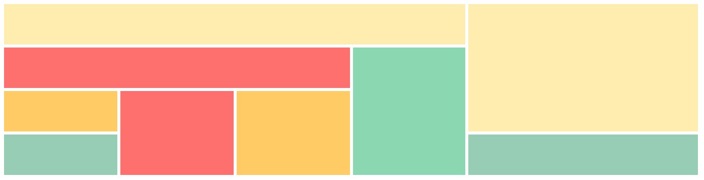
Usually, when it comes to developing web sites I actually used to draw mock-ups on papers. So here is a mock-up that I was trying to do in different system views ( I mean by system view: Desktop view, Tablet view, and mobile view ).


As you can notice easily, that in each view type there are some changes in orders of the elements inside the web page. For example, we see that in the mobile view we have an image then maybe the title after that the meta content and finally, we have the content. But on the tablet view, we see that the title and the meta content come first before the image. Before the CSS grid, if we want to make this kind of layout we will definitely need to use some JavaScript, to reorder the DOM and create that order that we wanted for each view type. nowadays this is easily doable with CSS Grid and with the most cleaned HTML code ever. nowadays you don’t need to think about nesting div’s in order to float elements or displaying them in specific positions, you can easily create a grid system layout and then position your items in it as you wish wherever you want and whenever you want.
Here is a definition of a CSS grid system:


CSS Grid Layout is a two-dimensional system, meaning it can handle both columns and rows, unlike flexbox which is largely a one-dimensional system (either in a column or a row). A core difference between CSS Grid and Flexbox is that — CSS Grid’s approach is layout-first while Flexbox’s approach is content-first.
Enough of speaking about why and what is a Grid system. And let’s see how to work with the CSS grid System.
How to work with CSS Grid?
From my point of view, the best and easiest way to work with the CSS grid is to use the magical grid property “grid-template-areas”. but before jumping into that, we need to understand first how the CSS grid is structured and get familiar with some technical words. Grid systems usually have a grid container and grid items. A grid container is the HTML element that has a display property of grid “display: grid”. and a grid item is every element that a direct descendant of that element.


Terminology:
There are a few bits of terminology that are introduced by the Grid Layout specification. I’ve explained them here as they will make the examples easier to follow.
Grid Line


Grid Lines are the lines that make up the grid. These can be horizontal or vertical. We can refer to them by number, or by name.
Grid Tracks

A Grid Track is a space between two Grid Lines, either horizontal or vertical.
Grid Cell

A Grid Cell is a space between 4 Grid Lines. So it is the smallest unit on our grid that is available for us to place an item into. Conceptually it is just like a table cell.
Grid Area
A Grid Area is any area on the Grid bound by four grid lines. It may contain a number of Grid Cells.
After these simple terminologies let’s see how we can work with this amazing layout.
Here is how:
let’s return back to our magical property that I have mentioned before. so to start with the CSS grid. we use “display: grid”, and we define our columns and rows, then after that, we use that magical property to draw our areas as shown in the code below :
.container {
     display: grid;
     gird-template-columns: repeat(6, 1fr);
     grid-template-rows: repeat(3, 1fr) 100px;
     grid-template-areas:
          “header header header header header header”
          “main main main . sidebar sidebar”
          “main main main . sidebar sidebar”
          “ . footer footer footer footer . “;
}
With this property, we are drawing the grid areas by specifying for each grid cell what area it will take.
“I know, I know I got you, some of these properties are new to you I will explain don’t worry “
so
repeat()Let’s continue, so in grid-template-areas we kind of have defined some areas that we will be used later by the grid items in order to align there self’s in them. Now let’s see how a grid item should look like.
.header {
     gird-area: header;
}
.main {
      grid-area: main;
}
...


Now, what if I want to change the order in the mobile version I need only to add this media query with this code in it :
@media only screen and (max-width: 700px) {
     .container {
          gird-template-columns: 1fr;
         grid-template-areas:
            “header”
            “sidebar”
            “main
            “footer“;
}


Summary
That’s all friends.
I hope you’ve enjoyed this article and learned from my experience.
If you can like this post and share it, I will appreciate applause and sharing :-)
You can contact or follow me:
My Twitter
Facebook
LinkedIn
Some valuable external resources :
https://css-tricks.com/snippets/css/complete-guide-grid/

L O A D I N G
. . . comments & more!
. . . comments & more!
About Author

TOPICS
THIS ARTICLE WAS FEATURED IN...


RELATED STORIES


100 Stories To Learn About Html5 #html5
Invalid Date

10 Things You Probably Didn’t Know about Sass #css
Invalid Date