242 reads
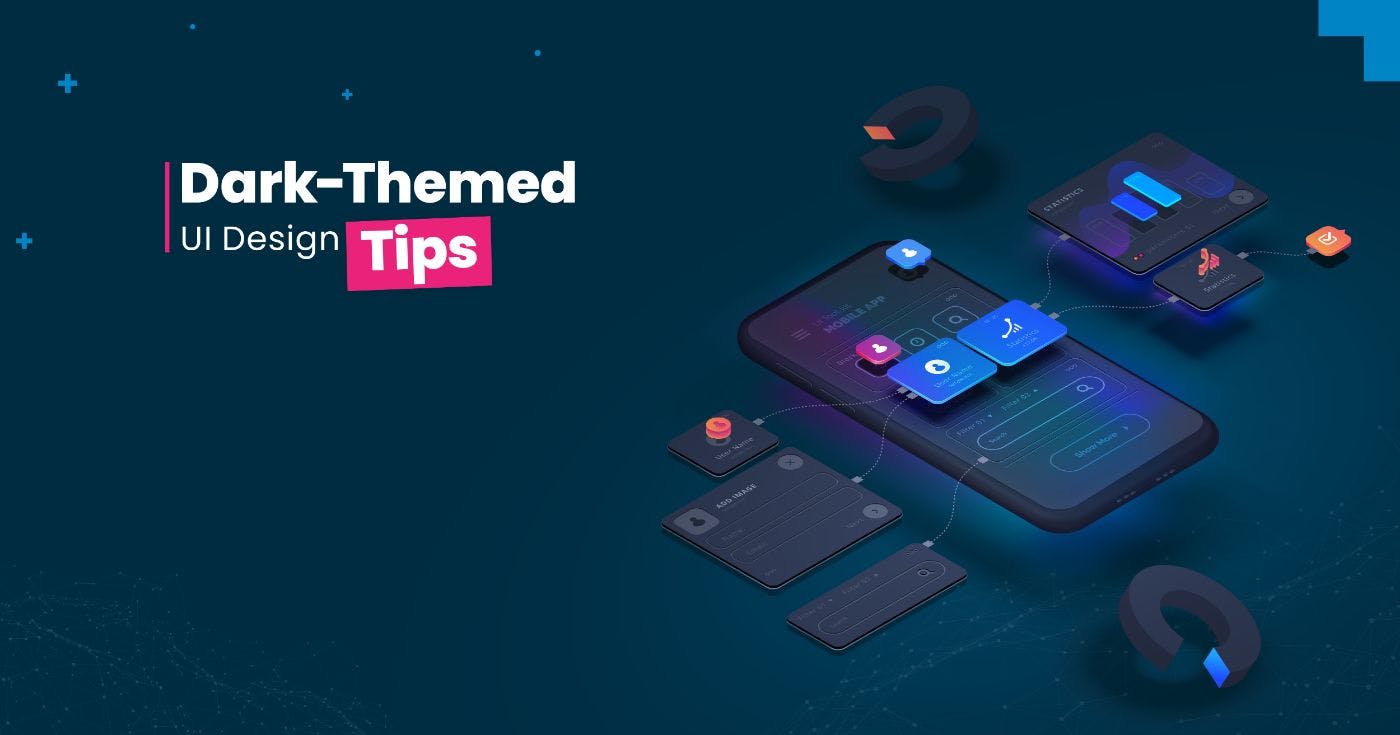
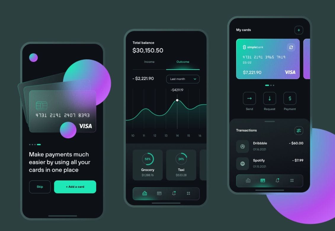
6 Principles of Dark UI Design
by byFireart Studio@fireartstudio
Top-quality Development services and UI/UX design for startups & leading brands
February 3rd, 2022


Top-quality Development services and UI/UX design for startups & leading brands


Top-quality Development services and UI/UX design for startups & leading brands
About Author

Top-quality Development services and UI/UX design for startups & leading brands
Comments