paint-brush
Technology Probe Study in UX Design Dark Patterns by@feedbackloop

Technology Probe Study in UX Design Dark Patterns

tldt arrow

Too Long; Didn't Read

Discover the Dark Pita technology probe's insights into user reactions against dark patterns. This browser extension, rooted in Protection Motivation Theory, focuses on user awareness and action. The article explores a two-week deployment study, detailing how Dark Pita empowers users to counter dark patterns in popular online services like Amazon, YouTube, Netflix, Facebook, and Twitter.
featured image - Technology Probe Study in UX Design Dark Patterns
The FeedbackLoop: #1 in PM Education HackerNoon profile picture

Authors:

(1) Yuwen Lu, he contributed equally to this work, University of Notre Dame, USA;

(2) Chao Zhang, he contributed equally to this work and work done as a visiting researcher at the University of Notre Dame;

(3) Yuewen Yang, Work done as a visiting researcher at the University of Notre Dame;

(4) Yaxin Yao, Virginia Tech, USA;

(5) Toby Jia-Jun Li, University of Notre Dame, USA.

Table of Links

Introduction

Background and Related Work

Co-Design Workshops

Technology Probe Study

Results

Scaling Up: A Research Agenda

Limitations and Future Work

Conclusions and References

Appendix

4 TECHNOLOGY PROBE STUDY

The co-design workshops (Section 3) served as a starting point for us to understand the existing relationship of users with dark patterns and their desired interventions. They looked at users’ past daily experiences of encountering and coping with dark patterns with little or no external support. To further explore users’ in-situ reactions toward “fixing” dark patterns on their own devices, we conducted a two-week deployment study of a technology probe.


The technology probe method, proposed by Hutchinson et al. [51], deploys “simple, flexible technologies” as probes in the real world with three goals: “the social science goal of collecting in-context information about the use and the users, the engineering goal of testing the technology, and the design goal of inspiring users and researchers to envision future technologies” [51]. This method is widely used to examine the influence of new technologies on the daily experience of users as part of the co-design process [54, 108]. It is worth mentioning that a technology probe study, while containing an engineering goal of field-testing a probe, is not equivalent to an evaluative study for the efficacy of well-developed systems. This method does not seek to evaluate the probe’s effectiveness on users’ behavior change but to discover design implications and insights [51]. Thus we designed our technology probe, Dark Pita, with three research goals in mind:


(1) Social science goal is to understand end-user reactions, preferences, and desires in situ on awareness of and action for dark patterns in their online experiences.


(2) Engineering goal is to field test the technical feasibility of combining awareness and action as an end-user-empowerment intervention for dark patterns in realistic contexts of use.


(3) Design goal is to explore the design space of techniques, strategies, and interfaces for end-user-empowering interventions, with a specific focus on trade-offs and user constraints.

4.1 Theoretical Grounding

According to the design implications in the co-design workshops, the probe should help users to (1) raise awareness of dark patterns and understand their underlying design intents (DI2) and (2) take actions to counter the effects of dark patterns in a web augmentation approach (DI1). The awareness and action mechanisms are naturally aligned with the Protection Motivation Theory (PMT) [106], which has been widely applied in behavior change design [105, 116, 117, 125].


PMT is commonly used to understand people’s responses to triggers that appraise a potential threat [106]. It suggests to intervene in people’s cognitive appraisal processes to motivate selfprotection by articulating fear appeals. In PMT, two factors, threat appraisal (how much people consider themselves at risk) and coping appraisal (how effective people think their actions are against the risk), determine whether people would protect themselves [106]. This is in line with our workshop findings (WF2 and WF3). Thus in our design, we used PMT as our theoretical basis and mapped our awareness and action mechanisms to threat and coping appraisal by disclosing the risk of dark patterns and guiding users to take effective measures against them (Figure 2).

4.2 The Probe: Dark Pita

To fulfill the research goals, we materialized our new PMT-based approach as a technology probe named Dark Pita, in the form of a browser extension that facilitates awareness and action for end-users against a small representative sample of UX dark patterns in several popular online services.


interacting with Dark Pita. Then, we introduce the probe’s main features in line with the five dimensions of probe design by Hutchinson et al. [51] and describe how we come up with UI enhancements for sampled dark pattern instances based on a new Design-Behavior-Outcome framework. Finally, we detail the technical implementation of Dark Pita.


4.2.1 User Experience. We selected five popular online services to support in Dark Pita (Amazon[10], Youtube[11], Netflix[12], Facebook[13], and Twitter[14]). These samples represent different types of online services across task domains (i.e., online shopping, video streaming, and social media), containing diverse types of dark patterns (described in Section 4.2.3). They also possess substantial user bases, facilitating our recruitment process by accommodating a larger pool of potential participants. In this section, we provide one example scenario of how a user may interact with Dark Pita.


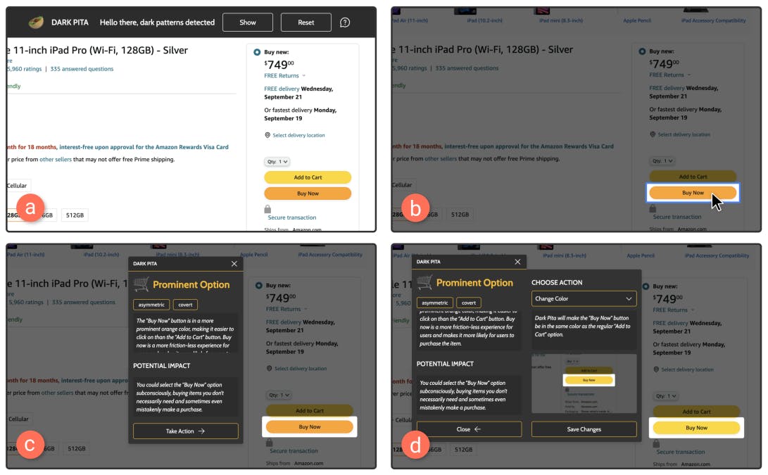
Lisa is a frequent user of Amazon. When trying to check out on an item’s page, she sees two buttons: “Buy Now” and “Add to Cart”. The “Buy Now” button reduces the friction in checking out, improving Amazon’s conversion rate; however, it can potentially cause users to buy unnecessary items they regret later [59]. Here, Amazon designed “Buy Now” to be more visually prominent, making it easier to click on than “Add to Cart”. Dark Pita notifies Lisa that dark patterns are detected on the page and highlights the “Buy Now” button (Fig. 3a and b). Then, she clicks on the highlighted area, and the awareness panel reveals (Fig. 3c). It shows Lisa information about this dark pattern’s manipulative mechanism and potential impacts, making her realize how the design can potentially trick her into directly checking out instead of adding the item to the cart. This way, Lisa will not be able to look at the total price of all items in the cart and reflect on the purchase before checking out, making her more likely to overspend on Amazon.


To mitigate the effect of this dark pattern, Lisa opens the action panel (Fig. 3d) and chooses a UI enhancement that changes the color of the “Buy Now” button to the same as the “Add to Cart” button (from several options available as shown in Fig. 4d). With such experience, Lisa realizes that user interfaces can be styled differently to manipulate her decision-making process. Lisa feels that Dark Pita gives her more control and autonomy over these malicious interfaces.


Fig. 3. An example scenario of how users might interact with Dark Pita on Amazon


Fig. 4. Dark Pita’s awareness and action panels.


4.2.2 Design Features. Following the threat appraisal and coping appraisal processes of PMT (Section 4.1), Dark Pita consists of an awareness panel and an action panel (Fig. 2). The awareness panel brings the attention of end users by disclosing the manipulative mechanism of a dark pattern and the potential impact on user behavior (Fig. 4). The action panel empowers end users to take action to mitigate the negative impact by choosing from the multiple UI enhancements provided (Fig. 4). Overall, our probe can (1) detect and highlight dark patterns on websites, (2) disclose the manipulative mechanism (DI2), (3) articulate the potential impact (DI2), and allow users to (4) select UI enhancements for dark patterns (DI1, DI3, and DI4), and (5) preview the enhancement effect. Lastly, Dark Pita can (6) record participant interactions with the browser extension, the UI enhancements, and the supported dark patterns and allow participants to keep diary notes for study purposes.


Dark pattern detection. Dark Pita detects dark patterns when the user enters a website. Once the probe detects dark patterns (the detection technique is described in Section 4.2.4), a top banner appears, allowing the user to highlight all discovered dark patterns using the “show” button (Fig. 3b). When the user hovers their cursors over a highlighted dark pattern, a blue border suggests the clicking affordance for more information.


Manipulative mechanism disclosure. Dark Pita provides a brief explanation for each dark pattern (Fig. 4b) and introduces the threat susceptibility with “dark” attributes [82] (Fig. 4a). These attributes describe changes that the dark pattern imposes on the user’s underlying choice architecture. Users can hover over each tag to get more details. For example, “restrictive” means that the dark pattern “eliminates certain choices that should be available to you.”


Potential impact articulation. For each dark pattern, Dark Pita explains its potential impact (threat severity) through a normative perspective of individual welfare [82] (Fig. 4c). Specifically, we consider three types of individual welfare—financial loss, invasion of privacy, and cognitive burden, based on the framework proposed by Mathur et al. [82]. Dark Pita identifies the theme to which the dark pattern belongs and elaborates on its impact. For example, it says “You are likely to get distracted and watch videos that you never planned to. The automatic preview on hover grabs your attention and distracts you even further” for the “recommended videos” dark pattern on Youtube.


User interface modification. If the user wants to take action to mitigate the potential impact of a dark pattern, they can press the “Take Action” button. The action panel will appear on the left. Dark Pita provides 1–4 options of UI enhancements for each dark pattern to empower users to take protective actions (self-efficacy) (Fig. 4d). The user can select their desired enhancements and save the changes for their next visit to the site. We detail the design process of UI enhancements in Section 4.2.3.


UI enhancement preview. For each enhancement, Dark Pita introduces its response efficacy by explaining the effect (Fig. 4e) and providing a preview (Fig. 4f). The explanation informs the user about the intervention mechanism offered by the enhancement. It describes how this enhancement scaffolds the user to avoid harm to individual welfare. For example, the probe says “Dark Pita will disable the preview function, which can protect you from being distracted.” for a “block preview” enhancement. To demonstrate how an enhancement works, Dark Pita also displays a preview animation below the explanation.


Action logging and diary notes. The probe records interactions of participants who have explicitly given their consent. All personal information contained in log entries is removed locally on the participant’s device before being sent out. The log contains fine-grained interactions with the probe, such as timestamps, site information, panel openings, and saved UI enhancement choices. Dark Pita also provides a diary note panel for users to submit their reflections and expectations about the probe, dark patterns, and interventions. Participants can also attach screenshots that capture context information.


Overall, Dark Pita’s features implement recommendations by Hutchinson et al. [51] that technology probes should be distinguished from regular design prototypes in five dimensions:


• Functionality: Dark Pita is simple enough to test only two key ideas: raising awareness of and taking action on dark patterns.


• Flexibility: Dark Pita allows users to access its features on five sites in three task domains. It also provides multiple UI enhancements for each dark pattern, allowing users to modify dark patterns flexibly.


• Usability: Dark Pita leverages a small sample of dark pattern instances to demonstrate its functionality, while leaving other dark patterns on these sites to evoke participants’ reflections and design ideas. Usability was not a main concern in our deployment study.


• Logging: Dark Pita implemented a comprehensive logging mechanism of participant interactions. It allows participants to record their situational thoughts and keep diary notes.


• Design phase: Dark Pita proposes an end-user-initiated intervention paradigm in complement to existing solutions to dark patterns led by designers, educators, policymakers, etc. It is used in early design and aims to influence the future design of interventions and user empowerment.


4.2.3 UI Enhancements. We first sampled 13 instances of dark patterns across five popular sites. Then, we designed 1–4 UI enhancements for each instance (31 in total) using selected intervention techniques from previous studies [11, 13, 17, 34, 57, 75, 89, 126] and co-design workshops (DI4) based on a Design-Behavior-Outcome framework.


Dark pattern samples. Given that millions of dark patterns exist on the internet [26], it is infeasible to cover all instances in our design probe. To build a simple and flexible probe [51] as a demonstration of our approach, we sampled a representative group of dark patterns. Also to ensure our participants can use the probe frequently during the study period, we selected 13 instances from five popular websites across different service categories (Amazon, YouTube, Netflix, Facebook, and Twitter). Based on Mathur et al.’s approach [81], three researchers determined each instance’s “dark” attributes individually and discussed to resolve conflicts and reach a consensus. Detailed category information and descriptions of the selected dark patterns are included in Appendix A.3. The research team balanced the dark pattern instances with different attributes and from different categories to form a representative sample, while some dark pattern attributes or categories are unavoidably more common than others.


Design-Behavior-Outcome framework. Previous studies have explored various intervention techniques to counteract the influence of dark patterns on user behaviors [11]. These techniques can act in different phases of user interaction with dark patterns. Based on DI4 from our co-design workshops, we propose a Design-Behavior-Outcome framework to situate different intervention techniques in their corresponding interaction stages to design appropriate UI enhancements for end users (Fig. 5). This framework can inspire future intervention technique designs before, during, and after a user’s interaction with dark patterns.


• Design: Design interventions change the visual style of the interfaces or the information displayed before the user interacts with the dark pattern.


• Behavior: Behavior interventions directly guide, modify, or constrain users’ behavior during the interaction flow with the dark pattern.


• Outcome: Outcome interventions explain the possible consequences of provoking user reflection after interacting with the dark pattern.


Table 1. Instances of dark pattern with “dark” attributes [82]. We designed 1–4 UI enhancements for each instance, employing different intervention strategies.


Table 2. The intervention strategies used in the design of UI enhancements.


Specifically, we first selected 7 intervention strategies from previous literature on dark patterns [11] and technology-mediated nudging [17], including detection [76, 81], warning consequences [75], hiding [75], disabling [57], counterfactual thinking [13], friction [34, 89], and reflection [126]. Detection and warning consequences were excluded because we have implemented them in the awareness features of Dark Pita. As a complement, we derived 3 participant-designed intervention strategies from our co-design workshops, that is, fairness, information disclosure, and action guide (DI4). Overall, we selected 8 techniques and situated them in our proposed Design-Behavior-Outcome framework (Table 2).


Fig. 5. The Design-Behavior-Outcome framework illustrated with examples of UI enhancements.


Intervention design. For each instance, we designed 1–4 UI enhancements (31 in total, shown in Table 2). In Fig. 5, we illustrate how we designed 3 enhancements against Amazon’s “Buy Now”. By using a more prominent color and hiding the cart item subtotal from users, the “Buy Now” button potentially promotes users’ impulsive buying behavior [110]. To target the visual design of this dark pattern before interaction, we designed an enhancement to change the “Buy Now” button’s color to the same as the alternative option (the fairness strategy, Fig. 5a). During interaction, the enhancement using friction opens a popup alert when the user hovers over “Buy Now” (Fig. 5b). Another alternative enhancement after interaction, utilizing the reflection strategy, provides a summary on how much dark patterns on Amazon have potentially led to unintentional shopping (Fig. 5c). A similar suite of UI enhancements can be used for similar dark patterns such as Subscribe & Save or Buy Now & Pay Later. Details of UI enhancements can be found in the Appendix A.4.


4.2.4 Implementation. The Dark Pita probe is a Chrome browser extension. It was implemented using the Vue[15] framework and the Chrome extension API[16]. For dark pattern detection, it uses a rule-based method by matching the attributes of HTML elements (e.g., id, aria-label, data-uia) using manually authored regular expressions or finding unique section title strings in the innerHTML attribute of HTML elements. This approach allowed Dark Pita to detect all instances of the same dark patterns regardless of the content of the page. For UI enhancements, we implemented them by programming the browser extension to automatically add, remove, and/or modify the corresponding DOM elements when the target website is loaded. Once the user selects a UI enhancement for a detected dark pattern, Dark Pita immediately executes the corresponding script to modify the UI of the website. Additionally, we use the Chrome storage API[17] to store user configurations of UI enhancements. Every time a user opens a new instance of the target web page, the extension automatically retrieves the user’s saved configurations and applies their previous UI enhancement setup.

4.3 Study Participants

After implementing the probe, we recruited participants through online advertising and word-ofmouth. None of the previous co-design workshop participants were included in order to mitigate the geographic biases in in-person activity recruitment. We conducted purposive sampling to ensure the diversity of participant demographics (e.g., age, gender), technology literacy, occupation, Chrome usage, and familiarity with dark patterns. In total, 17 participants were recruited, and 15 (PB1–PB15; 9 males, 6 females) completed the study. One of the two dropouts did not find time to use our probe after the entry interview. We were unable to get in touch with the other dropout after the entry interview. Therefore, we excluded the data from these two participants from the analysis. Detailed demographic information about the 15 participants can be found in Appendix A.5.

4.4 Study Protocol

The two-week technology probe deployment study[18] began with a semi-structured entry interview for study introduction and Dark Pita installation. We also discussed participants’ perceptions, attitudes, and behaviors toward dark patterns in past experiences to help them better understand the concept and contextualize our study. During the study, participants were asked to use Dark Pita on routine websites according to their everyday habits. We obtained consent from all participants prior to the study. We understand that experiences with dark patterns can be annoying, so we ensured that each participant understood their right to leave the study at any point if they wish.


During the two weeks of use, we encouraged participants to log their thoughts and feelings as they interacted Dark Pita. We provided several heuristic questions to guide participants. For example, they can talk about a specific dark pattern, answering questions such as “How does the dark pattern affect your online experience?” and “Are there any other intervention designs that you can think of?”, or they can report any reflections or issues they encounter when using the probe. As an incentive, we offered a $2 (USD) reward for each submitted note (up to $16) and encouraged each participant to submit at least one note every two days. Our probe also recorded detailed log data as described in Section 4.2.2.


In the middle of the study, a semi-structured 30-minute check-in interview was conducted.


The main goals of this interview were to (1) clarify users’ questions and concerns from the first week of use; (2) understand their usage behavior with our probe; and (3) remind them of the study procedures, including probe usages and diary note submissions. At the end of the study, we conducted a semi-structured one-hour exit interview with each participant to (1) collect information about participants’ experiences with Dark Pita and explore the rationale behind interesting user behaviors or diary notes; (2) understand changes in user behaviors, perceptions, and attitudes toward dark patterns; and (3) find out users’ feedback for interventions in Dark Pita.


All interviews were conducted online through Zoom and recorded with the consent of the participants. Each participant was compensated $100 for using our probe and joining the three interviews. Additional compensation for sending diary notes is also provided. Appendix A.6 contains the protocols of our entry, middle, and exit interviews.


Fig. 6. The daily probe engagement of our participants. Red and green circles denote participants who visited sites containing dark pattern instances or modified dark pattern instances with UI enhancements at least once on that day, respectively. The blue dots denote participants who sent diary notes at least once on that day. The touchpoints (mid-study check-in interviews) were on Day 8.


4.5 Data Analysis Methods

Three researchers conducted open coding and thematic analysis [14, 63] of interview transcriptions and diary notes. Throughout the analysis, they went through three rounds of labeling and engaged in constant discussions to identify code, merge themes, and resolve conflicts. Similar to the codesign workshop analysis process (Section 3.3), our goal was to discover emergent themes, and the analysis process was discussion-based, so the inter-rater reliability is not necessary [84]. The themes we derived during our data analysis were included in Appendix A.2. Our analysis paid attention to users’ reactions and changes throughout the 2-week period, with the three research goals in mind (Section 4).


[10 ]https://www.amazon.com/


[11] https://www.youtube.com/


[12 ]https://www.netflix.com/


[13] https://www.facebook.com/


[14] https://twitter.com/


[15] https://vuejs.org/


[16] https://developer.chrome.com/docs/extensions/reference/


[17] https://developer.chrome.com/docs/extensions/reference/storage/


[18] The study protocol has been approved by the IRB at our institution.