paint-brush
SaaS Landing Page Optimization: 5 Hacks To Get More Conversionsby@tobynwazor
418 reads
418 reads

SaaS Landing Page Optimization: 5 Hacks To Get More Conversions

by Toby NwazorMay 22nd, 2021
Read on Terminal Reader
Read this story w/o Javascript
tldt arrow

Too Long; Didn't Read

Report: SaaS landing pages converted 10.46% lower than the overall conversion rate for landing pages across all industries in 2020. Landing pages are a web page where you send visitors to initiate a conversation and close a deal. They are often standalone web pages with a single goal – getting your prospect to join your mailing list, buy your service, attend your business event, or whatever your goal is. A good landing page should have the following: A clear and concise value statement, a compelling and catchy headline, a strong call to action (CTA)

Companies Mentioned

Mention Thumbnail
Mention Thumbnail
featured image - SaaS Landing Page Optimization: 5 Hacks To Get More Conversions
Toby Nwazor HackerNoon profile picture

According to a report by Unbounce, SaaS landing pages converted 10.46% lower than the overall conversion rate for landing pages across all industries in 2020. The report examined more than 34,132 landing pages and 19.2 million conversions before reaching its conclusions. This statistic implies that SaaS landing pages are less likely to convert when compared to other industries. 

In this post, I will show you five hacks to help you optimize your SaaS landing pages for more conversions. But before we do that, let’s understand the basics.

What is a landing page?

Your website is the online version of your business's physical location where clients and prospects can get all the information they need about your business, make inquiries, and buy whatever service you are selling.

A landing page, on the other hand, exists to help you drive one goal – your preferred CTA (Call-to-Action).

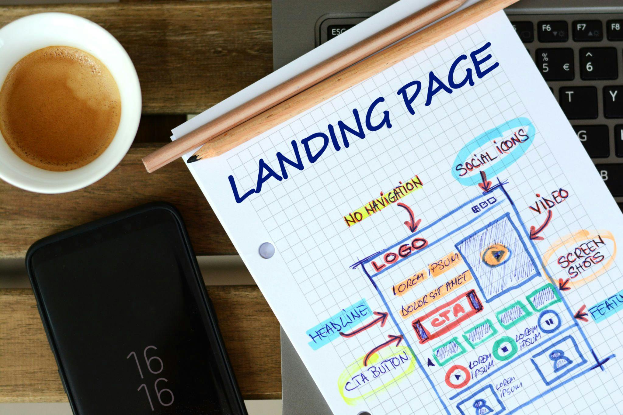
A landing page is a web page where you send visitors to initiate a conversation and close a deal. They are often standalone web pages with a single goal – getting your prospect to join your mailing list, buy your service, attend your business event, or whatever your goal is.

A good landing page should have the following:

  1. A clear and concise value statement.
  2. A compelling and catchy headline.
  3. Excellently written solution/service offering.
  4. Supporting images or video content.
  5. A strong call to action (CTA).
  6. Social proof or testimonials.

As a SaaS company, it is not enough to merely own a business website, you need to have a great landing page to ensure that your business stays in the game by helping your prospects move from the discovery stage to the “I want this software” stage.

Why you need to optimize your SaaS landing page

From the statistics in the introduction above, there is a lot to be desired of SaaS landing pages. The good thing is that the stats point to a door of possibilities that your business can tap into. Your Saas landing page should be so optimized that it can compete with that of other industries, and here is why:

1. It helps you acquire more leads

Whatever your service offering is, having an optimized landing page increases your chances of acquiring more leads. These leads can be nurtured into paying customers. But you may never reach them if you don’t optimize your landing page for the best performance.

2. To make the most of your cost

Some resources have gone into creating and maintaining your website, you might as well get the most of it. From acquiring new leads to new paying customers, your landing can save you extra marketing costs.

3. Serves as a signup form

Your landing page can be adapted for data collection. Whether it is directing your prospects to a contact page on your website or collecting their contact right on the landing page, make data collection a core of your landing page strategy.

Graph Source: Omnisend

According to a 2017 report, landing pages are the least popular signup form and had the highest conversion rate, sitting comfortably at 23% at the time. 

4. Increases your chances of ranking on Google Maps and Search queries

Optimizing your landing page for search queries and maps increases your business exposure, which in turn results in the acquisition of more leads.

A report shows that 48% of the top landing pages ranked in Google Maps and organic search queries. You need to join this train.

Mistakes to avoid on your landing page

Don’t get carried away by the prospects of your service offering that you fail to put in the work required to make your landing page work. Below are a few mistakes to avoid:

1. Undefined goals

One of the things that can mess up your landing page is a lack of clarity for your goal. Trying to use the same landing page for multiple purposes would make it more difficult for it to convert. It is best to choose a goal and stay with it. This makes tracking and optimization easy to achieve.

2. Information overload

When you overload your landing page with too much information, you end up not achieving the goal you set out for it in the first place.

Unlike your website that has sections and pages, your landing page should have a central message – the solution you are providing, and a CTA – whatever you want it to be. Focus your content on these core areas, so those who visit don’t end up confused.

3. Unnecessary imagery

Your landing page is not a picture gallery, and definitely not the right place for showcasing your carousels. Every detail on your landing page must serve the goal of the landing page.

Adding images to your landing page is great and advisable, but only in the right proportion. Use image(s) that align with your brand values and you are sure would help your prospects reach a decision.

4. Appearing salesy

Think of your landing page more as a marketing tool. Your goal is to whet your prospect’s appetite for more, leading them to act on your CTA.

Sounding salesy can scare them away and prevent them from taking the required action. Your job is to win them over by selling without making them feel they are being sold to.

5. Longer page load time

According to Neil Patel, 47% of consumers expect a web page to load in two seconds or less, 40% of people abandon a website that takes more than three seconds to load, while a one-second delay in page response can result in a 7% reduction in conversions.

This means that no matter how great your content is, you must make sure that your average page load time is not more than three seconds.


Having identified the mistakes to avoid, below are the five best hacks to help you optimize your SaaS landing page.

Hack 1 – Limit your offers

Whether as a response to a social media post, an email, Google search, Bing search, YouTube, or any other source, visitors to your landing page got there from somewhere else on the internet.

Once they get to your landing page, you have just a few seconds to tell them your brand story and get them to act on your CTA. Don’t waste these seconds by making two or more offers. Multiple offers can reduce your conversion rates drastically.

Welcome them to your landing page with a bold killer headline, supporting image(s), and a single offer – one CTA. Take a look at this landing page design by Shopify.

The simplicity of the design is just breathtaking and makes room for a superb user experience. A visitor to the page is clear about the next step to take.

Make it easy for your prospects to decide by simplifying the entire decision-making process for them – give them one offer. 

Notice how Shopify uses social proof to make their landing page more compelling?

Nothing beats simplicity with a touch of the right elements in the right quantity.

Hack 2 – Remove navigation from your page

Again, it is a landing page, just that. Your goal here should be single.

Everything on your landing page should be geared towards a single goal – getting your page visitor to act on your clear CTA. Adding navigation buttons to your landing page opens up a world of options for your prospects.

With navigation buttons on your landing page, it is easy for them to get lost trying out different options instead of simply acting on your CTA. 

Once the attention of your prospect shifts to another link on your landing page, there is no guarantee that they would go back to act on the CTA. By removing navigation buttons and links, you keep the eyes of your visitors single.

Source: Hubspot

The image above is a screenshot of a Hubspot landing page with no top navigation.

According to this HubSpot report, their rates for some of their pages increased significantly when they removed their top navigation.

Image source: Hubspot

This hack is not an easy decision for most people to make, especially when considering that multiple links give visitors alternative actions to take and the opportunity to learn more about your business. 

However, if you want to see more conversions, consider removing external links from your landing page.

Hack 3 – Optimize your landing page for mobile

This may seem like an obvious thing to do, but Adobe Analytics reports that only 50 percent of all landing pages are optimized for mobile performance.

Adobe reports that she saw a doubling of traffic from mobile devices but less than half of the survey respondents said they have a mobile-optimized site or mobile app. This is shocking!

The Adobe report revealed that companies with mobile-optimized sites triple their chances of increasing their mobile conversion rate to 5% or above. Wouldn’t this be great for your business too?

Optimizing your landing page for mobile isn’t just about making sure the page fits on mobile. You need to ensure that the most important information is being served to your mobile visitors at a first glance.

For your mobile landing page to work, font arrangement, picture(s), CTA button and every other element must be in the right place and suitable size for mobile viewing.

Hack 4 -  Personalize your CTA

According to this report, personalized Calls to Action convert 202% better. It shows that people cherish personalized experiences, and are more likely to take an action when they feel something was made for them – some sort of personal connection. 

It could be a simple choice to reword regular lines for a more personalized feel.

For example, if you are collecting email details in exchange for a free resource, use “Send me the free resource” instead of “Submit Email”. 

If you want them to fill a contact form so a representative from your team can contact them, instead of “Contact Us” use “We’d like to Get in Touch with you”. The incredible power of a simple tweak such as this is enormous.

Source

Notice how Crazy Egg reframed the opt-in above? Instead of saying “Send Report”, they used, “Show me my Heatmap”.

That means that instead of “Sign Up”, your opt-in can be made to read something like, “Yes, give me the FREE formula”. This informal and personalized method of presenting your CTA can increase your conversion rate.

Hack 5 – Incorporate Video Content

Video content works! People love videos, it just makes it easier for them to digest information quicker. 

Seeing a face explain what you could have read up has a way of reassuring you that there is a human behind the brand, that hears you, feels your pain, and has a solution for you.

Incorporating video content in your SaaS landing page can make a world of difference. Catchy, concise, and clear video content allows your prospects into the world of your service offering, empowering them to act on your CTA.

It could be in the form of an explainer video like this one from Plutio.

Letting people in on how to use your service is a great idea, that way they know just what they are getting into and the effort it requires. 

The landing page includes a bold headline, brief text to get people started and, a clear CTA – getting people to sign up for a free 14 days trial.

While video content is great, you must be wary of people’s patience. 

If the video links to YouTube or your website, it is best to include a preview on your landing page, just to give them an extra reason to progress to the main video.

A good landing page helps you examine and better understand the buying behavior of your target audience. By optimizing your landing page, you are further learning what makes your audience tick, which in turn empowers you to serve them better. 

Get started today on the optimization of your SaaS landing page using the simplified hacks shared in this post.