


931 reads
Introduction to CSS Media Queries


Too Long; Didn't Read
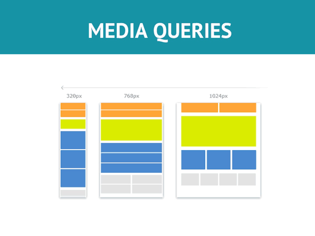
Responsive web design is an approach to web design that makes web pages render well on a variety of devices and window or screen sizes. CSS media queries is a way of targeting devices, but it is helpful to know what the dimensions for all these devices are. They are the underlying theory of Responsive Design where we respond our content to fit any viewport. Media queries are used together with flex box to create a responsive website. The layout of a page depending on the orientation of the browser is also used to change many things as listed below.People Mentioned

Companies Mentioned


Okikiola Apelehin
@okikiola-apelehin

L O A D I N G
. . . comments & more!
. . . comments & more!
