After the dust settled from the Dot Com Bubble, we saw distinctive phoenix internet companies rise from the ashes and deliver immense value to the every day user. This not only allowed them to attract hundreds of millions of users, but this also translated into significant price increase in their associated stock prices.
Since history often repeats itself, we can look to the internet’s past to see what the future might hold for crypto assets. While we only have a few years of crypto history to use, we are already generating some valuable metrics that can help us forecast the future.
Before jumping into those metrics, let’s briefly look back at the growth of the internet and internet based stocks.
“70% of the price appreciation in internet stocks was simply due to the growth of the internet” — Thomas Lee, Fundstrat
The first chart below shows new Gmail users from 2006–2018.
The growth of individuals using Gmail is astounding, starting 2006 with only a few million users and 20 years later attaining more than a billion. That is more than a 100x growth in Gmail users over just two decades.
The next chart we will look at is Google’s stock price movements from 2006–2019.
Image Source: Yahoo Finance
As you can see by this image, it looks eerily similar to the Gmail user adoption chart. This shows Google stock price going from nearly 170 in 2006 to over 1,200 by 2016. This does not include a stock split that occurred in 2014. When accounting for the stock split, investors gained nearly a 1,400% return on their investment in just two decades.
Now while we could extrapolate this one finding and say it rings true for all internet stocks, let’s first look at one more example to get more data.
Instead of focusing on just one single company, let’s examine the growth of the internet population over the past two decades.
Image Source: DART Consulting
This chart shows the internet growing from roughly 40 million users in 2006 to nearly 400 million by 2016. This is nearly a 10x growth in users over a two decade period.
Compare that with the First Trust Dow Jones Internet Index Fund (FDN) chart below, which shows immense growth over the same time frame.
Image Source: Yahoo Finance
Most will say, “just because we saw internet adoption clearly mirror internet stock price appreciation does not mean it will happen with crypto” and that may be true.
But, what if I told you it’s already happening?
The first crypto chart we will look at is the Ethereum Transaction Chart from 2015-2019. While you can see the spike in Q4 2017 due to rabid speculation, the growth over the past 4 years is spectacular. In October 2015 processing just 6,000 transactions per day and now in October 2019 we are seeing more than 700,000 every single day. That is a 100x increase in daily transactions in just four short years.
Image Source: EtherScan.io
The next chart is simply the historical price of Ether (ETH) which is nearly identical to the above Ethereum Transaction Chart but with one differentiator.
The difference is that the price of Ether (ETH) is proportionally down much more than transaction count. This finding is what prompted Chris Burniske, who literally wrote the book on crypto assets to alert investors that prices are down more than the fundamentals.
Below you will see the Ethereum Active Addresses chart in log scale. This shows steady growth of what is essentially active accounts / users.
Image Source: BitInfoCharts
The next chart you will see is nearly indistinguishable to the chart above while measuring for something completely different. It’s measuring Ethereum Market Capitalization, which is the price of Ether (ETH) multiplied by total quantity of units (supply) in circulation.
Image Source: BitInfoCharts
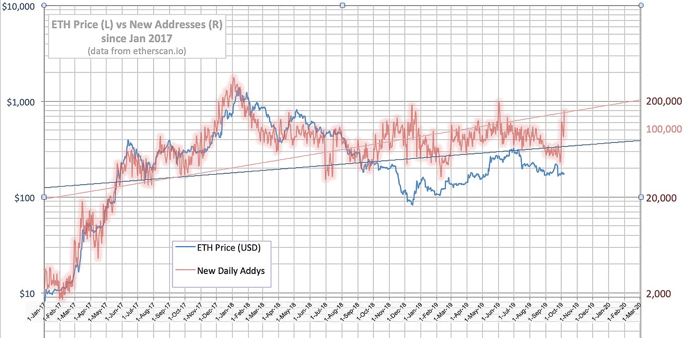
The final chart I will leave you with is the Ethereum Price in blue overlaid with New Addresses (comparable to new Gmail accounts) in red.
Image Source: EtherScan.io
As you can see, price almost always directly matches new addresses. Luckily for the innovative investor; market conditions and information asymmetry is temporarily allowing Ether (ETH) to trade significantly below its typical fundamental value.
Ethereum has seen explosive growth over the past four years, not only from speculation purposes but valuable real world use cases as well. This trend is not only going to continue, but it will with compounding effects as shown by Metcalfe’s Law. If you want to learn why Ethereum will likely remain the dominant public blockchain, look no further than Network Effects and Friendly Developer Moats.
If you are interested in learning more or have any questions, feel free to reach me on twitter @iDecentralized.