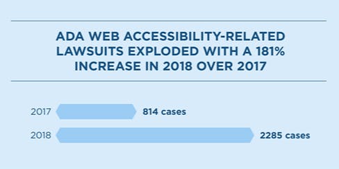
A recent article I did for the where I work as a Designer. Digital Transformation Agency Our custom accessible colour palette incorporating Google Material Design At the DTA we to for simple, clear and fast government services. is all about making things easier for users, regardless of their circumstances. design 13 criteria Criteria 9 While developing our most recent performance dashboard (for ), we learnt quite a bit about accessibility in colour and contrast, some of which I’ve shared below. Australia’s largest cities A major group of people who use our dashboard are older Australians. With more than 1 in 7 people , they are a growing segment of Australia’s population and expected to double in the next 50 years. Half of them are also thought to have low-vision and it’s an issue not limited to their age group. Many people over 40 years old can’t read small text without glasses or bifocals. That’s a natural condition called and just one of . aged 65 and over presbyopia 7 known colour conditions So how did these conditions affect our choice of colour and contrast in the ? Smart Cities dashboard Colour A key part of our work is using colour to help people understand information. Charts can look completely different to people with colour conditions. In Australia, 9% of us have some form of colour-blindness. Others have vision affected by colour contrast and sizing. The chart as seen by someone with no colour condition. The same chart as seen by people with different colour conditions. To design the we needed 6 different colours — one for each category. But colours are very subjective and carry different meanings depending on your cultural and social background. Because of this, we avoided: smart cities dashboard Red — which is often used to signify danger or negativity. Bright green — which can have positive connotations. Choosing 6 colours within these limitations was hard but we chose the palette based on Google material design colours and ended up with a more neutral bluey-green. We were also selective about which colours appeared next to each other to improve the contrast and make it easier to tell them apart. We then tested the palette with some known colour conditions. There are different ways to do this kind of testing but we used and this palette performed very well. Stark Applying patterns can help It’s harder to find the right palette if you need to use lots of different colours in your design. One way to overcome this is to overlay patterns which make it easier again for the viewer to differentiate between categories. Patterns applied to charts help with colour conditions like Protanopia. Applying a pattern helps resolve colour issues by adding another layer of visual distinction. Especially useful for multicoloured charts. To build these charts and apply these patterns, we used the accessibility module in . High Charts Contrast It’s one thing to come up with a good colour palette but we also needed to take contrast into account. The people that wrote the on this are the , an international community that develops for accessibility. It’s their (WCAG 2.0 AA) which features in our for the Australian Government. They also define what should look like for the presentation of text, images of text, contrast ratios, large-scale text, user interface, decoration and logotypes. book World Wide Web Consortium (W3C) standards web content accessibility guidelines digital criteria minimum contrast It can be a challenge to meet the W3C’s standards and keep an interface working in harmony, looking good and pleasant for users. On the dashboard we found having a good colour range really helps. Google material design allowed us to use an extensive colour range which is still manageable. We also needed more colours on the lower end of the range so we were able to create one. It was a big help to have subtle backgrounds to work with, lessening the blow of working with a high contrast accessibility effect. 3 of the Google material design palettes. Showing a good range but limited in the lighter tones i.e. only 100 and a 50. The Smart City custom palette combined with Google Material Design. We extended the palette to to include a 20, 40, 60, 80 and 90 shade. Also an additional on in the dark — 950. This also is needed to get a good contrast and range to display a chart with multiple legend items. Implementing the colour system using a main colour for each section and various tones within that colour range. By using a palette like this we can assure to the right levels of contrast to meet the needs of people with colour conditions and simplify the design by using subtitle tones to help communicate the essential data information. The design awareness with both colour and contrast follows the . The purpose of the Principles to guide the design of environments, products and communications for all people. It directly applies to: 7 Principles of universal design Principle 1: Equitable Use Principle 2 Flexibility in Use Principle 3: Simple and Intuitive Use Principle 4: Perceptible Information. Tips and tools to get you started Accessible design is where each element works well together. It has the potential to change the way millions of people access and use government services and makes things easier for everyone regardless of their circumstances. To finish off, here are some top tips for accessible visual design: Be bold, graphic, intentional Visuals do far more than just please the eye. They create hierarchy, clarity and meaning. It helps users focus on core tasks, features, and information when there is a clear viewing order to the visual elements on a screen. Make deliberate colour choices Choose a set of colours that work well with each other for contrast and accessibility. The right colours can also set the tone of your content and help communicate your message clearly. Intentional white space Create a bold interface that brings the user into the experience. Use colour Colour is the key component. It’s bold, graphic and intentional. Think about the context What is the context of your design? What kind of activity does your service promote? What is its purpose, when, where and how will it be accessed? Study the meaning behind colours Every colour has connotations. Know what these are and make them fit your purpose. Think about the whole product Individual visual elements and colours are great, but how do they work in the bigger picture of your product? Consider how visuals for the whole product affects the meaning and connection for your users. Make use of the colour design tools available: — use Stark to work with . Easily check colour contrast and view what you’re doing through different colour conditions. getstark.co Sketch — a better way to visually see and search for colour palettes. colordrop.io — well presented colour palettes. lolcolors — check contrast with multiple screens and colour palettes at the same time. material.io — a large single colour palette selection. coolors.co If you want to know more about accessible design, have a look at our blog about . going beyond the guidelines If you have any questions about the , leave a message below or contact . cities dashboard dashboard@digital.gov.au