Authors:
(1) Omid Davoodi, Carleton University, School of Computer Science;
(2) Shayan Mohammadizadehsamakosh, Sharif University of Technology, Department of Computer Engineering;
(3) Majid Komeili, Carleton University, School of Computer Science.
Interpretability of the Decision-Making Process
The Effects of Low Prototype Counts
Our second set of experiments has the goal of finding out whether the regions activated by a prototype contain the same concept as the prototype itself. Prototype classifiers, in general, use the closest prototype to a query in their operation. Part-prototype classifiers follow the same idea by finding the closest prototype patch to another patch in the input image. For this to be interpretable, the notion of closeness used by the method should match that of a human. Otherwise, the explanation itself will seem nonsensical. Figure 5 shows examples of both good and bad similarity between the query patch and the prototype.
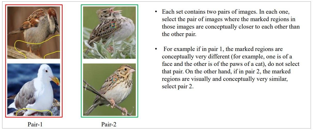
As before, the first experiment was purely comparative. Each fine-grained task consisted of two pairs of images. Each pair consisted of a prototype and its activation on a query image. The prototypes picked were the most important prototypes when trying to classify an image. The idea was to avoid prototypes that were not instrumental in the final decision as they were more likely to not be present in the query image itself. The annotators were then told to select the prototype/activation pair that were conceptually more similar to each other. Figure 6 shows examples of this task where annotators are expected to select pair-2 because the corresponding images are more similar than the pair-1 images.
This works well for the part-prototype classification methods as they all have an explanation generation procedure that utilizes their prototypes. On the other hand, ACE is not a classifier. It is an unsupervised concept learning method. Nevertheless, we thought that ACE by itself also had a notion of similarity baked into the method. It picks multiple patches from potentially different images to represent a concept. The assumption is that these patches are similar because they share that concept. Here, we decided to simply include two patches from the same concept in the pairs that represented ACE.
The annotators were presented with batches of 10 fine-grained tasks. Like before, 2 out of those 10 tasks contained validation data. Also similar to previous experiments, annotators had to obtain qualification by completing 7 tasks perfectly before being allowed to work on the main experiment. The experiment was repeated 3 times and the results were aggregated. The instructions shown to the annotators are shown in Figure 6.
As with prototype interpretability experiments, we also devised a more absolute version of the similarity experiment by adding the options "Both" and "None" to the same experimental layout. The instructions for this other experiment were as follows:
• Each set contains two pairs of images. In each one, select the pair of images where the marked regions in those images are conceptually closer to each other than the other pair.
• For example if in pair 1, the marked regions are conceptually very different (for example, one is of a face and the other is of the paws of a cat), do not select that pair. On the other hand, if in pair 2, the marked regions are visually and conceptually very similar, select pair 2.
• If both pairs have similar regions, select Both. If none of the pairs has similar regions, select None.
In total, 1156 pairs were compared and annotated by humans for the comparative study of prototype-query similarity. Table 5 shows the percentage each method was chosen against others. As can be seen, TesNet were chosen 71.88% of times when compared to other methods. At the second place was ProtoPNet with 64.47% preference. This shows that apart from TesNet, the other methods show comparatively worse prototype-query similarity compared to ProtoPNet itself. This has an interesting implication for the interpretability of these methods compared to the baseline.
Table 6 shows the results of the same experiments but on a method-by-method basis. Each element of the table shows the results of the pairwise comparison between the two methods, with the method shown in the first column being the one selected out of the two. For example, the intersection between the row "ACE" and the column "ProtoPool" shows the percentage of times (24.17%) ACE was chosen against ProtoPool in the experiments. While there is more variation when looked at with this much detail, the general trends hold true.
For the absolute experiments, 1984 pairs were compared and annotated by humans in total. Table 7 shows the percentage of times each method’s prototypes and query sample activations were seen to be close conceptually. While the overall rankings seem to have mostly remained the same, the lower overall percentages show that none of these methods is doing well in this regard. The best results, TesNet at 42.98% and ProtoPNet at 40.41% are still quite low. This is in agreement with the results previously reported in[12], [14].
Finally, Table 8 shows the results of the same experiments but on a method-by-method basis. Each row shows the percentage of times a method (shown on the first column) was selected either solely or as part of the "Both" option when paired with another method shown on the top row. Note that the sum of mirrored cells does not necessarily add up to 100% due to the existence of "Both" and "None" options. The consistently low similarity rates across different methods point to a general failure of all models in achieving a good similarity between the activated regions of the query samples and the prototypes.
This paper is available on arxiv under CC 4.0 license.