


1,898 reads
How the YouTube Homepage has Changed in the Past 15 Years


Too Long; Didn't Read
YouTube is an online video-sharing platform. It was created in February 2005 by Chad Hurley, Steve Chen, and Jawed Karim. In November 2006, Google bought the platform for US$1.65 Billion. The platform allows users to upload, view, share, rate, comment on videos, report, add to playlists, and subscribe to other users.Companies Mentioned


YouTube is an online video-sharing platform. It was created in February 2005 by Chad Hurley, Steve Chen, and Jawed Karim. In November 2006, Google bought the platform for US$1.65 Billion. The platform allows users to upload, view, share, rate, comment on videos, report, add to playlists, and subscribe to other users.
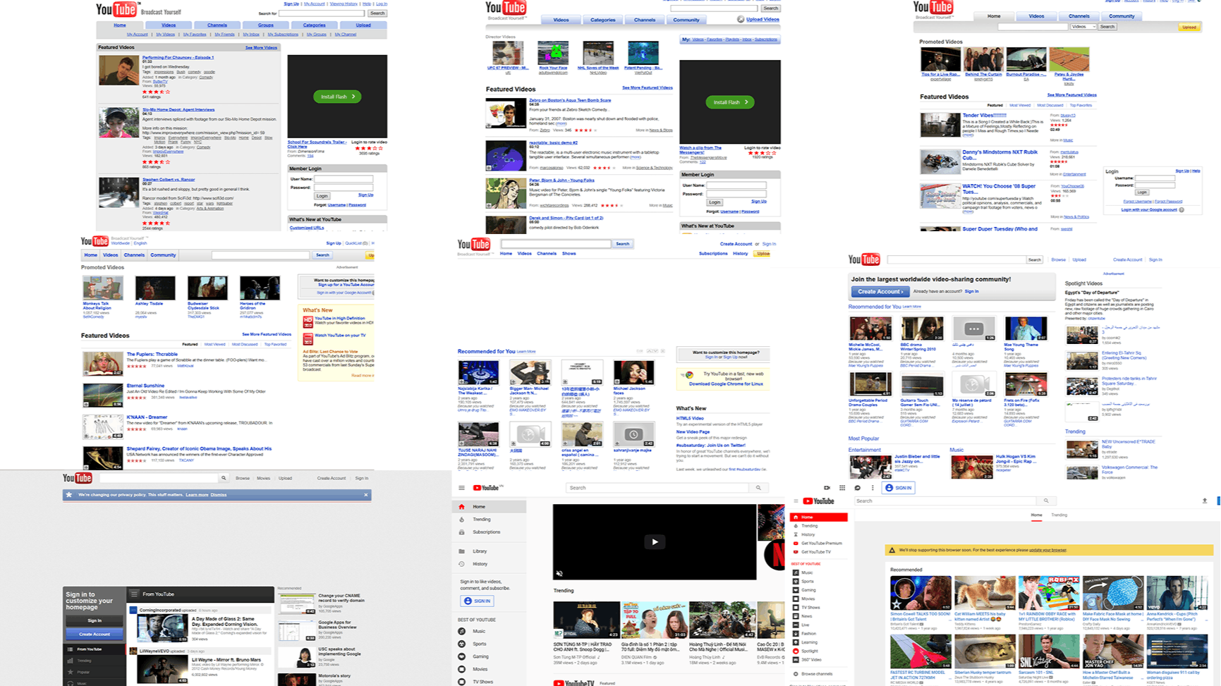
Let us review how the homepage of YouTube evolved over the years.
2006


In 2006, YouTube featured extensive and straightforward navigation panels on top. The overall design was too cluttered because of the information provided about featured and suggested videos. The color scheme however, looked dull.
2007


In 2007, YouTube optimized the navigation panels as well as the information of the videos. The background color was also changed to white. However, the overall structure remained the same and had too much information.
2008


In 2008, the overall design was almost the same as in 2007 but YouTube optimized the search bar.
2009


In 2009, the major changes included an integrated search and navigation panel. The overall structure remained the same but reduced information about videos optimized the overall feel.
2010


2010 was the start of the modern YouTube layout. It featured a much better and optimized search bar and navigation panel as well as better ad space and featured videos.
2011


In 2011, YouTube opted for a more structured approach by dividing the homepage into different sections. It enabled the platform to feature more content on the page.
2012


In 2012, YouTube featured the design we see today, it featured videos in one section, recommendations in one, and also introduced a category panel.
2013


In 2013, YouTube improved on previous layout. It introduced a better background color as well as optimized the panels.
2014


In 2014, the panels remained almost the same. However, YouTube dedicated more space to ads.
2015


The overall design remained the same. However, a recommendation panel was added to the homepage.
2016


In 2016, only some buttons were tweaked everything else remained the same.
2017


In 2017, YouTube decreased ad space and optimized the category and navigation panel.
2018


In 2018, YouTube only improved on the panels. The overall design remained the same.
2019


2019 improved the overall look of the homepage. YouTube improved the overall division of the page sections. The recommendation panel was removed and adjusted in a single panel of the left side.
2020


In 2020, YouTube used a design similar to 2018, and they optimized the category panel.

L O A D I N G
. . . comments & more!
. . . comments & more!


