
Four Types of Bar Charts in Python - Based on Tabular Data
by Luca LiuMarch 15th, 2024


Too Long; Didn't Read
How to create simple bar charts in Python using tabular data.

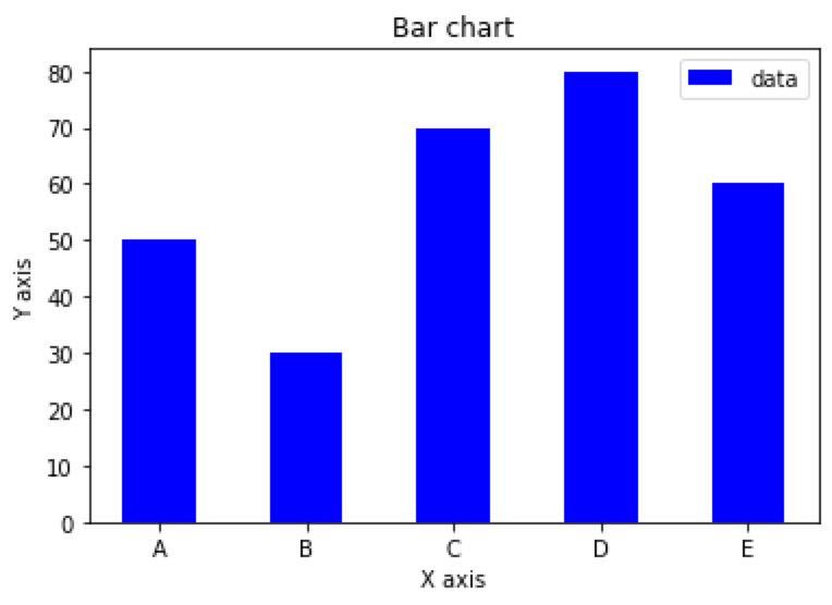
Simple Bar Charts in Python Based on Tabular Data
import matplotlib.pyplot as plt
import pandas as pd

df = pd.DataFrame({'x': ['A', 'B', 'C', 'D', 'E'],
                   'y': [50, 30, 70, 80, 60]})

plt.bar(df['x'], df['y'], align='center', width=0.5, color='b', label='data')
plt.xlabel('X axis')
plt.ylabel('Y axis')
plt.title('Bar chart')
plt.legend()
plt.show()

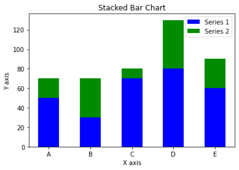
Stacked bar chart in Python Based on Tabular Data
import matplotlib.pyplot as plt
import pandas as pd

df = pd.DataFrame({'x': ['A', 'B', 'C', 'D', 'E'],
                   'y1': [50, 30, 70, 80, 60],
                   'y2': [20, 40, 10, 50, 30]})

plt.bar(df['x'], df['y1'], align='center', width=0.5, color='b', label='Series 1')
plt.bar(df['x'], df['y2'], bottom=df['y1'], align='center', width=0.5, color='g', label='Series 2')
plt.xlabel('X axis')
plt.ylabel('Y axis')
plt.title('Stacked Bar Chart')
plt.legend()
plt.show()

Grouped bar chart based on Tabular Data in Python
import matplotlib.pyplot as plt
import pandas as pd
import numpy as np

# Prepare the data
df = pd.DataFrame({
    'group': ['G1', 'G2', 'G3', 'G4', 'G5'],
    'men_means': [20, 35, 30, 35, 27],
    'women_means': [25, 32, 34, 20, 25]
})
ind = np.arange(len(df))  # x-axis position
width = 0.35  # width of each bar

# Plot the bar chart
fig, ax = plt.subplots()
rects1 = ax.bar(ind, df['men_means'], width, color='r')
rects2 = ax.bar(ind + width, df['women_means'], width, color='y')

# Add labels, legend, and axis labels
ax.set_xticks(ind + width / 2)
ax.set_xticklabels(df['group'])
ax.legend((rects1[0], rects2[0]), ('Men', 'Women'))
ax.set_xlabel('Groups')
ax.set_ylabel('Scores')

# Display the plot
plt.show()


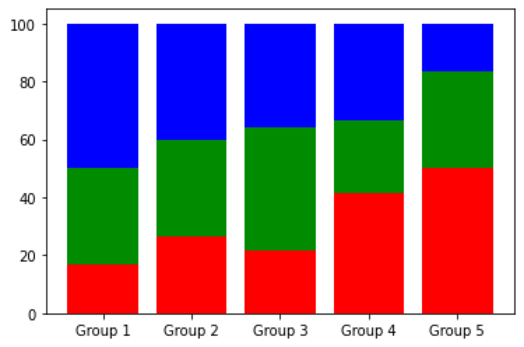
Percent stacked bar chart based on Tabular Data in Python
import matplotlib.pyplot as plt
import pandas as pd

# Prepare the data
df = pd.DataFrame({
    'x': ['Group 1', 'Group 2', 'Group 3', 'Group 4', 'Group 5'],
    'y1': [10, 20, 30, 25, 30],
    'y2': [20, 25, 30, 15, 20],
    'y3': [30, 30, 25, 20, 10]
})

# calculate percentage
y_percent = df.iloc[:, 1:].div(df.iloc[:, 1:].sum(axis=1), axis=0) * 100

# plot the chart
fig, ax = plt.subplots()
ax.bar(df['x'], y_percent.iloc[:, 0], label='Series 1', color='r')
ax.bar(df['x'], y_percent.iloc[:, 1], bottom=y_percent.iloc[:, 0], label='Series 2', color='g')
ax.bar(df['x'], y_percent.iloc[:, 2], bottom=y_percent.iloc[:, :2].sum(axis=1), label='Series 3', color='b')

# Display the plot
plt.show()

Thank you for taking the time to explore data-related insights with me. I appreciate your engagement. If you find this information helpful, I invite you to follow me or connect with me on LinkedIn or X (@Luca_DataTeam). You can also catch glimpses of my personal life on Instagram, Happy exploring!👋

L O A D I N G
. . . comments & more!
. . . comments & more!